New to R coding, new to coding in general

Hello all, thank so much for your attention.

I'm very new to coding and I'm trying to learn how to do some nice plots with ggplot2.

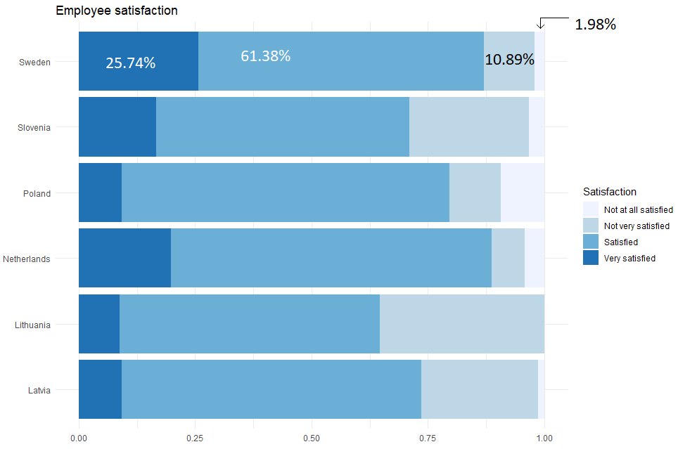
I have this dataset, I want to represent the Employee Job Satisfaction per country. I made a bar chart as follows:

##############
data08_n <- data08%>%mutate(like_job = ifelse(job_satisfaction=="Satisfied", 1, 0),
love_job = ifelse(job_satisfaction=="Very satisfied", 1, 0),
dislike_job = ifelse(job_satisfaction=="Not very satisfied", 1, 0),
hate_job = ifelse(job_satisfaction=="Not at all satisfied", 1, 0))

data08_n <- data08_n[complete.cases(data08_n), ]

ggplot(data08_n, aes(country, fill=job_satisfaction))+
geom_bar(position = "fill")+
labs(title="Employee satisfaction", x=element_blank(), y=element_blank(), fill="Satisfaction")+
scale_fill_brewer()+
theme_minimal()+
coord_flip()

##############

MY QUESTION:
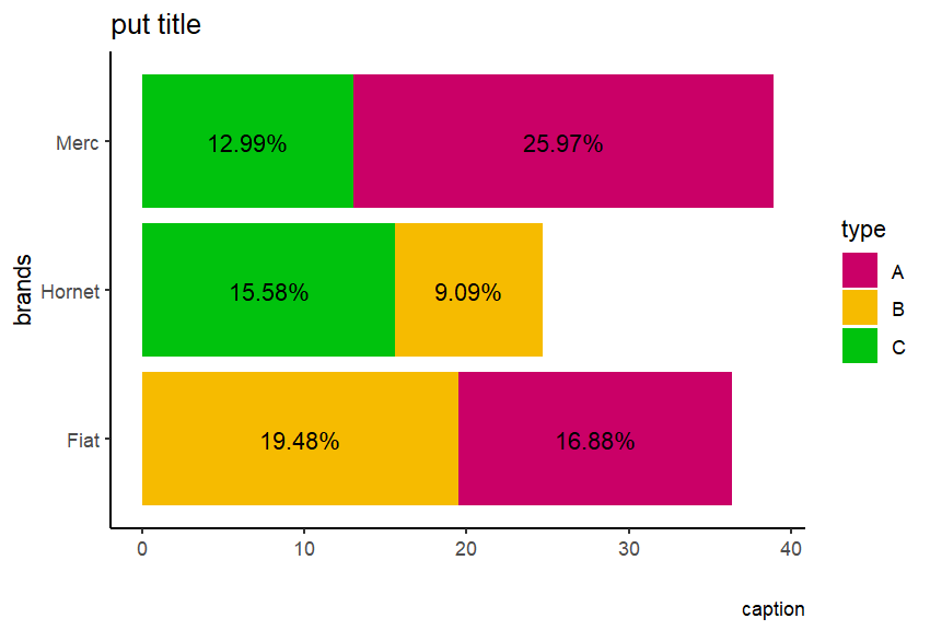
How can I add a percentual to each color to get something like:

Sorry for the trivial question. I'm very new to all of this.
Thank you for taking some time to help a newbie.

Daniel Almeida.

1 Like

It is going to require use of geom_text(). Maybe something like:

ggplot(
    data = data08_n
    )+
geom_col(
    mapping = aes(
        x = country, 
        y = percentage # a new variable you need to calculate before calling ggplot
        fill = job_satisfaction
        ),
        position = "fill"
    )+
geom_text(
    position = position_fill(vjust = 0.5),
    mapping = aes(label = percent(percentage)) # not sure about this, exactly
  ) +
  scale_y_continuous(scales::labels = percent)

If you want more specific advice, then prepare a reproducible example.

3 Likes

Hi @Dan_Almeida , welcome.

Is better if you put a reproducible example of data, see this link for that.

You need something like that, and the data is this order for make more easy:

df <- data.frame(brands=c('Merc','Fiat','Hornet','Merc','Fiat','Hornet'),
                 cnt=c(20,15,12,10,13,7),
                 type=c('A','B','C','C','A','B'),
                 percentage=c(25.974026,19.480519,15.584416,12.987013,16.883117,9.090909))

tibble(df) %>% 
  ggplot(aes(
    x = brands,
    y = percentage,
    fill = type,
    label = percentage)) +
  geom_bar(stat = 'identity') +
  scale_fill_manual(values=c('#CA0067','#F6BB00','#00C20D'))+
  geom_text(position = position_stack(vjust = .5), 
    aes(x = brands,
        y = percentage,
        label = paste0(round(percentage,2),"%"))) +
  labs(title='put title',
       caption = 'caption',
       y=' ')+
  coord_flip()+ # for rotate the plot
  theme_classic()

In a before opportunity Im make the same quenstions and other user help me.
Im make better the code for you.

1 Like

This topic was automatically closed 42 days after the last reply. New replies are no longer allowed.

If you have a query related to it or one of the replies, start a new topic and refer back with a link.