NEW Having a problem with geom_label

baltemission<-NEI[NEI$fips=="24510" & NEI$type=="ON-ROAD", ]
losaemission<-NEI[NEI$fips=="06037" & NEI$type=="ON-ROAD", ]

baltemission$County<-"Baltimore City, MD"
losaemission$County<-"Los Angeles County, CA"

bothemissions <- rbind(baltemission,losaemission)

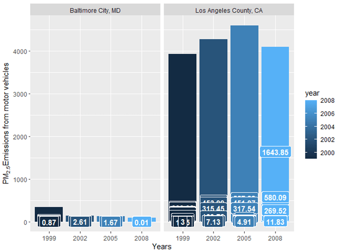
g<-ggplot(bothemissions,aes(x=factor(year),y=Emissions,fill=year,label=round(Emissions,2)))
g+geom_bar(stat="identity")+facet_grid(.~County,)+xlab("Years")+
ylab(expression("PM"[2.5]*"Emissions from motor vehicles"))+
geom_label(aes(fill = year),colour = "white", fontface = "bold")

May I ask why did it appear seperated? Thank you.
Welcome! I'm afraid you'll need to supply some more info in order for helpers to be able to understand your problem (this is pretty common — when you're new to this stuff, it's hard to know how much information is enough!).

The best thing would be if you can make your question into a reproducible example (follow the link for instructions and explanations). To include your data, you'll want to follow one of the methods discussed here.

If you try all that and get stuck, here's a fallback option...
  1. Edit your post and add in some of the code you have tried. It's OK it doesn't work! It's really helpful to see what you've been attempting. Be sure to format your code as code (it's hard to read unformatted code, and it can get garbled by the forum software)
  2. Include sample data:
    • If your data set is OK to share, run the following line and paste the output into your post. Again, be sure to format it as code :sparkles:
    dput(head(your_dataframe_name, 10))
    
    • If your data set can't be shared, run this line instead and paste the output into your post (and yes, format as code!) This will still share some information about your data. If it's truly confidential, I'm afraid you'll need to make a fake sample dataset to share.
    str(your_dataframe_name)
    

Yeah. Thank you so much, just started learning R 2 weeks ago..

dput(head(bothemissions, 10))
structure(list(fips = c("24510", "24510", "24510", "24510", "24510",
"24510", "24510", "24510", "24510", "24510"), SCC = c("220100123B",
"220100123T", "220100123X", "220100125B", "220100125T", "220100125X",
"220100127B", "220100127T", "220100127X", "220100129B"), Pollutant = c("PM25-PRI",
"PM25-PRI", "PM25-PRI", "PM25-PRI", "PM25-PRI", "PM25-PRI", "PM25-PRI",
"PM25-PRI", "PM25-PRI", "PM25-PRI"), Emissions = c(7.38, 2.78,
11.76, 3.5, 1.32, 5.58, 4.43, 1.67, 8.41, 3.66), type = c("ON-ROAD",
"ON-ROAD", "ON-ROAD", "ON-ROAD", "ON-ROAD", "ON-ROAD", "ON-ROAD",
"ON-ROAD", "ON-ROAD", "ON-ROAD"), year = c(1999L, 1999L, 1999L,
1999L, 1999L, 1999L, 1999L, 1999L, 1999L, 1999L), County = c("Baltimore City, MD",
"Baltimore City, MD", "Baltimore City, MD", "Baltimore City, MD",
"Baltimore City, MD", "Baltimore City, MD", "Baltimore City, MD"
)), row.names = c("114470", "114472", "114477", "114479", "114481",
"114486", "114488", "114490", "114495", "114497"), class = "data.frame")

str(bothemissions)
'data.frame': 2097 obs. of 7 variables:
fips : chr "24510" "24510" "24510" "24510" ... SCC : chr "220100123B" "220100123T" "220100123X" "220100125B" ...
Pollutant: chr "PM25-PRI" "PM25-PRI" "PM25-PRI" "PM25-PRI" ... Emissions: num 7.38 2.78 11.76 3.5 1.32 ...
type : chr "ON-ROAD" "ON-ROAD" "ON-ROAD" "ON-ROAD" ... year : int 1999 1999 1999 1999 1999 1999 1999 1999 1999 1999 ...
$ County : chr "Baltimore City, MD" "Baltimore City, MD" "Baltimore City, MD" "Baltimore City, MD" ...

Thanks so much for including a sample of your data. Now, can I ask what exactly you are hoping to plot? Is it the total emissions per year by city?

Thanks to you. Yes! That is exactly what I want.

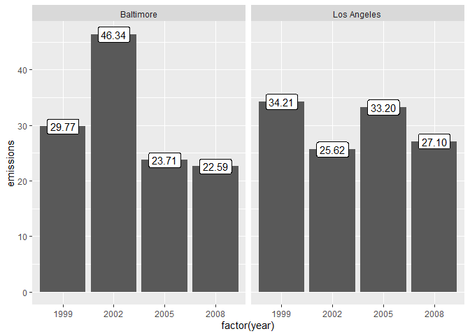
I think the challenge you are having with the label is the in the structure of your data, you have multiple observations per city per year and so there is one label per observation, rather than one label per year. I would recommend summarizing your data and creating a new data frame that has totals per year by city before you plot it. It would look something like this:


library(tidyverse)

# make up some fake data
df <- tibble(
  emissions = rnorm(16, 15, 5),
  year = rep(c(1999, 2002, 2005, 2008), 4),
  city = rep(c("Baltimore", "Los Angeles"), each = 8)
  )

# create city year summary
by_city_year <- df %>% 
  group_by(city, year) %>% 
  summarize(emissions = sum(emissions))
#> `summarise()` regrouping output by 'city' (override with `.groups` argument)
  
by_city_year %>%   
  ggplot(aes(x = factor(year), y = emissions)) +
  geom_col() +
  geom_label(aes(label = scales::number(emissions, 0.01))) +
  facet_wrap(vars(city))

Created on 2020-06-09 by the reprex package (v0.3.0)

Thank you so much now I get it! I appreciate your time and expertise!

This topic was automatically closed 7 days after the last reply. New replies are no longer allowed.