New Category Colors for RStudio Community - Your Thoughts?

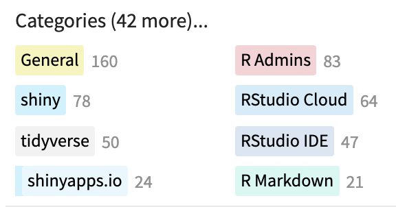
We recently re-added category colors to the community forum.

For background, these were removed with the aim of making topic lists look cleaner and more in line with RStudio's design direction. The thought was that the previous bright colors added noise and clutter for folks visiting the site for the first time.
However, many regular users -- RStudio folks, sustainers, and other who regularly visit the site --requested bringing category colors back, as they served as an important navigational tool for regular contributors. Many people are keen to see the full list of new posts, but then want to go straight to a set of categories the are most interested in helping out in. Dedicated categories colors visually separate category topics and make this navigation workflow easier. Removing colors made it harder to engage with the site in that way.

Andres and I were just in a direct message discussing what the new colors should be. We were about to start discussing borrowing colors from a continuous color pallet, and realized we open the discussion up here.

You can see all category colors here. Posit Community
image

Colors for the RStudio IDE, Tidyverse, Shiny, Cloud, R Markdown are lean on hex sticker designs. I'd love to hear your suggestions.

Greg, RStudio's chief designer, suggests we stick to hex-sticker colors, and RStudio's style guide colors (and shades of these). Shared below.

PRIMARY
RStudio Blue: #4D8DC9
Dark Gray: #404040
Light Gray: #F8F8F8
Pure White: #FFFFFF

SECONDARY / ACCENT
Accent Orange: #E7553C
Logo Gray: #4D4D4D
Dark Blue: #447099
Logo Blue: #75AADB
Accent Green: : #A4C689
Accent Yellow: #FDBE4B

My opinion about this is that since this is a science related forum, form (or in this case, color) must follow function, so I think the colors must firstly accomplish a functional end and then look pretty, having said that, I think they could do both just fine, it is only matter of choosing the right palette.

On the functional side of things, I think that colors of the main categories should have high contras among them, which I think is not currently the case for all of them (e.g. #shiny, #rstudio-cloud and #rstudio-ide), and sub categories should have low contrast in relationship with the parent category.

This topic was automatically closed 42 days after the last reply. New replies are no longer allowed.

If you have a query related to it or one of the replies, start a new topic and refer back with a link.