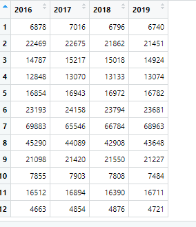
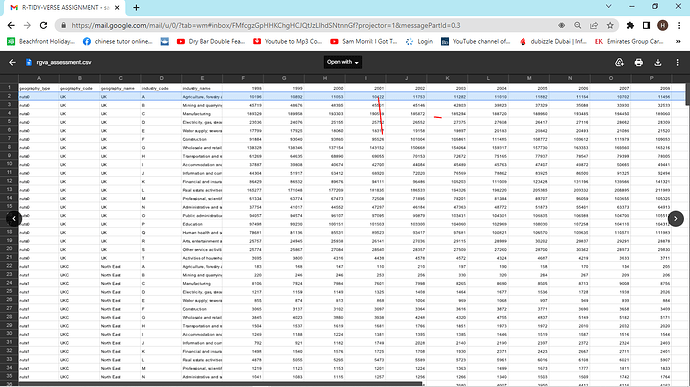
I am a beginner in r studio, just got my Google analytics data certificate and doing some exercises to expand my knowledge of R studio. Used to use Excel in the past but based on the functionalities of R studio I don't think I will ever go back again. However, while doing my exercise I have hit a rock in the attached task. I have already filtered the required data but am stuck on how to show the change in employee numbers within the particular industry. Any assistance will be appreciated
TASK 2:
Produce a column chart that shows the change in GVA per employee between 2016
and 2019 in the real estate activities sector in nuts1 (nuts level 1) regions.
rgva_assessment_1_ %>%
filter(geography_type == 'nuts1' &
industry_name == 'Real estate activities') %>%
select(2016, 2017, 2018, 2019) %>%
view()

