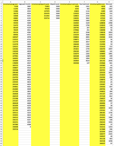
Hi, I have this data in a CSV.
It was output from a Unity simulation as part of an experiment and I am trying to learn to use R so wanted to work with this data set.
Every other column is a time stamp for various processes/tasks and the other columns are durations associated with that time stamp.
I want to see all the yellow columns as the x-axis and the white columns as the y-axis. I was able to do it with the first two columns using this:
> ggplot(data = cogLoad, mapping = aes(x = timeStamp, y = timeOn)) + geom_point() + geom_smooth()
but now I don't know how to add the other columns in the graph. I have imported everything into R Studio using this:
> read_csv("data/testData.csv")
── Column specification ───────────────────────────────────────────────────────────────────────────────────────────────────────────────────────────────────────────────────────────────────────────────────────────────────────────
cols(
timeStampCogLoad = col_double(),
CogLoadTimeOn = col_double(),
timeStampObjectFound = col_double(),
ObjectFound = col_double(),
timeStampNavToolUsed = col_double(),
NavToolUsed = col_double(),
timeStampINSUsed = col_double(),
INSUsed = col_double()
)
# A tibble: 59 x 8
timeStampCogLoad CogLoadTimeOn timeStampObjectFound ObjectFound timeStampNavToolUsed NavToolUsed timeStampINSUsed INSUsed
<dbl> <dbl> <dbl> <dbl> <dbl> <dbl> <dbl> <dbl>
1 5104 3087 71831 5000 4534 1261 4634 265
2 11205 3850 95426 5000 6242 402 4940 1307
3 13486 4592 147970 5000 65803 1116 6289 644
4 30279 4556 205476 5000 119503 2101 66146 715
5 31868 4261 311042 5000 128853 2192 67042 111
6 40885 4192 359714 5000 138305 3062 67333 325
7 43858 4391 NA NA 144858 1483 67724 116
8 45593 4304 NA NA 150302 1529 128858 2780
9 51473 4519 NA NA 166366 1794 131819 178
10 60169 4139 NA NA 169746 207 138310 62
# … with 49 more rows
>
Sorry about the horrible formatting, but can't get it to work better.
Any suggestions are appreciated.
