Hi
I have the following data frame as a sample
VAPublicIP2 = data.frame(Session = c("Apr2016", "Feb2017", "Jan2016", "Mar2018", "Mar2017", "Dec2016", "May2018", "Nov2018", "Oct2016", "Sep2017") ,
                         Plugin = c( "1234567", "7353565", "5553565", "7353565", "5553565", "7353565", "5553565", "5553565", "1234567", "5553565"))
VAPublicIP2
   Session  Plugin
1  Apr2016 1234567
2  Feb2017 7353565
3  Jan2016 5553565
4  Mar2018 7353565
5  Mar2017 5553565
6  Dec2016 7353565
7  May2018 5553565
8  Nov2018 5553565
9  Oct2016 1234567
10 Sep2017 5553565
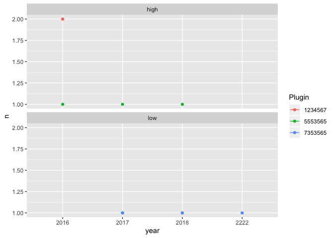
My goal is to plot a graph with year as the X axis, the number of top 10 Plugin on the Y axis with Plugin ID shown with color in the plot. I am am thinking the codes should look something like this:
ggplot(data = VAPublicIP2) +
  geom_point(mapping = aes(x = *SessionYear*, y = *Number of Top 10 Plugin*, color = Plugin))
As you can see the values for X and Y must be derived from the sample data and this is I am able to do so far:
To get one SessionYear and to count plugin
VAPublicIP2[grepl("2017",VAPublicIP2$Session, ignore.case = FALSE),] %>% count(Plugin)
but then ...how do I get for every year and combine them? I know group_by may help but I cant seem to fit it in this code.
The X axis should be in increasing order of Session Year like this: 2016 2017 2018. So for 2016 it is actually combining Apr2016, Jan2016, Dec2016 and Oct2016. The same applies to other Sessions.
The Y axis for 2016 will have the number of Plugins for 1234567, 5553565, and 7353565 (All in 2016). The same goes for other Session Year.
The plot should later has line connecting the same Plugin for each Session Year
Please help. Thanks.