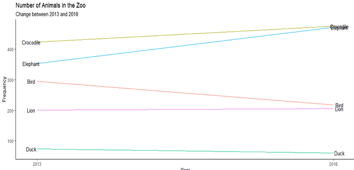
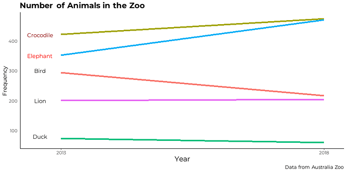
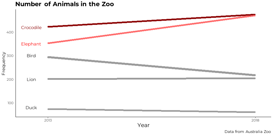
Hello,
I am having trouble formatting my ggplot2 into the desired plot. How do I make the name of the animals tagged next to their respective line in the slope plot rather than having a legend on the right hand side. I would also like to remove all the excess gap thats outside 2013-2018 as it makes the graph look funny.
This is my current graph:
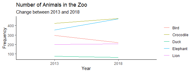
This is my desired graph:
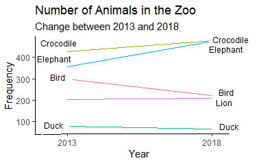
I have attached my code on the bottom. Any help would be appreciated!
data1 <- data_frame(
  Animal = c("Bird", "Elephant", "Lion", "Duck", "Crocodile"),
  year2013 = c(295,353,201,74,423),
  year2018 = c(218,471,205,61,475)
)

data1 %>%
  ggplot(aes(x="2013", xend="2018", y=year2013, yend=year2018,
             group=Animal, color=Animal))+
  geom_segment()+
  labs(title= "Number of Animals in the Zoo",
       subtitle = "Change between 2013 and 2018",
       x = "Year",
       y = "Frequency",
       color = "")+
  theme_classic()
