Need help editing my graphic

Hello,
I really need help with a formality in my graphic. I want to remove the visual data points because they are so many and also overlapping. I do not need the points for my visualization but cannot get rid of them.

Here is my script:

ggbetweenstats(daten_cc, GENDER, NEGAFF,type = "parametric",results.subtitle =TRUE, bf.message = FALSE,effsize.type = "biased")+
ylab("Negative Affect")+
scale_x_discrete(labels=c("1" = "Male", "2" = "Female"))

And here is the graphic
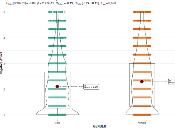
grafik

Could you help me to remove the colored points?

ggbetweenstats(daten_cc, GENDER, NEGAFF,
               type = "parametric",results.subtitle =TRUE,
               bf.message = FALSE,effsize.type = "biased",
               point.args = list(size=0)) +
      ylab("Negative Affect") +
      scale_x_discrete(labels=c("1" = "Male", "2" = "Female"))

Thank you very much!

This topic was automatically closed 21 days after the last reply. New replies are no longer allowed.

If you have a query related to it or one of the replies, start a new topic and refer back with a link.