NCT Predict
Authors: Niall Walsh
Abstract: Each year in Ireland the majority of car owners are required to have their car under go the National Car Test (NCT) to determine their roadworthiness. Cars that are 4 years old are required to be tested on a Biennial basis and once they reach 10 years old the NCT is required annually. The Road Safety Authority (RSA) publishes aggregated data on the first attempts for all cars at passing the test. I’ve created the following R Shiny application to delve into the 2019 data with my main goal being to develop a simple app to predict if your car will pass or fail on its next NCT.
When creating NCT Predict I created a ranked a list of questions I wanted to answer.
- Will my car pass its next NCT on its first attempt?
- What are the main areas my car might fail on?
- What popular car makes have the best first time pass rate?
- How do car makes compare to NCT average performance?
Full Description: The following is description of my App with some descriptions of individual graphs that might be of interest to users.
The first page is a brief description of the Application and what each tab consists of.

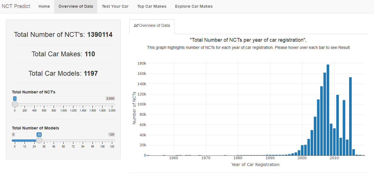
The first tab gives and overview of the data, how many NCTs per year of car registration along with information on amount of car makes and models in the data.
The next page 'Test your car' aimed to answer my first question The answer is binary either your car will pass or fail its next NCT. At first I created a few graphs to visualise this but realised I was over complicating things. Instead I created a simple function to return a PASS or FAIL response based on the probability of your car passing the test. I added in some colour to the returned text to make it even easier for the brain to comprehend the response, green for PASS and red for FAIL.

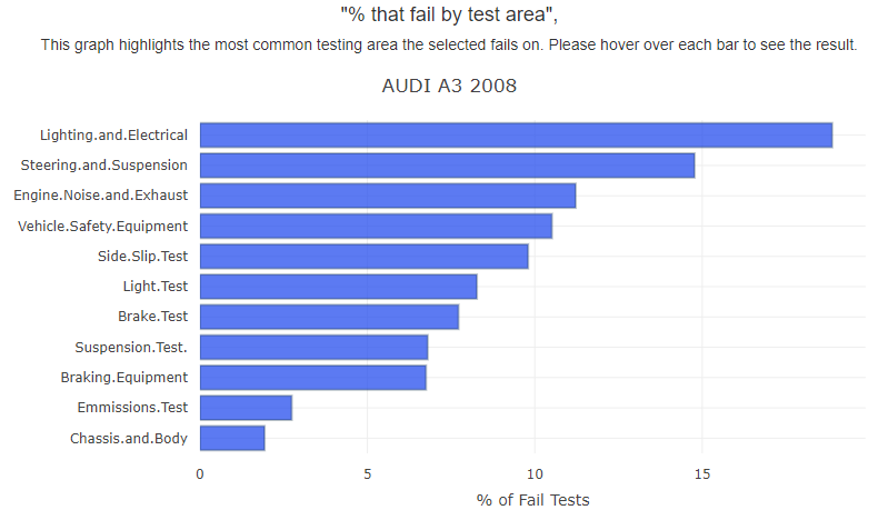
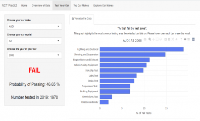
My second question was abit more complex than a binary response. NCT tests have 11 categories of testing and depending on the chosen car the category of testing that it is most likely to fail on can change. For this I chose a horizontal bar chart ordered by % fail in descending order. I also chose to use a horizontal bar chart due to the volume of categories and some have long names such as “Engine.Noise.and.Exhaust”.
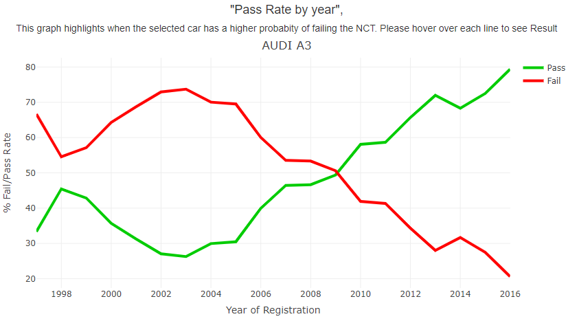
I produced this line graph of % pass rate and year of registration. This was the first graph I produced with this data set and I later added the % fail rate (inverse of pass rate) so the year of registration of the chosen car is more likely to pass the NCT is clear. In the below example it is clear Audi A3 with a registration of 2010 and onwards are more likely to pass the NCT
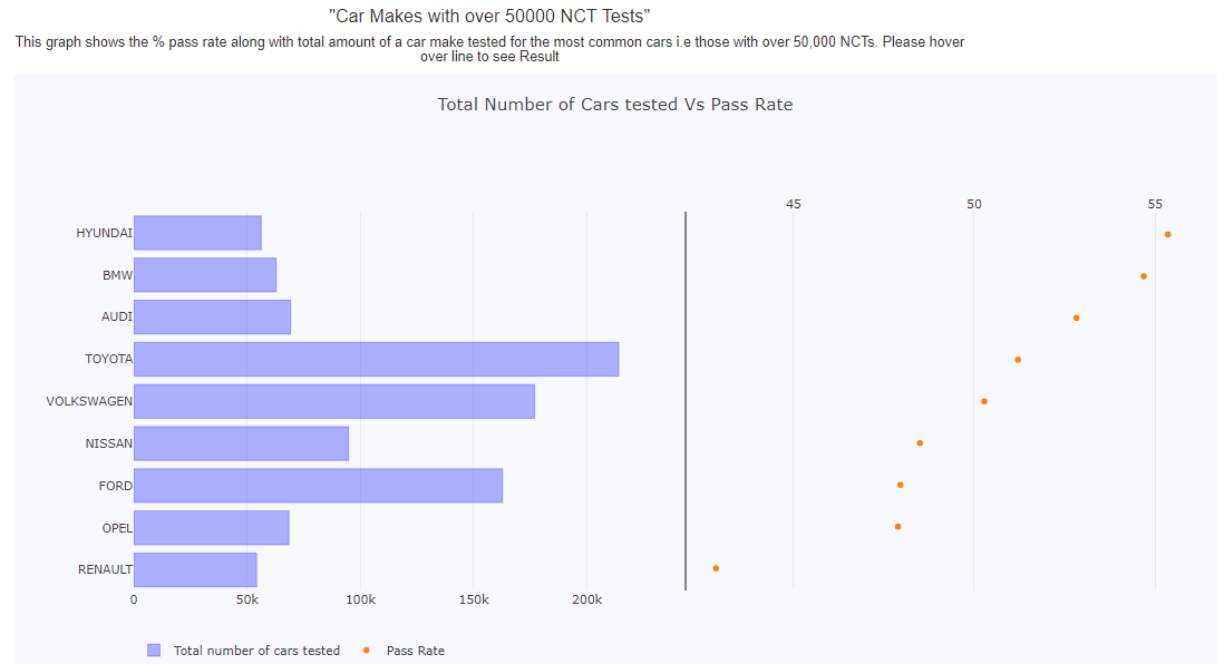
The third question I wanted to visualise was what popular car makes have the best first time pass rate? I defined popular car makes as those with over 50,000 NCT across all their car models. This reduced car makes from 110 down to 8 which helped make the visualisation more manageable. I created bar chart with a scatter plot to visualise the results. Hyundai came out on top with just over 50,000 NCT’s and a pass rate of over 55% followed closely by BMW. Toyota is the most popular car make on Irish roads with well over 200,000 NCTs and a pass rate of 51% placing it 4th out of all the popular car makes. There is a distinct gap between the pass rate of Renault and the other 8 popular car.
My last question was to investigate how different car makes compare to the NCT mean statistics. A user can select a car make and analyse a number of different graphs to determine how it compares to NCT averages. I chose the following two graphs to describe in this post. The graph is a grouped horizontal bar chart which shows NCT mean fail rates Vs the chosen car make. The main testing area cars fail on is Lighting and electrical with over 20% of all cars failing on this area. We can see that Hyundai is about 2% below the mean at 18%. Looking at the rest of the testing areas Hyundai is below the NCT mean for all areas validating its position as most popular car with best first time pass rate. Hyundai seem to do particularly well on Suspension test and is 50% below the average fail rate for this particular test.

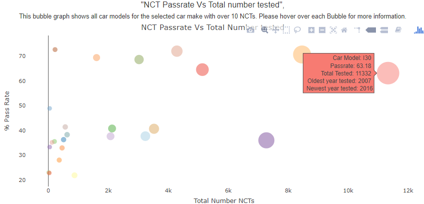
The final graph I am going to talk about is a bubble chart. A bubble chart is a scatter plot in which a third dimension of the data is shown through the size of markers and additional information car be displayed in a text box when curser is placed on it. Here we can easily see that the Hyundai I30 has the most NCT tests of all Hyundai makes at 11332, its pass rate is high at 63% but there are other models with higher pass rates. The make is quite new as the oldest car tested was register in 2007.
Keywords: Plotly, Visualization, Transport
Shiny app: https://niallwalsh.shinyapps.io/nct_2019/?_ga=2.25451838.2075015895.1612037296-2015932448.1611505790
Repo: NCT-Predict-2019/app.r at main · NiallWalshCIT/NCT-Predict-2019 · GitHub
RStudio Cloud: Posit Cloud
Thumbnail:
Full image: