My RStudio code doesn't have colors

I'm studying R in university at the moment and I'm following my professor's R cheatsheet and codes to replicate using my own database.
But when I wanna replicate this following code, it loads, but uncolored... while the plot it's supposed to be filled with a variety of colors

This is the code I need to replicate:

ggplot(diamonds) +
 geom_histogram(bins = 50, aes(x = carat, fill = cut)) +
 xlab("Carat") +
 ylab("Frecuencia") +
 ggtitle("Distribución de la variable Carat") +
 theme_minimal()

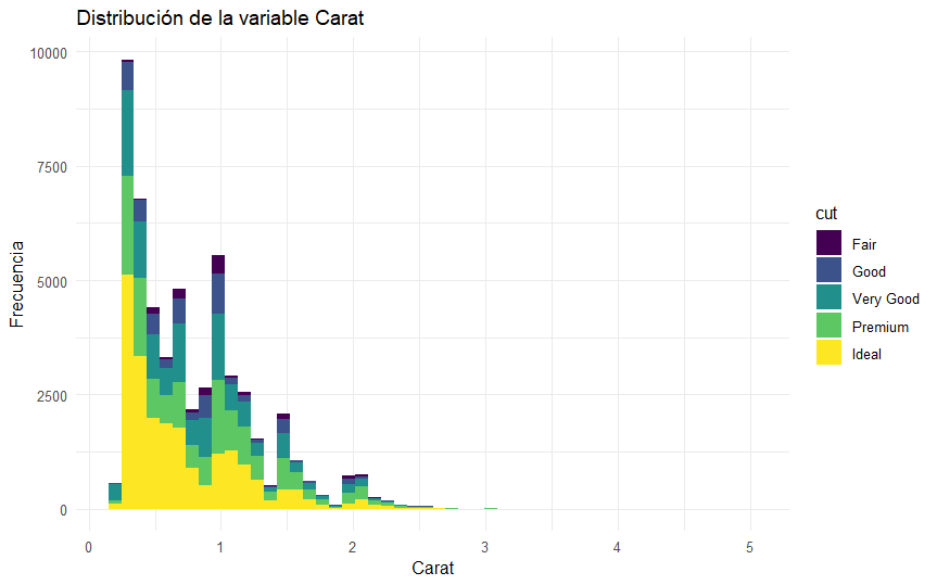
This is the outcome of the previous code:
And this is my version:

ggplot(baseDeDatos2) +
  geom_histogram(bins = 50, aes(x = EDAD, fill = ALTURA)) +
  xlab("EDAD") +
  ylab("Frecuencia") +
  ggtitle("Distribución de la variable EDAD") +
  theme_minimal()

And my outcome is uncolored: I can't post more than 1 photo since I'm a new user... but my outcome is the plot in gray colors.

Could someone tell me why is my outcome uncolored..? Thank you
Please post some of your data by posting the output of

dput(head(baseDeDatos2,30))

You can adjust the value of 30 to whatever makes sense for your data.

this is the outcome, I only put 1 to show, because my database has 50 registers and it looks really messy to read here

> dput(head(baseDeDatos2,1))
structure(list(ID = "0-01", NOMBRE = "Pedro", EDAD = 26, TELEFONO = 123456, 
    MAIL = "Pedro20@gmail.com", ALTURA = 175, PESO = 56), row.names = c(NA, 
-1L), class = c("tbl_df", "tbl", "data.frame"))

It's a database with 50 registers of Name, age, telephone, mail, height and weight

I can't reproduce your plot with one row. Since your plot only uses the columns EDAD and ALTURA, you can simplify the dput output with

dput(baseDeDatos2[,c("EDAD","ALTURA")])

> dput(baseDeDatos2[,c("EDAD","ALTURA")])
structure(list(EDAD = c(26, 28, 35, 20, 10, 78, 82, 42, 17, 92, 
40, 78, 43, 10, 78, 97, 83, 81, 41, 44, 40, 95, 37, 22, 41, 47, 
60, 13, 60, 61, 28, 91, 24, 31, 87, 44, 14, 76, 92, 91, 35, 61, 
38, 83, 75, 24, 38, 70, 63, 23), ALTURA = c(175, 185, 172, 162, 
168, 161, 158, 172, 185, 192, 171, 168, 166, 189, 175, 166, 174, 
171, 169, 173, 168, 171, 165, 157, 162, 165, 155, 161, 159, 176, 
182, 158, 162, 152, 159, 161, 155, 156, 162, 165, 163, 166, 155, 
151, 164, 152, 151, 152, 141, 191)), row.names = c(NA, -50L), class = c("tbl_df", 
"tbl", "data.frame"))

Is this what you suggest me to reply? I'm sorry, I'm a newbie who's struggling...

Yes, your latest dput() output is exactly what I needed.
The reason you do not get any color is that within each bin of EDAD there are several values of ALTURA and there is no way to choose a color. The original plot from your professor does show the color because each bar is sub divided into the the values of cut and cut only has 5 categorical values. In your data, ALTURA is a continuous variable.
Would it make more sense to plot ALTURA vs EDAD in a scatter plot?

ggplot(baseDeDatos2, aes(EDAD, ALTURA)) + geom_point()

Thank you, I think my doubt is solved, I didn't know why my plot didn't have a similar outcome.
Where can I get to know more about subdivision of bars and cut? I really like R and I barely know the basics

Yes I've previously made a scatter plot and it looks like that

You might find the first three chapters of this book to be useful.

https://r4ds.had.co.nz/

Thank you FJCC, have a good day

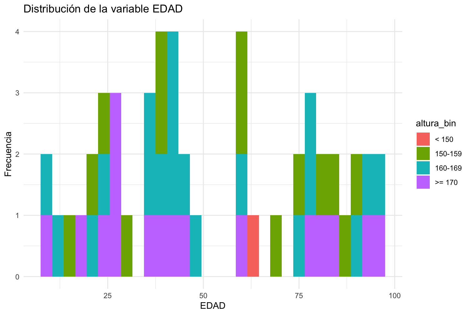
You could use discrete categories, for example:

a %>% 
  mutate(altura_bin = case_when(ALTURA < 150 ~ "< 150",
                                ALTURA >= 150 & ALTURA < 160 ~ "150-159",
                                ALTURA >= 160 & ALTURA < 170 ~ "160-169",
                                ALTURA >= 170 ~ ">= 170"),
         altura_bin = factor(altura_bin, levels = c("< 150", "150-159", "160-169", ">= 170"))) %>% 
  ggplot(aes(x = EDAD, fill = altura_bin)) +
  geom_histogram() +
  labs(x = "EDAD",
       y = "Frecuencia",
       title = "Distribución de la variable EDAD") +
  theme_minimal()

Thank you Flm, where did you learn so much about R? I'm reading books online but I don't find very detailed info about certain topics. I want to learn which kind of plots to apply to certain dataframes, how to know when, when not to...

I attended a university course at the beginning of the year, then I experimented with using it on a daily basis. I suggest you follow Riffomonas Project on youtube, it can be inspiring.

Nice. I'm in Uni studying to be a technician in programming, and we see a variety of things. Now we're studying R, but my professor didn't teach us enough, he just gave us a lot of exercises and 2 Pdf's. Those are well explained, but I need more info, my codes are messy and full of errors sometimes...

I just subscribed to Riffomona's Project as you recommended, so far his content looks good. I really like R, the plotting part specially