my data is coming up as different lengths in r studio but they are the same length in excel

Im doing an assignment for college and very new to R studio. I'm currently trying to create a histogram from 2 pieces of data from an excel sheet however, when i try to plot the histogram using the
hist.data.frame() function it says my values are 2 different lengths. In the excel sheet the data sets are the same lengths and i am using the summary() function the exact same for both variables.

Can any help me fix this problem cause im not sure why something like this would happen


you can see that red_summary is 83 long while, GFP1_summary is 84.

I would show more of the code but i can only embed 1 image at the moment.

Run tail(GFP1_summary) and tail(red_summary) to see if the last few rows of each data frame matches what you expect to see based on looking at the Excel file.
I'm not sure what you are doing with the summary() function. Please show your code.
You can post the actual data here by running

dput(GFP1_summary)

and

dput(red_summary)

and posting the output from the Console here. Put lines with three back ticks just before and after the dput() output, like this:
```
output from dput()
```

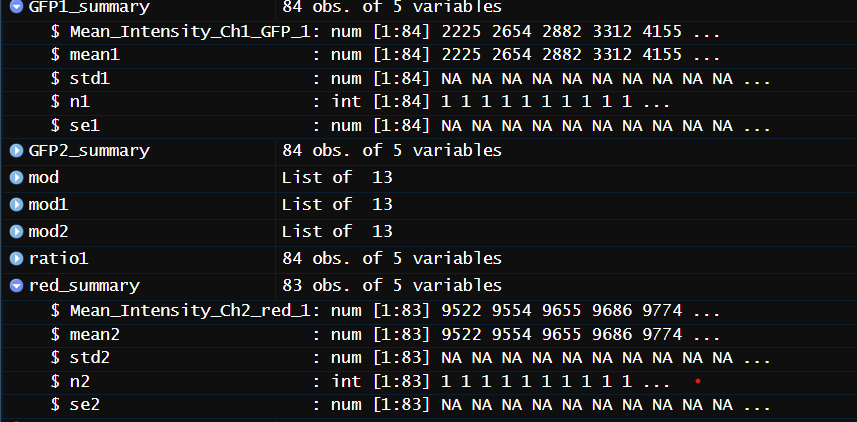
im using summary() to find the mean, se, std and length of the column, im sure there is a more efficient way to do this but thats just how i was taught

the output of dput(GFP1_summary) is

structure(list(Mean_Intensity_Ch1_GFP_1 = c(2225.2, 2654.3, 2882.3, 
3312.1, 4154.9, 4596.2, 4611.3, 4734.3, 4949.5, 4954.4, 5114.7, 
5125.2, 5140.7, 5275.5, 5316.2, 5655.1, 5703.6, 5841.5, 5926.7, 
5936.5, 6042.6, 6306.2, 6539.8, 6565, 6599.1, 6649, 6751.3, 6784.5, 
6856.8, 6859.2, 7073.3, 7101, 7153.8, 7169.1, 7242.4, 7248.4, 
7253.2, 7293, 7345.7, 7378.4, 7391, 7441.6, 7462, 7517.7, 7519.7, 
7521.4, 7572.4, 7600.8, 7606.7, 7628.4, 7628.6, 7637.1, 7647.8, 
7680.4, 7735.5, 7749.2, 7750.2, 7762.1, 7764.8, 7773.2, 7775.2, 
7784.5, 7829.6, 7936.5, 8047.3, 8056.5, 8095, 8130.3, 8140.3, 
8149.5, 8158.8, 8175.2, 8183.7, 8266.1, 8268.8, 8353, 8374.6, 
8388.6, 8395.5, 8422.6, 8598.5, 8676.4, 13497.8, 16393.9), mean1 = c(2225.2, 
2654.3, 2882.3, 3312.1, 4154.9, 4596.2, 4611.3, 4734.3, 4949.5, 
4954.4, 5114.7, 5125.2, 5140.7, 5275.5, 5316.2, 5655.1, 5703.6, 
5841.5, 5926.7, 5936.5, 6042.6, 6306.2, 6539.8, 6565, 6599.1, 
6649, 6751.3, 6784.5, 6856.8, 6859.2, 7073.3, 7101, 7153.8, 7169.1, 
7242.4, 7248.4, 7253.2, 7293, 7345.7, 7378.4, 7391, 7441.6, 7462, 
7517.7, 7519.7, 7521.4, 7572.4, 7600.8, 7606.7, 7628.4, 7628.6, 
7637.1, 7647.8, 7680.4, 7735.5, 7749.2, 7750.2, 7762.1, 7764.8, 
7773.2, 7775.2, 7784.5, 7829.6, 7936.5, 8047.3, 8056.5, 8095, 
8130.3, 8140.3, 8149.5, 8158.8, 8175.2, 8183.7, 8266.1, 8268.8, 
8353, 8374.6, 8388.6, 8395.5, 8422.6, 8598.5, 8676.4, 13497.8, 
16393.9), std1 = c(NA_real_, NA_real_, NA_real_, NA_real_, NA_real_, 
NA_real_, NA_real_, NA_real_, NA_real_, NA_real_, NA_real_, NA_real_, 
NA_real_, NA_real_), n1 = c(1L, 1L, 1L, 1L, 1L, 1L, 1L, 1L, 1L, 
1L, 1L, 1L, 1L, 1L, 1L, 1L, 1L, 1L, 1L, 1L, 1L, 1L, 1L, 1L, 1L, 
1L, 1L, 1L, 1L, 1L, 1L, 1L, 1L, 1L, 1L, 1L), se1 = c(NA_real_, 
NA_real_, NA_real_, NA_real_, NA_real_, NA_real_, NA_real_, NA_real_, 
NA_real_, NA_real_, NA_real_, NA_real_, NA_real_, NA_real_)), class = c("tbl_df", 
"tbl", "data.frame"), row.names = c(NA, -84L))

and the output of dput(red_summary) is

structure(list(Mean_Intensity_Ch2_red_1 = c(9521.5, 9553.9, 9654.8, 
9686.5, 9774.3, 9778.7, 9804.8, 9848.2, 9858.2, 9859.9, 9865.9, 
9883.6, 9909.1, 9988.3, 9990.1, 9994.5, 9997.7, 9998, 10005.3, 
10017.3, 10019.8, 10045.6, 10052.7, 10102, 10110.2, 10114, 10136.4, 
10170, 10179.3, 10203.7, 10218.3, 10218.6, 10239.9, 10297.2, 
10348.4, 10358.9, 10385.4, 10391, 10420.5, 10446.3, 10552.8, 
10570.7, 10575.7, 10598.4, 10600.5, 10740.4, 10766.8, 10789.3, 
10814.9, 10902.3, 11030.7, 11059.4, 11068.8, 11091.5, 11106.1, 
11130.6, 11184.6, 11195.4, 11288.1, 11299.9, 11331.6, 11380.8, 
11403.6, 11601.1, 11619.9, 11774.3, 11981.9, 12043.2, 12631, 
13012.7, 13571.3, 13873.9, 13903.7, 15110.4, 15758.3, 16500, 
16742, 17518, 18719.2, 24637.3, 25117.6, 26339, 55895.5), mean2 = c(9521.5, 
9553.9, 9654.8, 9686.5, 9774.3, 9778.7, 9804.8, 9848.2, 9858.2, 
9859.9, 9865.9, 9883.6, 9909.1, 9988.3, 9990.1, 9994.5, 9997.7, 
9998, 10005.3, 10017.3, 10019.8, 10045.6, 10052.7, 10102, 10110.2, 
10114, 10136.4, 10170, 10179.3, 10203.7, 10218.3, 10218.6, 10239.9, 
10297.2, 10348.4, 10358.9, 10385.4, 10391, 10420.5, 10446.3, 
10552.8, 10570.7, 10575.7, 10598.4, 10600.5, 10740.4, 10766.8, 
10789.3, 10814.9, 10902.3, 11030.7, 11059.4, 11068.8, 11091.5, 
11106.1, 11130.6, 11184.6, 11195.4, 11288.1, 11299.9, 11331.6, 
11380.8, 11403.6, 11601.1, 11619.9, 11774.3, 11981.9, 12043.2, 
12631, 13012.7, 13571.3, 13873.9, 13903.7, 15110.4, 15758.3, 
16500, 16742, 17518, 18719.2, 24637.3, 25117.6, 26339, 55895.5
), std2 = c(NA, NA, NA, NA, NA, NA, NA, NA, NA, NA, NA, NA, NA, 
NA, NA, NA, NA, NA, NA, NA, NA, NA, NA, NA, NA, NA, NA, NA, NA, 
NA, NA, 0, NA, NA, NA, NA, NA, NA, NA, NA, NA, NA, NA, NA, NA, 
NA, NA, NA, NA, NA, NA, NA, NA, NA, NA, NA, NA, NA, NA, NA, NA, 
NA, NA, NA, NA, NA, NA), n2 = c(1L, 1L, 1L, 1L, 1L, 1L, 1L, 1L, 
1L, 1L, 1L, 1L, 1L, 1L, 1L, 1L, 1L, 1L, 1L, 1L, 1L, 1L, 1L, 1L, 
1L, 1L, 1L, 1L, 1L, 1L, 1L, 2L, 1L, 1L, 1L, 1L, 1L, 1L, 1L, 1L, 
1L, 1L, 1L, 1L, 1L, 1L, 1L, 1L, 1L, 1L, 1L, 1L, 1L, 1L, 1L, 1L, 
1L, 1L, 1L, 1L, 1L, 1L, 1L, 1L, 1L, 1L, 1L), se2 = c(NA, NA, 
NA, NA, NA, NA, NA, NA, NA, NA, NA, NA, NA, NA, NA, NA, NA, NA, 
NA, NA, NA, NA, NA, NA, NA, NA, NA, NA, NA, NA, NA, 0, NA, NA, 
NA, NA, NA, NA, NA, NA, NA, NA, NA, NA, NA, NA, NA, NA, NA, NA, 
NA)), class = c("tbl_df", "tbl", "data.frame"), row.names = c(NA, 
-83L))

I don't see anything in the data that suggests it has been misread. Have you compared the data frames to the Excel sheet line by line to see where the discrepancy is?

It's not clear to me what you are trying to do that requires the data frames have the same number of rows. Please show all your code from the reading of the data to the point where the error occurs. Please remove any steps in the code that are not essential to producing the error.

Its quite hard to compare the data sets cause it orders the data from smallest to largest in r studio

all im trying to do right now is create a histogram with all the data.

 
 auto <- read_excel("data-raw/Autophagy.xlsx")
 
 red_summary <- auto %>% 
   group_by(Mean_Intensity_Ch2_red_1) %>% 
   summarise(mean2 = mean(Mean_Intensity_Ch2_red_1),
             std2 = sd(Mean_Intensity_Ch2_red_1),
             n2 = length(Mean_Intensity_Ch2_red_1),
             se2 = std2/sqrt(n2))
 
 GFP2_summary <- auto %>% 
   group_by(Mean_Intensity_Ch1_GFP_2) %>% 
   summarise(mean3 = mean(Mean_Intensity_Ch1_GFP_2),
             std3 = sd(Mean_Intensity_Ch1_GFP_2),
             n3 = length(Mean_Intensity_Ch1_GFP_2),
             se3 = std3/sqrt(n3))
 
df <- data.frame(red_summary, GFP1_summary)
head(df)


library(Hmisc)
hist.data.frame(df)

im also supposed to have a column with the ratio between the two data sets but im not sure how to tackle that either.
Im also aware i dont need the std, se and length for the histogram but summary() wasnt working when i got rid of them so i just kept them

My aim is to have a histogram with a column for the GFP data, red data and then a column for the ratio between the 2.

Your data as it stands make no sense. Each data set only has one useful column of data. That is either "Mean_Intensity_Ch1_GFP_1" or "mean1" in GFP2_summary and either "Mean_Intensity_Ch2_red_1" or "mean2" in red_summary as they are identical in each data set. The other columns are either all NAs or all 1's.

I think what we need to see is what is the raw data is in "data-raw/Autophagy.xlsx". Would it be possible to export it to a .csv file and paste it here as you did with the other data or post it to a file-sharing service such as dropbox or mediafire where we could grab it?

I think the reason the various summary stats don't really exist is that you are grouping by by Mean_Intensity_Ch1_GFP_2 or Mean_Intensity_Ch2_red_1 and thoso are unique numbers.

heres the dropbox for the excel file, thanks for taking a look!

(the columns on the far right were me doing the ratios you can just ignore that)

Got the file. Thanks.

I really not sure what I am doing. I am just blundering around blindly but have a look at this. Is it doing anything, even vaguely, like what you need for the histograms?

suppressMessages(library(data.table))
suppressMessages(library(tidyverse))
library(patchwork)

DT <- fread("Autophagy.csv")

p1 <- ggplot(DT, aes(Mean_Intensity_Ch1_GFP_1)) + geom_boxplot()
      
p2 <- ggplot(DT, aes(Mean_Intensity_Ch2_red_1)) + geom_boxplot()
      
p3 <- ggplot(DT, aes(Mean_Intensity_Ch1_GFP_2)) + geom_boxplot()

p4 <- ggplot(DT, aes(Mean_Intensity_Ch2_red_2)) + geom_boxplot()

p1 + p2 / p3 + p4

hist

i think its close for what hes looking for but typically when measuring autophagy youre looking for a graph like the ones on the right of this image

Those are known as dynamite plots and "conceptually" I have always thought them more as a type of bar plot but I suppose one could do a histogram that way though I am not immediately sure how. I have never done one.

I'll poke around and see what I can find. They look to be bad graphing practice from 100 years ago.

Some people don't like them :smile:

https://simplystatistics.org/posts/2019-02-21-dynamite-plots-must-die/

I may be missing something but I don't see any obvious grouping variable in the data set. Without one I don't see any way to do a dynamite chart. That example of yours above, has 6 groups of data that can be graphed.

Your data set looks like it can only be plotted an a histogram or a density chart.

Is a chart like this anything like what is wanted?

library(tidyverse)
DF <- read.csv("~/R/Play/Autophagy.csv")
DF <- DF[1:84,]
DF_stats <- DF |> summarize(MeanGFP1 = mean(Mean_Intensity_Ch1_GFP_1, na.rm = TRUE),
                            MeanRed1= mean(Mean_Intensity_Ch2_red_1, na.rm = TRUE),
                            SdGFP1 = sd(Mean_Intensity_Ch1_GFP_1, na.rm = TRUE),
                            SdRed1 = sd(Mean_Intensity_Ch2_red_1, na.rm = TRUE))
DF_stats2 <- DF_stats |> pivot_longer(cols = everything(), names_pattern = "(Mean|Sd)(.+)",
                         names_to = c("Stat", "Source")) |> 
  pivot_wider(names_from= "Stat", values_from = "value")
ggplot(DF_stats2, aes(x = Source)) +
  geom_col(aes(y = Mean), fill = "steelblue", color = "black") +
  geom_errorbar(aes(y = Mean, ymax = Mean + Sd, ymin = Mean), width = 0.3)

Created on 2024-03-09 with reprex v2.0.2

Nice. I was thinking of 4 subsets of data. I still disapprove of dynamite charts.

yeah thats great thank you so much! i have a lot to learn lmao

ill just have to figure out how to do the ratio bit now

You can calculate a ratio for the two columns as follows. I added a summary of that column to show some information about its values. Do you want a dynamite plot of that column or a histogram or something else? Its values can' be plotted along with those of the other columns, given the scale difference.

library(tidyverse)
DF <- read.csv("~/R/Play/Autophagy.csv")
DF <- DF[1:84,]
DF <- DF |> mutate(Ratio = Mean_Intensity_Ch1_GFP_1/Mean_Intensity_Ch2_red_1)
summary(DF$Ratio)
#>    Min. 1st Qu.  Median    Mean 3rd Qu.    Max. 
#>  0.1922  0.4984  0.6822  0.6249  0.7437  1.3501

Created on 2024-03-09 with reprex v2.0.2

Another, equivalent way using {data.table} rather than {tidyverse} is

library(data.table)
DT <- fread("Autophagy.csv")
DT[, ratio1 := Mean_Intensity_Ch1_GFP_1 / Mean_Intensity_Ch2_red_1]
DT[, summary(ratio1)]

Thank you so much for the help, i definitely couldnt have done this without you!

This topic was automatically closed 42 days after the last reply. New replies are no longer allowed.

If you have a query related to it or one of the replies, start a new topic and refer back with a link.