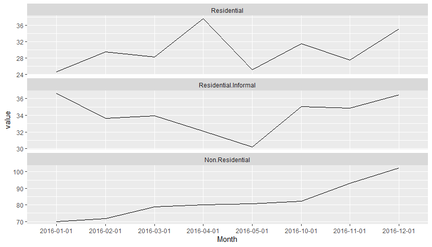
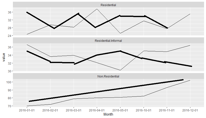
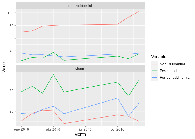
I am trying to create multiple time-series graphs into a multiple time-series plot. I have a total of 9 CSV, 3 CSV are for the land use category residential , 3 for non-residential and 3 for slums . All of them have one same column, called Month which has the same dates. I want to create a graph similar to picture1, but in each row of the picture I want to have three lines instead of one. Something like in picture 2 (apologize for the bad sketching). I can create the plot in picture1 but the problem is with the second picture. I don't know if that's possible, or if there is an other way, possible better, to do it.
The code for the plot1:
df <- read.csv("ww/ts_all_month_1.csv")
df_melt = melt(df, id.vars = 'Month')

#multiple ts plots
ggplot(df_melt, aes(x = Month, y = value, group = 1)) +
  geom_line() +
  facet_wrap(~ variable, scales = 'free_y', ncol = 1)
The data can be found here.


