Hi,
I have a dataset with groups and I want to plot three lines of each group representing one variable, the lines should show 95% CI.
I read about geom_ribbon but I couldn't success to do it. Can you please provide a clear example?
Thanks
Hi,
I have a dataset with groups and I want to plot three lines of each group representing one variable, the lines should show 95% CI.
I read about geom_ribbon but I couldn't success to do it. Can you please provide a clear example?
Thanks
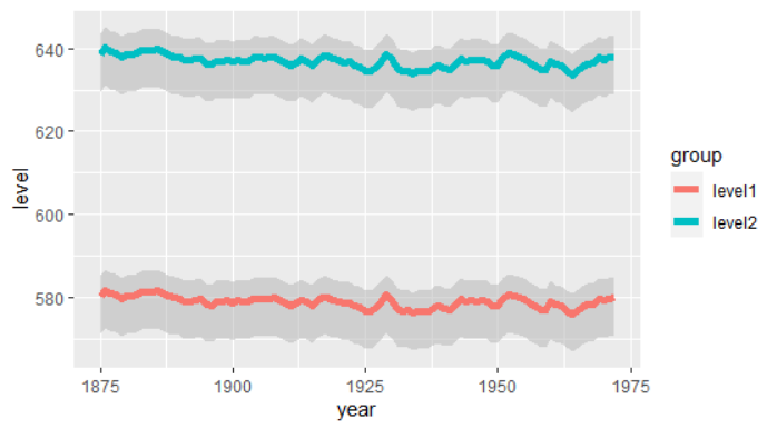
example
library(tidyverse)

# Generate example data
(huron <- data.frame(year = 1875:1972, level1 = as.vector(LakeHuron),
                     level2 = 1.1*as.vector(LakeHuron)) %>% pivot_longer(
                       cols=-year,
                       names_to="group",
                       values_to = "level"
                     ) %>% mutate(
                       numbers_below_level = level-9,
                       numbers_above_level = level +5
                     )
)

# plot the data
(h <- ggplot(huron, aes(x=year,group=group)) +
  geom_ribbon(aes(ymin = numbers_below_level,
                  ymax =numbers_above_level),
              fill = "grey70",alpha=.5) +
  geom_line(aes(y = level,colour=group),size=2))
Thanks. I already have the data as a csv. I need to define the ymin and ymax. I do not understand why in the example you use 9 and 5?
Because I didn't calculate anything with confidence intervals.... Once you have your data, you can plot your data. I thought you were asking a plotting question, are you asking a modelling question? 
I think I need to calculate summary statistics of my data first in order to define the ci bands!
This topic was automatically closed 21 days after the last reply. New replies are no longer allowed.
If you have a query related to it or one of the replies, start a new topic and refer back with a link.