Multiple curves with ggplot

Hello,

I want to display multiple curves on the same graph with geom_line(). I have my access to my values as follows :
for (i in a:b){
appel(i)$y}

I would like to plot all those curves y(i),i=a..b with different color each time and if possible, a legend (matching curve and color).

Thanks for your help.

This is not a base R function so we don't have enough information to reproduce your issue.

To help us help you, could you please prepare a reproducible example (reprex) illustrating your issue? Please have a look at this guide, to see how to create one:

1 Like

It doesn't really matter. Just consider you have a function that I denote f which produces many outputs f(i) for i=a..b and one of these outputs is the serie y I'm interested in ("appel" is the French word for "call").

I know how to represent let's say f(1)$y and f(2)$y (2 series) or 3 or more but here I have supposedly N series generated by some function.

Is it clearer ? If not, I will give the entire code, though it shouldn't make things simpler.

Thanks again.

I think we need a minimum working example based on the link tha @ andresrcs supplied. without it, we ale groping in the dark since we have on idea of what your data looks like.

1 Like

The typical way to use ggplot2 is to generate and reshape your data beforehand, so that you can map each series to an aesthetic, like color. So if I had two objects like:

df1 <- data.frame(y = 1:100)
df2 <- data.frame(y = 21:91)

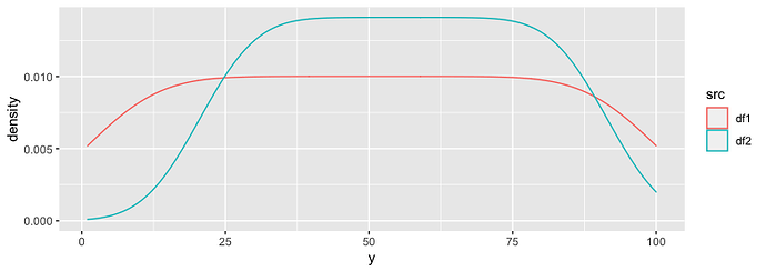
We could combine them into one data object with a variable specifying the series, and map that variable to color. ggplot2 will then make separate plot lines for each series and a legend.

library(tidyverse)
combined <- bind_rows(df1 = df1, df2 = df2, .id = 'src')   # improvement suggested by @Axeman

ggplot(combined, aes(y, color = src)) +
  geom_density()

That said, there are ways to use loops to add series with ggplot2, but they involve more complication.

1 Like

Ok then, here's what I generate :

#last element of a list
last<-function(l)
{l[length(l)]}


traj<-function(N,Q0,T,p){
  X=c(0)
  Q=c(Q0)
  Y=c(0)
  for (t in 0:N){
    y=rbinom(1,1,p)
    Y=c(Y,y)
    Q=c(Q,ifelse (last(Q)>0,last(Q)-y,0))
    if (t-T+2>0 && Q[t-T+2]>0  ) {Z=Y[t-T+2]}
      else {Z=0}
    X=c(X,last(X)+y-Z)
  }
  return(list("X"=X,"Q"=Q,"Y"=Y, "total admitted" = sum(Y), 
              "total treated"= ifelse(last(Q)>0, Q0-last(Q),Q0), 
              "time shortage" = ifelse(last(Q)>0,N,min(which(Q==0))), 
              "health rate"= ifelse(last(Q)>0, Q0-last(Q),Q0)/sum(Y)))
}

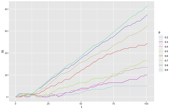
Here's what I want but with ggplot package (and geom_line) in a more elegant way.

palette=distinctColorPalette(8)
N=100
t=c(-1:N+1)
Q0=10
T=3
p=seq(0.2,0.9,0.1)
plot(t,traj(N,Q0,T,0.1)$X,type="l", ylim=c(0,80),xlab="t", ylab="Xt")
title(main="Trajectory according to p")
for (pbis in p){
  y=traj(N,Q0,T,pbis)$X
  lines(t,y, type="l",col=palette[which(p==pbis)])}

Doing so, I get all my curves with a different color. I would need a legend if it's not more complicated...

Hoping you have enough information now...
Thanks.
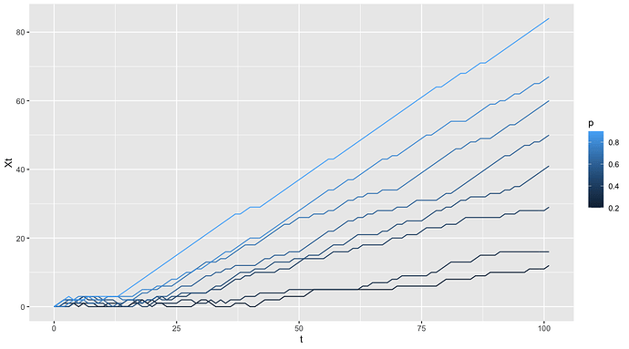
Here's one approach using dplyr and purrr from the tidyverse meta-package to create a dataframe populated with columns for t, Xt, and p, so that we can pipe those into ggplot.

library(tidyverse)
data.frame(p = seq(0.2, 0.9, 0.1)) %>%
   mutate(Xt = map(p, ~traj(N,Q0,T,.x)$X)) %>%
   unnest(Xt) %>%
   mutate(t = rep(c(-1:N+1), times = length(unique(p)))) %>%

    ggplot(aes(t, Xt, color = p, group = p)) +
    geom_line()

By default, p is interpreted as continuous values, so ggplot2 maps it onto a color gradient. If you want to use separate colors for each, you can switch in ggplot(aes(t, Xt, color = as.character(p))) + to get the default "discrete" palette, and add scale_color_manual(values = palette, name = "p") to get the palette you specified.

2 Likes

@jonspring : Thank you wholeheartedly ! Exactly what I needed, you just made my day !

Note that this can be also be written as:

combined <- bind_rows(df1 = df1, df2 = df2, .id = 'src')

Yes, that can be a good option if a numbered series (i.e. the first dataframe will be called 1, the second 2, etc.) is good enough to distinguish the sources. Is there a simple automatic way to label it with it's own name?

e.g. we could do something like this, but it still needs to be applied to each table, and using purrr and a list of data frames feels like overkill.


library(dplyr)
self_label <- function(df) {
  name = deparse(quote(df))
  mutate(df, src = name)
}

Not sure if I follow. If you name the arguments, then that's what the .id will use. So it's a general solution, not one that just gives a numbered series, e.g.:

bind_rows(
  'I have this table' = mtcars, 
  'and also this other table' = mtcars, 
  .id = 'table_name'
)

That's why I wrote bind_rows(df1 = df1, ... instead of bind_rows(df1, .... to match your df1 %>% mutate(src = "df1"). In both cases you need to specify the name. You're right that neither uses the object name.

(Your way works fine of course, just thought you might want to know a more common and (I think) straightforward solution.)

Nice, I didn't realize it worked that way -- definitely better. Thanks!

1 Like

This topic was automatically closed 7 days after the last reply. New replies are no longer allowed.

If you have a query related to it or one of the replies, start a new topic and refer back with a link.