ggplot(country_joined, aes(x = long, y = lat, group = group, fill = movie_count)) +
  geom_polygon(color = "white") +
  scale_fill_gradient2(
    name = "Movie Count",
    low = "green",
    high = "green",
    guide = "colorbar",
    breaks = pretty_breaks(n = 5)) +
  labs(title="No. of Movies Produced in the Country")+
  coord_fixed(1.3)
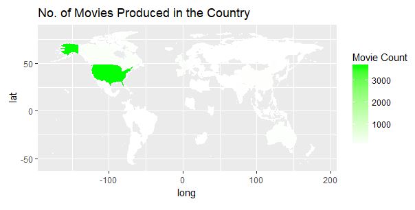
But the map I am getting is not showing the distribution for other countries with smaller movie counts. Can I kindly get hep how to modify the code so that we can see the colour distribution or other countries too. Help is appreciated.
On my phone, so I can’t test this, but my gut tells me the countries on the low end are too light on your gradient scale to show up against the white of your polygons. Maybe change the color of your map to test this (grey maybe)?
It looks like movie_count is 10x as high for USA than the next highest (UK), so you could take a few approaches to compress the input data so that there's more distinction between smaller numbers.
Replace fill = movie_count with fill = log10(movie_count). This will reduce the 10x difference between US and UK to a difference of 1 order of magnitude.
Use the midpoint argument of scale_fill_gradient2 to define the middle point of the scale, maybe around 100?
Thaks for the help colleagues. I was able to fix it using the midpoint idea. Can I get some reference to understand these functions scale_colour_gradient, etc. A comprehensive guide/link will be greatly appreciated. I would like to understand from scratch.