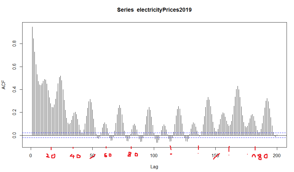
I use an ACF plot and I would like to have more x-ticks. So I plot 200 lags but the x-tick labels are only every 50th leg, so at 0, 50, 100, 150, 200. I'd like to have a x-tick label after 20 legs: 0, 20, 40, 60, ..., 200
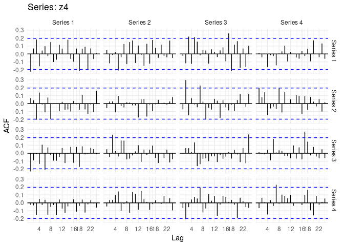
maybe I did not explain precisely what I want. I do not want to have multiple series in the ACF plot. I just have one ACF plot and the x-axis ticks (so the labels on the axis) should be adjusted. I uploaded a screenshot with the desired output (in red)
Thanks for your answer technocrat and your effort,
When I use the statement I get an error message:
library(fpp2)
Error in library(fpp2) : es gibt kein Paket namens ‘fpp2’
Translation: There is not package named 'fpp2'
now I managed to install the fpp2 and ggplot2 packages but unfortunately I still get the same error as posted above when using the code:
Acf(generationData$Price[0:200], scale_x_continuous(breaks = c(4,8,12,16,18,22)))
Error in scale_x_continuous(breaks = c(4, 8, 12, 16, 18, 22)) :
could not find function "scale_x_continuous"
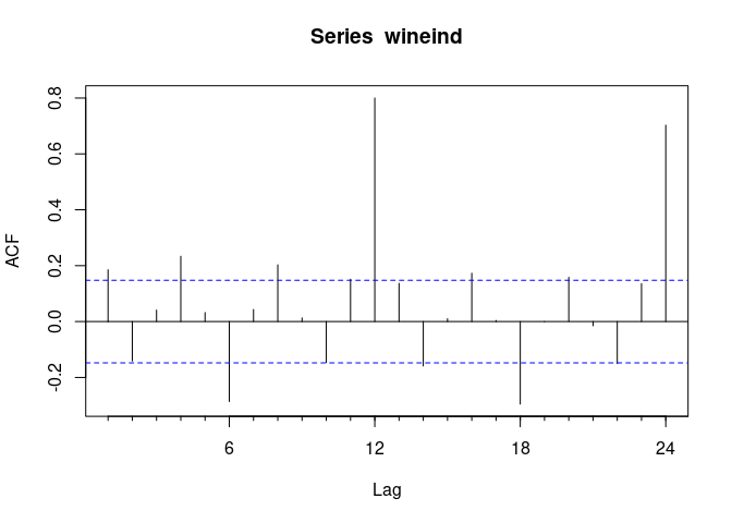
Hi, I cannot fully reproduce your example, but in the meanwhile while you work Richard's (@technocrat) solution, you can go back to base:
This is a similar example
## load a time series
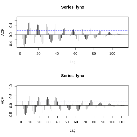
> data(lynx)
> par(mfrow = c(2,1))
> forecast::Acf(lynx, lag.max = 200)
> acf(lynx, lag.max = 200, xaxt = 'no')
> axis(1, at = seq(0,200,10))
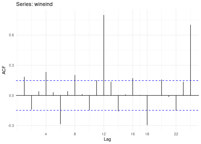
Plots are the same from forecast::Acf and stats:acf, only changing at the axis tick level. I wonder why forecast::Acf does not support straigth xaxt = 'no' but you could circunvent also by adding the extra axis values in a custom way to your specific extra ticks needed:
Thanks technocrat and Fer for your help and effort,
basically the solution from autocrat works. Thanks for your answer. Is it also possible to use plot instead of autoplot? The plot command seems to be easy to use and is not as complex as autoplot or ggplot for beginners.
Hi back. Sorry, not sure what you mean. I have never use autoplot, and barely ggplot functions. acf should take almost any argument that plot takes.
In fact,
I'd like to use plot but still have customized x-ticks. Is this possible? In your example there are no customized x-ticks whereas in the code of technocrat the x-ticks are customized:
Hi back.
I expand a bit more my last comment, but maybe you should stick to Richard's example with autoplot. Here I was offering an alternative to what he did
This code was to show that an object from acf can be plotted via plot, and thus, accept all the extra tunning from pars...
So in the example below, with xaxt = 'no' you tell R to not plot the x axis ticks
and then axis(1, at = c(1,5,10,50,75)) yo draw the ticks in the specific locations you want as they are written inside at = c(your ticklocations). The 1 means you want to draw an axis on the X bar....
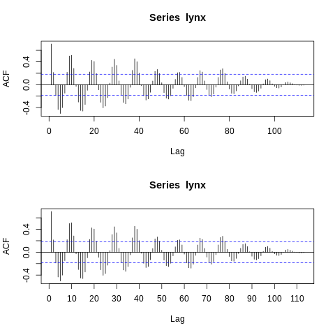
data(lynx)
L <- acf(lynx, plot = FALSE)
plot(L, xaxt = 'no')
axis(1, at = c(1,5,10,50,75))
Thanks a lot Fer for your answer and great help. I really appreciate it. Now your code with plot works fine and I think I am going to use this (and not the autoplot).
Also a big thank you to technocrat for your help and effort. Your solution is also quite valuable.