I have 2 different data sets, one with 196 obs with 32 var and another with 6804 obs with 39 variables. I tried to merge the files but it gave me 1.3 million obs which significantly slowed down the R studio.
For the graph, I plan to use ggplot to plot the graph with geom_line
Can I please get tip on how to have 6805 data sets only instead of 1.3 m obs and create the line graph. thank you
If you make your data tidy you will likely be able to trivially combine the two 'now tidied' sources by vertically stacking them with dplyr::bind_rows()
To fix the problem of merging two datasets you should make sure that:
Both data sets have a common key or identifier (example: a date or time column) that you can use to merge them.
Use the merge() or dplyr::join() function to merge the data sets by the common key. This should result in a data frame with the combined information without any extra data included.
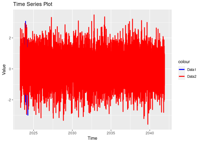
Here's an example of how to create a time series plot in R using ggplot2 with two example data frames and a common time column:
# Example data frame 1 with 196 observations
data1 <- data.frame(
  time = seq(Sys.Date(), by = "1 day", length.out = 196),
  value1 = rnorm(196)
)

# Example data frame 2 with 6804 observations
data2 <- data.frame(
  time = seq(Sys.Date() - 196, by = "1 day", length.out = 6804),
  value2 = rnorm(6804)
)

# Merge the data frames by the 'time' column
merged_data <- merge(data1, data2, by = "time", all = TRUE)

# Load the ggplot2 library
library(ggplot2)

# Create a time series plot
ggplot(merged_data, aes(x = time)) +
  geom_line(aes(y = value1, color = "Data1"), size = 1) +
  geom_line(aes(y = value2, color = "Data2"), size = 1) +
  scale_color_manual(values = c("Data1" = "blue", "Data2" = "red")) +
  labs(title = "Time Series Plot",
       x = "Time",
       y = "Value")
#> Warning: Using `size` aesthetic for lines was deprecated in ggplot2 3.4.0.
#> ℹ Please use `linewidth` instead.
#> This warning is displayed once every 8 hours.
#> Call `lifecycle::last_lifecycle_warnings()` to see where this warning was
#> generated.
#> Warning: Removed 6608 rows containing missing values (`geom_line()`).
The graph would look like this:
To breakdown the code for better understanding:
Create two example data frames, data1 and data2, each with a 'time' column and a value variable.
I merged these data frames by the 'time' column, resulting in a data frame named merged_data.
Use ggplot() to create a plot, specifying the x-axis (time). Use geom_line() to plot the time series for each data frame (value1 and value2). Then you can use scale_color_manual() to specify the line colors and label the plot using labs()
Based on the graph above, you should be able to see that the code will create a time series plot that shows the time series of two different variables (value1 and value2) from the merged data frames. You can replace the example data with your actual data frames and variable names accordingly.