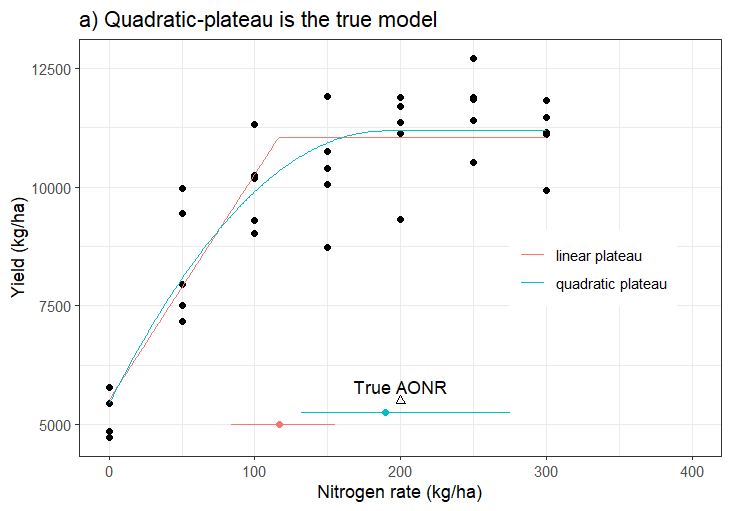
Hi everyone, considering this model and image attached below. Please, when I have a third factor called, cropping history (corn, soybean, fallow), what is the more efficient way to include it into the model and then visualize the output showing the three-cropping history for each model. Thank you very much.
Packages
library(ggplot2)
library(nlraa)
library(car)
library(patchwork)
quiet <- function(x) {
  sink(tempfile())
  on.exit(sink())
  invisible(force(x))
}
options(warn = -1)
Chunk: quadp3xs-true ----
Set up nitrogen rates
nrates <- seq(0, 300, by = 50)
set.seed(123) ## Set the seed for reproducibility
Here I'm assuming that both the yield and nrate are in kg/ha
yield <- replicate(5, quadp3xs(nrates, 6000, 50, 200) + rnorm(length(nrates), 0, 1000))

dat <- data.frame(nrate = nrates, yield = c(yield))
Add the cropping history column
It will cycle through corn, soybean, fallow to match the number of rows
histories <- c("corn", "soybean", "fallow")
dat$cropping_history <- rep(histories, length.out = nrow(dat))
Optional: make it a factor for better modeling/plotting
dat$cropping_history <- factor(dat$cropping_history, levels = c("corn", "soybean", "fallow"))
fm.LP <- nls(yield ~ SSlinp(nrate, a, b, xs), data = dat)
fm.QP <- nls(yield ~ SSquadp3xs(nrate, a, b, xs), data = dat)

new.nrates <- data.frame(nrate = seq(0, 300))
prds.LP <- predict_nls(fm.LP, newdata = new.nrates)
prds.QP <- predict_nls(fm.QP, newdata = new.nrates)

## Bootstrap confidence intervals
fm.LP.bt <- quiet(boot_nls(fm.LP))
fm.LP.bt.ci <- suppressWarnings(confint(fm.LP.bt)[3,])
fm.QP.bt <- quiet(boot_nls(fm.QP))
fm.QP.bt.ci <- suppressWarnings(confint(fm.QP.bt)[3,])
Chunk: fig-quadp3xs-true ----
gp1 <- ggplot() +
  geom_point(data = dat, aes(nrate, yield)) +
  geom_point(aes(x = 200, y = 5500), color = "black", shape = 2) +
  geom_text(aes(x = 200, y = 5800, label = "True AONR")) +
  geom_point(aes(x = coef(fm.LP)[3], y = 5000), color = "#F8766D") +
  geom_errorbarh(aes(y = 5000, xmin = fm.LP.bt.ci[1], xmax = fm.LP.bt.ci[2]), color = "#F8766D") +
  geom_point(aes(x = coef(fm.QP)[3], y = 5250), color = "#00BFC4") +
  geom_errorbarh(aes(y = 5250, xmin = fm.QP.bt.ci[1], xmax = fm.QP.bt.ci[2]), color = "#00BFC4") +
  geom_line(aes(y = prds.LP, x = new.nrates$nrate, color = "linear plateau")) +
  geom_line(aes(y = prds.QP, x = new.nrates$nrate, color = "quadratic plateau")) +
  xlab("Nitrogen rate (kg/ha)") +
  ylab("Yield (kg/ha)") +
  xlim(c(0,400)) +
  ggtitle("a) Quadratic-plateau is the true model") +
  guides(color = guide_legend(title = element_blank())) +
  theme_bw() +
  theme(legend.position = c(0.8, 0.45))


gp1