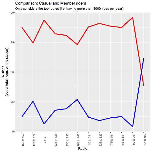
I'm using the following code to compare two variables using a line chart. However, the legend of the chart is missing.
It may be because while creating another chart in the same file earlier I changed legend.position = "none". But, it I don't know how it got defaulted for all data viz.
Please help. This is my first portfolio project. Thanks!
Hypo1_df <- new_df %>%
 count(route, route_name, member_casual, sort = T) %>%
  pivot_wider(names_from = member_casual, values_from = n) %>%
  mutate(total_rides = casual + member, casual_perc = round(casual/total_rides*100, digits = 2), member_perc = 100 - casual_perc) %>%
  filter(total_rides >= 3000)

ggplot(data = Hypo1_df, mapping = aes(x = route)) +
  geom_line(mapping = aes(y = casual_perc), group = 1, color = "red", size = 1.5) +
  geom_line(mapping = aes(y = member_perc), group = 1, color = "blue", size = 1.5) +

  theme(axis.text.x = element_text(angle = 90),  legend.position = "right") +

  labs(title = "Comparison: Casual and Member riders",
  subtitle = "Only considers the top routes (i.e. having more than 3000 rides per year)",
  x = "Route", y = "% Rides\n(out of total riders on the station)")
