Kingpin
January 25, 2022, 12:44pm
1
Hey guys!
I have the following code:
    ggplot(violin_data_1, aes(x=cpod, y=clx, fill=factor(net_type))) + geom_violin() + ylim(0,100) +
      ylab("Clicks (n)") + xlab("CPOD ID") + labs(fill = "Net Type") +
      stat_summary(fun = "mean", geom = "crossbar", width = 0.1, colour = "black")
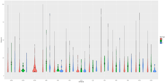
Which ends up as this plot:
I wonder why all means are projected in the middle violin of each CPOD station? I would like to have one crossbar for each violin.
Thanks in advance.
I think you need to specify the "position" of your stat_*().
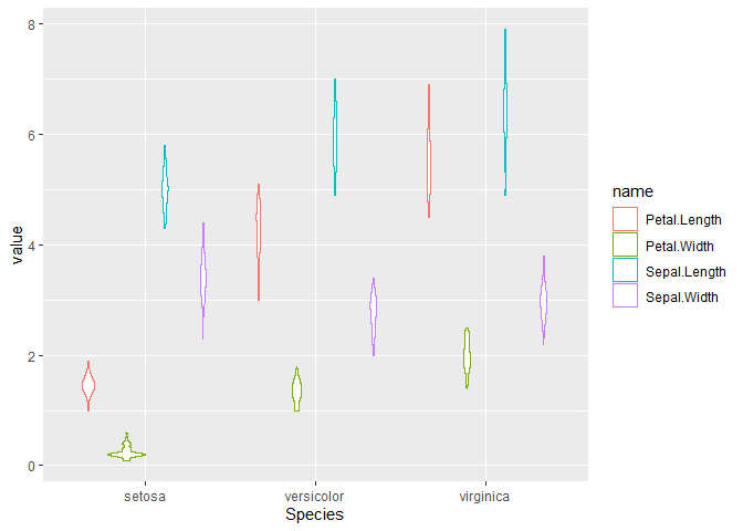
library(tidyverse)

(plt = iris |>
  pivot_longer(-Species) |>
  ggplot(aes(x = Species, y = value, color = name)) +
  geom_violin())
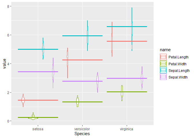
plt + stat_summary(fun = "mean", geom = "crossbar")
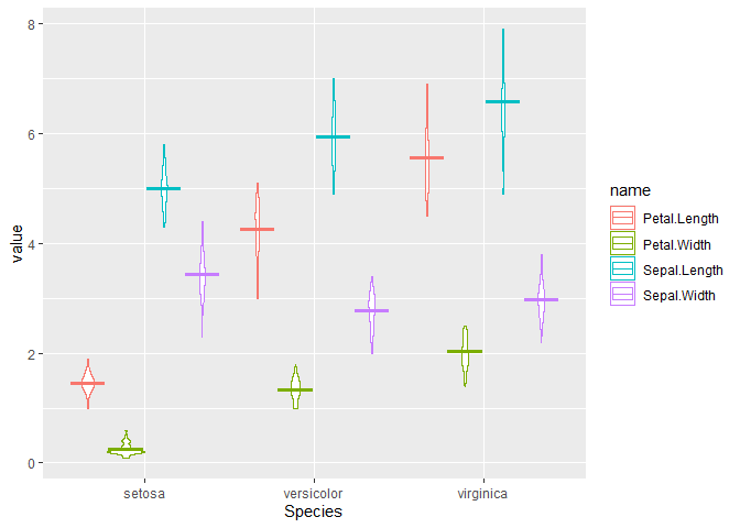
plt + stat_summary(fun = "mean", geom = "crossbar", position = position_dodge2())
Created on 2022-01-25 by the reprex package (v2.0.1)
If I add the
position = position_dodge2()
nothing really changes.
Kingpin:
nothing really changes.
Hello.
Share some representative data that will enable your code to run and show the problematic behaviour.
You might use tools such as the library datapasta, or the base function dput() to share a portion of data in code form, i.e. that can be copied from forum and pasted to R session.
A minimal reproducible example consists of the following items:
A minimal dataset, necessary to reproduce the issue
The minimal runnable code necessary to reproduce the issue, which can be run
on the given dataset, and including the necessary information on the used packages.
Let's quickly go over each one of these with examples:
1 Like
Axeman
January 25, 2022, 8:42pm
5
Since there's no data, wild guesses only. My guess is that @JackDavison is right, but you might need to supply the width of the dodge, e.g.
stat_summary(fun = "mean", geom = "crossbar", position = position_dodge2(width = 0.9))
system
February 15, 2022, 8:42pm
6
This topic was automatically closed 21 days after the last reply. New replies are no longer allowed.
![]()


