Material Design Corona/COVID-19 Dashboard

Authors: Sebastian Engel-Wolf (https://www.mail-wolf.de)
Working with Shiny more than 1 year
Abstract: Governments and COVID-19: Which one stops it faster, better, has fewer people dying? These questions get answered with my dashboard. Using plotly and shinymaterial, everyone can configure own graphics / statistics / views.
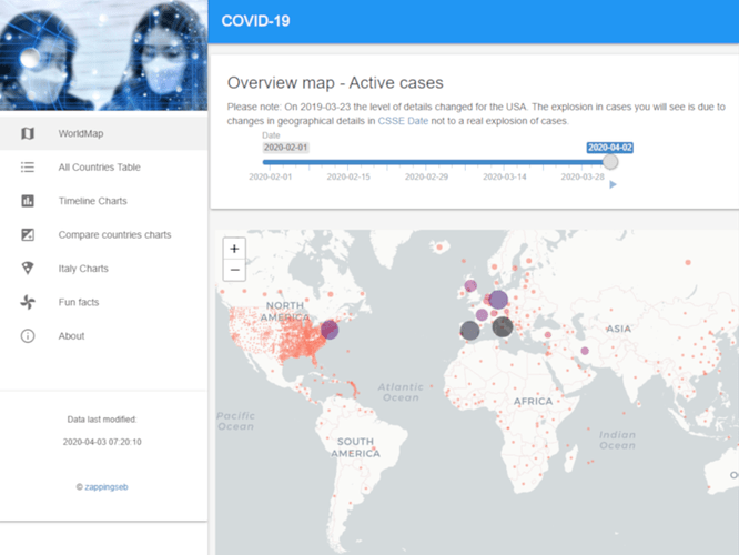
An animation of the spread of Corona:
https://mail-wolf.de/documents/shinycontest2020/map.mp4
Full Description: COVID-19 is the major topic in all news channels. The place I live in is Munich, Germany. Within weeks Germany moved from 3 patients in the hospital next to my home, to have 20,000 patients. As a data-scientist, I did not only see the numbers but the exponential growth. I wanted to know:
- How is the German government performing?
- How do other countries stop the disease from spreading?
- How long does it take for the disease to spread?
- For how long is there exponential growth?
- How many people do actually die?
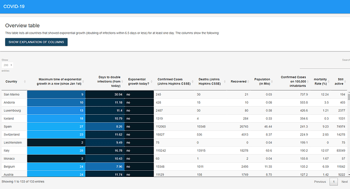
To enable this I got pretty fast using shiny. With shiny you can select countries, date-ranges, make flexible tables with datatable. Great! Additionally, I used plotly to zoom into all plots, get better legends, make it easy to browse through my data.
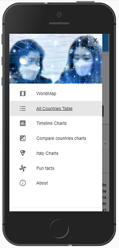
What else... shinymaterial makes the whole app look nice. It's a great package and comes with easy use on mobile devices. I guess that's it.
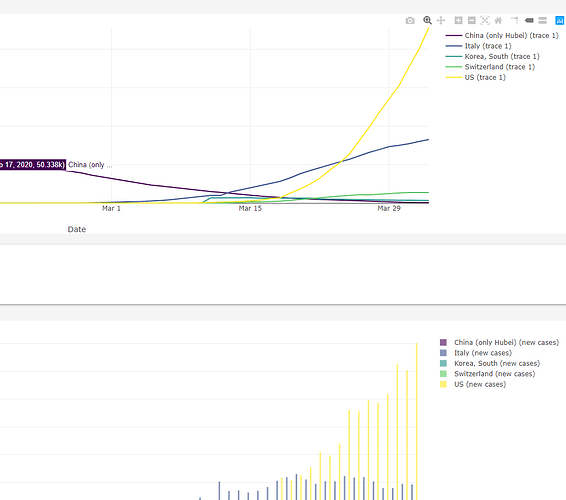
Now I can answer all my questions by browsing through the app. It's easy to see how well South Korea managed Corona for example. You can also see how long it took for people to die in German hospitals, while the outbreak was rather fast in Italy. Moreover, the app shows, that in the US up-to now (Apr 3rd) the spread is not really stopped.
For more, go into the app.
Category: Healthcare
Keywords: plotly, shiny, material design, Corona, modules
Shiny app: https://sebastianwolf.shinyapps.io/Corona-Shiny/
Repo: GitHub - zappingseb/coronashiny: A shiny app visualizing corona data
RStudio Cloud: Posit Cloud
Used packages:
Checked by:
- GoogleCloudBuild
Full images:
Compare Countries:
https://mail-wolf.de/documents/shinycontest2020/charts.mp4
Mobile Views:
Map:
https://mail-wolf.de/documents/shinycontest2020/phone_map.mp4
Table Navigation:
https://mail-wolf.de/documents/shinycontest2020/phone_table.mp4
Charts:
https://mail-wolf.de/documents/shinycontest2020/phone_charts2.mp4
Menu:
More images
Country Table:
Timeline Charts:
Detailed Statistics on Italy:
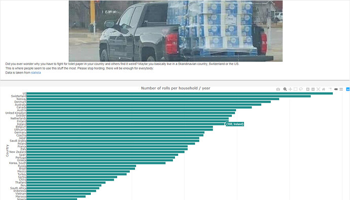
Toilet Paper consumption statistics:
