Map Zimbabwe province in ggplot, additional layer of average age per province. each province different colourge

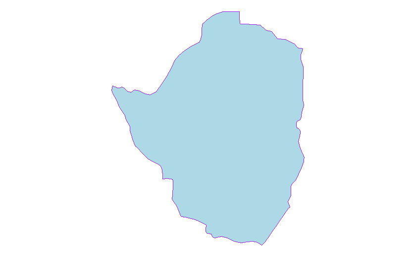
Hi! I wanted to visualize map of Zimbabwe where each state has a different colour and each state represents the average age of respondents.
I previously tried it with tmap but it was fruitless.
Currently I am trying with ggplot2.
Below is the code I have done so far-

zimbabwe_map <- map_data("world", region = "zimbabwe")
ggplot(data = zimbabwe_map, aes(x = long, y = lat, group = group)) +
geom_polygon(data = zimbabwe_map, fill = "lightblue", color = "purple") +
coord_fixed(1.4) +
theme_void()

Any guidance is helpful thank you!

I think two further essential ingredients would be needed

  1. map data for the zimbabwean states that you mention
  2. respondent data that relates to those states

hi,
yes both exists. I have the shapefile in sf format and respondent data. it's from DHS so it's a huge file

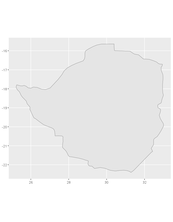
I recommend you take a look at the sf() package to learn about plotting maps and using shapefiles. I found a nice article from Edzer Pebesma that should help you start.

Based on your code, you can create a Zimbabwe geometry with

library(tidyverse)
library(sf)

zimbabwe_data <- map_data("world", region = "zimbabwe")
zimbabwe_poly <- cbind(zimbabwe_data$long, zimbabwe_data$lat) %>% as.matrix() %>% list() %>% st_polygon()

ggplot(zimbabwe_poly) + geom_sf()

You can read your further shapefiles with

st_as_sf(x = "shapefilepath.shp")

This topic was automatically closed 45 days after the last reply. New replies are no longer allowed.

If you have a query related to it or one of the replies, start a new topic and refer back with a link.