Hi. I have created an ARIMA model to look at how precipitation and streamflow patterns change over time and wanted to use a Mann-Kendall test to look for increasing or decreasing trends in the time series. However, one of the assumptions of ARIMA models is stationarity, so I used first-order differencing to make the data stationary. If I am correct this would also remove any underlying trends in the data, thus making the Mann-Kendall test inaccurate. Does anybody know of any solutions for determining the presence of trends in a time series? TIA.
Consider an STL model (use the fpp3 package which has a good plotting function). It will decompose the time series into a trend, season component and the remainder (randomness).
Doesn't the STL decomposition just decompose the data to identify the underlying trend? I have already decomposed my model to remove randomness and seasonality using the decompose() function. I'm just not sure how to identify trends in may ARIMA model if I previously made it stationary to satisfy the assumptions of ARIMA.
I mistook the question. Yes, part of ARIMA is making the data stationary, which wipes out trend and seasonality (in its usage here it means periodicity). But aperiodic cyclicity is still ok (See §9.1 in Hyndman). Aperiodic cyclicity is stationary because it has no long-term predictability.
Restating the problem to more closely define what is being sought may be helpful. You've used f(x) = y to derive an ARIMA model from a time series x after whitening, and now are looking to create g(f(x) = Y, where Y is some measure of change over time. What is it? Mean weekly, mean monthly? Given the metric, the possibilities for g should be a manageable number.
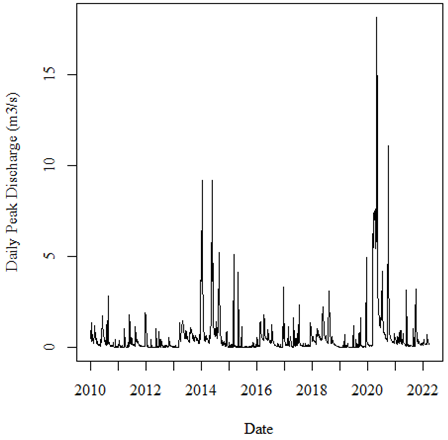
Y is the mean daily change in discharge over time. See the attached figures. The first figure is my original time series, which shows the daily peak discharge at a hydrometric gauging station over time.
After decomposing, seasonally, adjusting and smoothing the data using a simple moving average (SMA 40), I was left with the following time series.
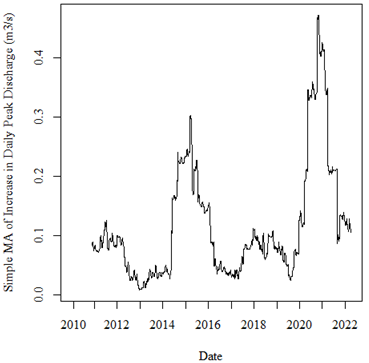
From visual observation it appears as if there may be some sort of increasing trend in the data (i.e., the peak from 2020-2022 is higher than from 2014-2016), although I am unsure of the significance of this trend.
I used the KPSS test to assess the stationarity of the data and the data was not stationary, so I used first-order differencing to make the time series stationary.
While it clearly looks like there is some sort of trend here, when I perform a Mann-Kendall trend test, I get a p-value of 0.73, indicating a lack of trend. I am wondering if this high p-value is due to making the data stationary in the previous step and how to get around this problem?
is not something to do on data with seasonality.
library(fpp3)
#> ── Attaching packages ────────────────────────────────────────────── fpp3 0.5 ──
#> ✔ tibble      3.2.1     ✔ tsibble     1.1.3
#> ✔ dplyr       1.1.2     ✔ tsibbledata 0.4.1
#> ✔ tidyr       1.3.0     ✔ feasts      0.3.1
#> ✔ lubridate   1.9.2     ✔ fable       0.3.3
#> ✔ ggplot2     3.4.3     ✔ fabletools  0.3.3
#> ── Conflicts ───────────────────────────────────────────────── fpp3_conflicts ──
#> ✖ lubridate::date()    masks base::date()
#> ✖ dplyr::filter()      masks stats::filter()
#> ✖ tsibble::intersect() masks base::intersect()
#> ✖ tsibble::interval()  masks lubridate::interval()
#> ✖ dplyr::lag()         masks stats::lag()
#> ✖ tsibble::setdiff()   masks base::setdiff()
#> ✖ tsibble::union()     masks base::union()
library(ggplot2)
library(nortest)
library(trend)

d <- read.csv("https://careaga.s3.us-west-2.amazonaws.com/gage.csv")
d[,1] <- lubridate::ymd(d[,1])
d <- as_tsibble(d)
#> Using `dte` as index variable.
autoplot(d) +
  theme_minimal()
#> Plot variable not specified, automatically selected `.vars = disc`
# the data are not normally distributed
ad.test(d$disc)
#>
#>  Anderson-Darling normality test
#>
#> data:  d$disc
#> A = 291.4, p-value < 2.2e-16
ggplot(d,aes(sample = disc)) +
  geom_qq() +
  theme_minimal()
# Kendall-Mann; reject the null
mk.test(d$disc)
#>
#>  Mann-Kendall trend test
#>
#> data:  d$disc
#> z = -1.43, n = 4749, p-value = 0.1527
#> alternative hypothesis: true S is not equal to 0
#> sample estimates:
#>             S          varS           tau
#> -1.560230e+05  1.190412e+10 -1.385446e-02

# Seasonal Kendall-Mann (Hirsch-Slack Test)
# accept the null
dts <- ts(d[,2], start = c(1960,1), frequency = 365)
smk.test(dts)
#>
#>  Seasonal Mann-Kendall trend test (Hirsch-Slack test)
#>
#> data:  dts
#> z = -4.1524, p-value = 3.291e-05
#> alternative hypothesis: true S is not equal to 0
#> sample estimates:
#>        S     varS
#> -1302.00 98166.67

# without lambda

dcmp <- d |>
  model(stl = STL(disc))
dcmp |>
  gg_tsresiduals()
components(dcmp) |>
  as_tsibble() |>
  autoplot(disc, colour="gray") +
  geom_line(aes(y=trend), colour = "#D55E00") +
  labs(
    y = "Daily peak discharge m^3/sec",
    title = "Representative Stream Gage Data",
    subtitle = "trend in red") +
  theme_minimal()
components(dcmp) |>
  autoplot() +
  theme_minimal()
# with box-cox transformation to dampen
# variability

lambda <- d |>
  features(disc, features = guerrero) |>
  pull(lambda_guerrero)
d |>
  autoplot(box_cox(disc, lambda)) +
  labs(y = "",
       title = latex2exp::TeX(paste0(
         "Transformed daily discharge with $\\lambda$ = ",
         round(lambda,2)))) +
  theme_minimal()
# Kendall-Mann; reject the null
mk.test(d$disc)
#>
#>  Mann-Kendall trend test
#>
#> data:  d$disc
#> z = -1.43, n = 4749, p-value = 0.1527
#> alternative hypothesis: true S is not equal to 0
#> sample estimates:
#>             S          varS           tau
#> -1.560230e+05  1.190412e+10 -1.385446e-02

# Seasonal Kendall-Mann (Hirsch-Slack Test)
# accept the null
dts <- ts(d[,2], start = c(1960,1), frequency = 365)
smk.test(dts)
#>
#>  Seasonal Mann-Kendall trend test (Hirsch-Slack test)
#>
#> data:  dts
#> z = -4.1524, p-value = 3.291e-05
#> alternative hypothesis: true S is not equal to 0
#> sample estimates:
#>        S     varS
#> -1302.00 98166.67
Created on 2023-08-29 with reprex v2.0.2
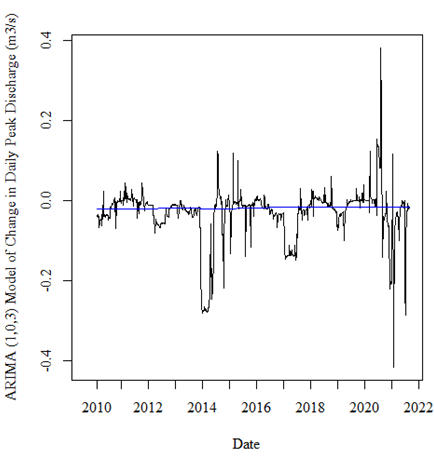
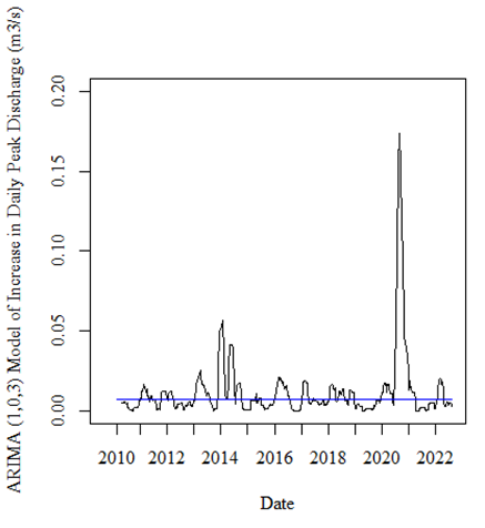
Thank you so much. Sorry, I'm kind of new to this. Is there a way to plot the underlying trend. I would like to plot a blue line over the graph showing the overall trend.
I used the code:
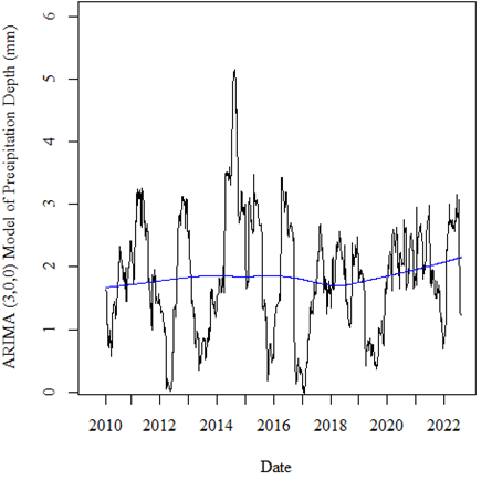
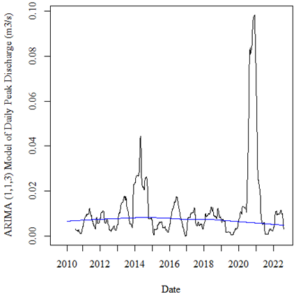
lines(lowess(time(precipARIMA$fitted), precipARIMA$fitted), col = 'blue') # trend line for precipitation depth
lines(lowess(time(dischARIMA$fitted), dischARIMA$fitted), col = 'blue') # trend line for daily peak discharge
lines(lowess(time(changeARIMA$fitted), changeARIMA$fitted), col = 'blue') # trend line for change in daily peak discharge
lines(lowess(time(increaseARIMA$fitted), incrARIMA$fitted), col = 'blue') # trend line for increase in daily peak discharge
Do you believe that this is an accurate representation of any increasing or decreasing trends, or is there a better way of plotting this?
Which provided me with the following plots:
I still don't understand the motivation for using model .innovations as the basis for trend; the purpose of a model is to illustrate the data, not itself. The purpose of a model, like any statistical manipulation, is to simplify and abstract. Looking at model-modified data adds another layer of abstraction that may, or may not, be informative.
The purpose of looking at data's trend in isolation is to abstract away random variation and periodic regularities (confusingly named seasonality) to detect how observations otherwise change. Often we are interested in whether they are monotonic (suggesting a linear relationship to some other variable) or wiggling up and down (suggesting a non-linear relationship to some other variable).
Some models ignore trend to match past and forecast future values. One example is the "naive" forecast that simply takes the final observation in a series and uses it for all future values. It can be surprisingly effective. Others include them implicitly but don't break them out. Decomposition is a model that does break out trend.
library(fpp3)
#> ── Attaching packages ────────────────────────────────────────────── fpp3 0.5 ──
#> ✔ tibble      3.2.1     ✔ tsibble     1.1.3
#> ✔ dplyr       1.1.2     ✔ tsibbledata 0.4.1
#> ✔ tidyr       1.3.0     ✔ feasts      0.3.1
#> ✔ lubridate   1.9.2     ✔ fable       0.3.3
#> ✔ ggplot2     3.4.3     ✔ fabletools  0.3.3
#> ── Conflicts ───────────────────────────────────────────────── fpp3_conflicts ──
#> ✖ lubridate::date()    masks base::date()
#> ✖ dplyr::filter()      masks stats::filter()
#> ✖ tsibble::intersect() masks base::intersect()
#> ✖ tsibble::interval()  masks lubridate::interval()
#> ✖ dplyr::lag()         masks stats::lag()
#> ✖ tsibble::setdiff()   masks base::setdiff()
#> ✖ tsibble::union()     masks base::union()
library(ggplot2)

d <- read.csv("https://careaga.s3.us-west-2.amazonaws.com/gage.csv")
d[,1] <- lubridate::ymd(d[,1])
d <- as_tsibble(d)
#> Using `dte` as index variable.

# the raw data
baseplot <- ggplot(d,aes(dte,disc)) +
  geom_point(size = 0.01, alpha = 0.5)
# with linear regression
baseplot +
  geom_smooth(method = "lm") +
  theme_minimal()
#> `geom_smooth()` using formula = 'y ~ x'
# with loess, a form of moving regression
baseplot +
  geom_smooth(method = "loess") +
  theme_minimal()
#> `geom_smooth()` using formula = 'y ~ x'
# decomposition model
dcmp <- d |>
  model(stl = STL(disc))

# show all components, breaking out trend
components(dcmp) |>
  as_tsibble() |>
  autoplot(disc, colour="gray") +
  geom_line(aes(y=trend), colour = "#D55E00") +
  labs(
    y = "Daily peak discharge m^3/sec",
    title = "Representative Stream Gage Data",
    subtitle = "trend in red") +
  theme_minimal()
# decomposition presented at scales appropriate to each component
components(dcmp) |>
  autoplot() +
  theme_minimal()
This topic was automatically closed 42 days after the last reply. New replies are no longer allowed.
If you have a query related to it or one of the replies, start a new topic and refer back with a link.