Hello everyone,
I have a data similar to this one:
tibble(year = c(rep("2012", 12), rep("2013", 12), rep("2014", 12), rep("2015", 12)),
month = c("Jan", "Feb", "Mar", "Apr", "Mag", "Jun", "Jul", "Aug", "Sep", "Oct", "Nov", "Dec",
"Jan", "Feb", "Mar", "Apr", "Mag", "Jun", "Jul", "Aug", "Sep", "Oct", "Nov", "Dec",
"Jan", "Feb", "Mar", "Apr", "Mag", "Jun", "Jul", "Aug", "Sep", "Oct", "Nov", "Dec",
"Jan", "Feb", "Mar", "Apr", "Mag", "Jun", "Jul", "Aug", "Sep", "Oct", "Nov", "Dec"),
species = c(rep("A", 20), rep("B", 18), rep("C", 5), rep("D", 5)),
color = c("blue", "red", "green", "yellow", "purple", "blue", "red", "green", "yellow", "purple", "blue", "red", "green", "yellow", "purple", "blue", "red", "green", "yellow", "purple", "blue", "red", "green", "yellow", "purple", "blue", "red", "green", "yellow", "purple", "blue", "red", "green", "yellow", "purple", "blue", "red", "green", "yellow", "purple", "blue", "red", "green", "yellow", "purple", "blue", "red", "green"),
value = runif(48)*100)
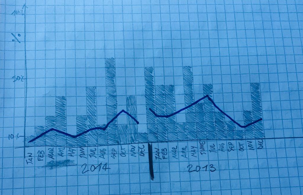
I would like to make a plot similar to the picture that I attach:
where the bars correspond to proportion of species, and the blue line correspond to the proportion of "blue" in color variable.
Thank you for the help.