Hi how is everyone?
I'm currently working on the terrorism global database and I've encountered some problems.
code: https://justpaste.it/573dt
database:https://github.com/evsv/NNEvaluator/blob/master/globalterrorismdb_0718dist.csv.zip
I would like to create this 2 plots
1st: I want to show the top 5 in freq order
ggplot(terror, aes(region)) + geom_bar(stat = "count") + coord_flip()
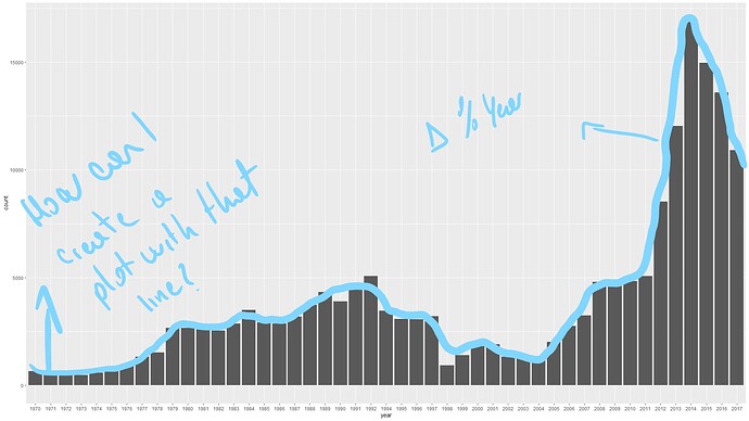
2nd: I want to show the growth per year in a line
ggplot(terror, aes(year)) + geom_bar(stat = "count")
This repeats for others plots on the html
anybody knows how to add this features?
thanks
