Essentially I am trying to re-create this map from the NYTimes of the 2025 Democratic Primary for mayor.
There are a few key objectives:
- Showing who won the precinct/geographic boundary by filling the geometry with a distinct color for each candidate
- Varying the intensity of the candidate color by the winning candidate's vote share (or margin of victory, or win percentage) in that precinct
- Returning a unified legend for the vote share fills, like the one on the NYT page
- Writing the code as efficiently and programmatically as possible, so that I can quickly plot similarly-formatted election results data from different elections without having to do too much hand coding any time I want to plot an election.
Below, I have included some sample code from an election which is not the NYC major election, but replicates the scenario. I left the geometry as NA because there was no good way to include the actual geometry for this tribble. But the literal geometry doesn't matter so much for this example; it can be any geometry tied to a particular voting district in the df. Office_code can be considered as a stand-in for "US President" or "United States Senate", etc. Having the office code number works just as well here. I have a relational df that includes results for this geography across many different races. I have filtered it down for this example, but I have the data to determine which candidate won a particular voting district in every election on the ballot (and thus the ability to plot every election on the ballot if I wanted to). Similarly, winner_key is just a stand-in for the name of the winning candidate.
results <- tribble(
~VOTINGDISTRICT_KEY, ~office_code, ~first, ~second, ~winner_key, ~total, ~winner_pct, ~win_margin, ~win_pct, ~geometry,
"025-1330-00-01", "0004", 649, 638, "0004-01", 1314, 49.4, 11, 0.84, NA,
"025-1330-00-02", "0004", 761, 482, "0004-01", 1280, 59.5, 279, 21.8, NA,
"025-1330-00-03", "0004", 406, 283, "0004-02", 697, 58.2, 123, 17.6, NA,
"025-1330-00-04", "0004", 471, 465, "0004-02", 960, 49.1, 6, 0.62, NA,
"025-1330-00-05", "0004", 257, 229, "0004-02", 496, 51.8, 28, 5.65, NA,
"025-1330-00-06", "0004", 381, 264, "0004-02", 654, 58.3, 117, 17.9, NA,
"025-1330-00-07", "0004", 350, 264, "0004-02", 628, 55.7, 86, 13.7, NA,
"025-1330-00-08", "0004", 637, 574, "0004-03", 1230,51.8, 63, 5.12, NA,
"025-1330-00-09", "0004", 382, 342, "0004-03", 739, 51.7, 40, 5.41, NA,
"025-1330-00-10", "0004", 350, 284, "0004-03", 646, 54.2, 66, 10.2, NA
      )
As we can see from the data, each candidate ("0004-01", "0004-02", and "0004-03") win at least a couple voting districts, with varying margins of victory. So, if candidate "0004-01" will have a corresponding fill color of "red" for the districts they won in, the intensity of the red fill should be different for the voting district where the percent margin of victory was 0.84% compared to the district where the percent margin of victory was 21.8%.
I attempted plotting data in a two-candidate race using this code:
results_map |>
  ggplot() +
  geom_sf(aes(fill = winner_key, alpha = win_pct,
              geometry = geometry), color = NA) +
scale_alpha(range = c(0.1,1)) +
  theme_minimal() +
    theme(axis.text = element_blank(),
        axis.ticks = element_blank(),
        panel.grid = element_blank())
which created this plot:
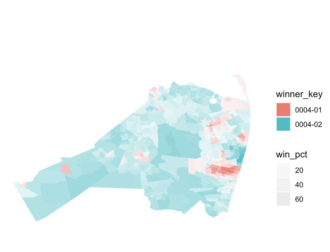
The resulting plot is actually not far from what I want! However, I do not know how to merge the legend for the alpha and the legend for the fill color to be one, as it is on the NYT site. And I don't know what the easiest way to iterate would be if I had results from office_code=="0005" and then office_code=="0006", and on and on. I assume purrr::map would become handy at some point, along with creating some functions, but I have been stuck. Any help and feedback would be appreciated. Thanks in advance!