Making a group bar chart

Hello,

I'm looking to make a grouped bar chart using existing data and columns. Specifically I have to conditions: experimental and control, all of them have completed columns Q1, Q2 and Q3 from an existing dataset called dem_data2. I want the bar chart to plot the means and show the difference for each Q and each condition individually. So Q1 on the plot will have the mean scores from both conditions.

To sum up I want the final plot to look like:

Y axis: means
X axis: Q1, Q2, Q3 and the two conditions for each

Thank you and if anyone can help I would be grateful.

Can you post all or a subset of your data? If your data frame is named DF, run

dput(DF)

to get output that describes the whole data frame or run

dput(head(DF,20))

to get output the describes the first 20 rows. Paste the output into a response, placing a line with three back ticks just before and just after the output, like this
```
Pasted output
```

Hello,

I have just created a tibble with the means for each individual score for each condition. Can I use this in some way? It looks like that:

structure(list(Condition = c("control", "experimental"), Q18_1_mean = c(5.375, 
4.47826086956522), Q18_2_mean = c(5.15625, 4.43478260869565), 
    Q18_3_mean = c(4.59375, 3.8695652173913), Q18_4_mean = c(5.1875, 
    4.21739130434783), Q18_5_mean = c(5.46875, 4.65217391304348
    ), Q18_6_mean = c(4.78125, 3.95652173913043), Q18_7_mean = c(4.78125, 
    4.26086956521739), Q18_8_mean = c(5.78125, 5.43478260869565
    ), Q18_9_mean = c(5.46875, 5.73913043478261), Q18_10_mean = c(4.90625, 
    4.30434782608696), Q18_1_sd = c(0.975506485486286, 1.53355099560676
    ), Q18_2_sd = c(1.16700263979578, 1.53226175536575), Q18_3_sd = c(1.07341405894253, 
    1.57550418556574), Q18_4_sd = c(0.895778630487862, 1.59420888728064
    ), Q18_5_sd = c(1.10670609788542, 1.46500684615757), Q18_6_sd = c(1.15659051219661, 
    1.49174275352279), Q18_7_sd = c(1.15659051219661, 1.684620035507
    ), Q18_8_sd = c(1.00753211747415, 1.47173635721156), Q18_9_sd = c(1.50235030921982, 
    1.32175473258942), Q18_10_sd = c(0.856074122506811, 1.42811963493946
    )), class = c("tbl_df", "tbl", "data.frame"), row.names = c(NA, 
-2L))

Hope this makes sense? if it doesn't I can repaste it somehow :slight_smile:

Oh also, this might. be a bit confusing since I've added the sd as well! But I don't need to include it in the plot

Here is a solution that plots the means as well as error bars (defined as mean - sd):

library(tidyr)
library(ggplot2)

data <- structure(list(Condition = c("control", "experimental"), Q18_1_mean = c(5.375, 
4.47826086956522), Q18_2_mean = c(5.15625, 4.43478260869565), 
    Q18_3_mean = c(4.59375, 3.8695652173913), Q18_4_mean = c(5.1875, 
    4.21739130434783), Q18_5_mean = c(5.46875, 4.65217391304348
    ), Q18_6_mean = c(4.78125, 3.95652173913043), Q18_7_mean = c(4.78125, 
    4.26086956521739), Q18_8_mean = c(5.78125, 5.43478260869565
    ), Q18_9_mean = c(5.46875, 5.73913043478261), Q18_10_mean = c(4.90625, 
    4.30434782608696), Q18_1_sd = c(0.975506485486286, 1.53355099560676
    ), Q18_2_sd = c(1.16700263979578, 1.53226175536575), Q18_3_sd = c(1.07341405894253, 
    1.57550418556574), Q18_4_sd = c(0.895778630487862, 1.59420888728064
    ), Q18_5_sd = c(1.10670609788542, 1.46500684615757), Q18_6_sd = c(1.15659051219661, 
    1.49174275352279), Q18_7_sd = c(1.15659051219661, 1.684620035507
    ), Q18_8_sd = c(1.00753211747415, 1.47173635721156), Q18_9_sd = c(1.50235030921982, 
    1.32175473258942), Q18_10_sd = c(0.856074122506811, 1.42811963493946
    )), class = c("tbl_df", "tbl", "data.frame"), row.names = c(NA, 
-2L))

data %>%
  dplyr::select(c(
    "Condition", "Q18_1_mean", "Q18_2_mean", "Q18_3_mean",
    "Q18_1_sd", "Q18_2_sd", "Q18_3_sd"
  )) %>%
  tidyr::pivot_longer(
    cols = -Condition,
    names_to = c("variable", ".value"),
    names_pattern = "(.*)_(.*)"
  ) %>%
  ggplot(aes(x = variable, y = mean, fill = Condition)) +
  geom_col(position = "dodge") +
  geom_errorbar(
    aes(ymin = mean - sd, ymax = mean + sd),
    width = 0.2,
    position = position_dodge(.9)
  ) +
  theme_classic()
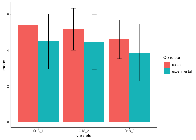
Created on 2022-04-05 by the reprex package (v2.0.1)

Thank you so much! I can't thank you enough for that, I was struggling for ages..

One additional point, since I have to follow APA guidelines and only include black and white in my report is there any code element that can be added to change this?

Thank you!

You could use ggplot2::scale_fill_grey() to make the figure black and white. You could also potentially use the jtools::theme_apa() function from the {jtools} package but I have never used this before.

1 Like

This topic was automatically closed 21 days after the last reply. New replies are no longer allowed.

If you have a query related to it or one of the replies, start a new topic and refer back with a link.