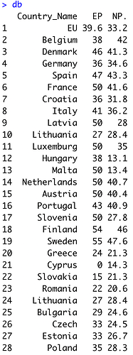
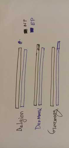
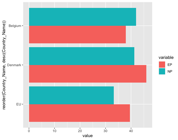
I wanna make a bar chart using data from screenshots. Here Countries_Name column is used in Y-axis, where EP and NP. go for X axia. Could you help me to do this?
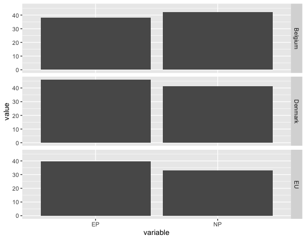
Are you looking for something like this?
library(tidyverse)

dat <-
  tibble::tribble(
  ~Country_Name,  ~EP,  ~NP,
           "EU", 39.6, 33.2,
      "Belgium",   38,   42,
      "Denmark",   46, 41.3
  )

dat_long <-
  dat %>%
  pivot_longer(cols = c("EP", "NP"),
               names_to = "variable",
               values_to = "value")

dat_long %>%
  ggplot(aes(x = variable,
             y = value)) +
  geom_bar(stat = "identity") +
  facet_grid(Country_Name ~ .)
How's this?
library(tidyverse)

dat <-
  tibble::tribble(
    ~Country_Name,  ~EP,  ~NP,
    "EU", 39.6, 33.2,
    "Belgium",   38,   42,
    "Denmark",   46, 41.3
  )

dat_long <-
  dat %>%
  pivot_longer(cols = c("EP", "NP"),
               names_to = "variable",
               values_to = "value")

dat_long %>%
  ggplot(aes(x = reorder(Country_Name, desc(Country_Name)),
             y = value,
             fill = variable)) +
  geom_col(position = "dodge") +
  coord_flip()
1 Like
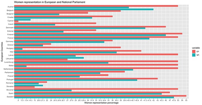
Its cool right now. Now I am trying to apply this
Hi @Kader_Zone - is your x axis correctly formatted as numeric data? In your picture the difference between 0 and 13.1 is the same as the distance between 13.1 and 13.4.
If the column isn't numeric, you could change it by doing something like
dat$col = as.numeric(dat$col)
Or you could use dplyr::mutate() instead.
This topic was automatically closed 21 days after the last reply. New replies are no longer allowed.
If you have a query related to it or one of the replies, start a new topic and refer back with a link.
