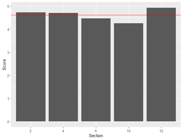
Making a barplot with an average line

This is a subset of my data just so I can learn how to do what I want first. I'm trying to create a bar plot of values from columns and then have a horizontal line representing the average. I was able to create pretty much what I need in Excel but I have very little R experience.
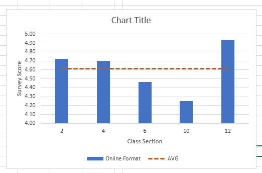
head(data)

A tibble: 1 x 6

 O2    O4    O6   O10   O12   AVG


1 4.72 4.7 4.46 4.25 4.94 4.62
Try whit this example:

df <- data.frame(dose=c("T0", "T1", "T2"),
len=c(4.5, 14, 27.2))

library(ggplot2)
ggplot(data=df, aes(x=dose, y=len)) +
geom_bar(stat="identity")+
geom_hline(yintercept = 6,color="red")

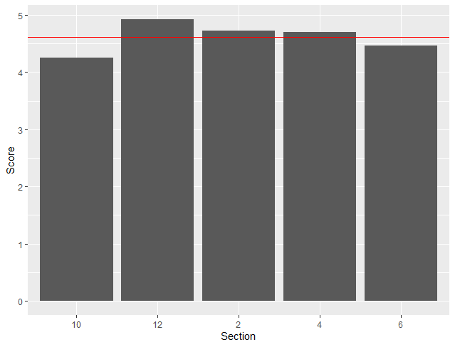
Wow thank you so much!! Any idea on how I can order the x axis numerically? 2 4 6 10 12

Check this example:

https://stackoverflow.com/questions/12774210/how-do-you-specifically-order-ggplot2-x-axis-instead-of-alphabetical-order

Perfect! Thank you so much!