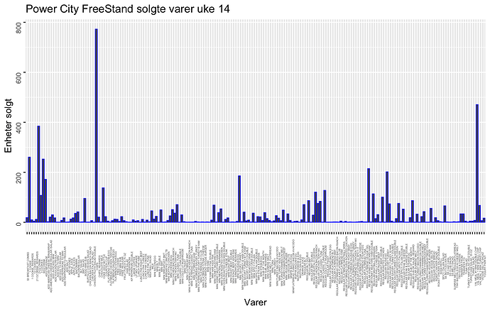
I have a school project to visualize a weekly sales report. Could you give me pointers to make this more readable?
The students in my data visualization course would start off with two questions. Who is the audience for this weekly sales report and what are you trying to communicate to them?
If the store manager wants sales for every single product, including "free cookie", in alphabetical order, then I would just switch to horizontal bars instead of vertical.
An alternative would be to show the top 25 (or bottom 25?) products with the order based on sales.
If the assigned data set has categories, such as sandwiches, salads, etc., then consider reporting total sales for each category.
This topic was automatically closed 7 days after the last reply. New replies are no longer allowed.
If you have a query related to it or one of the replies, start a new topic and refer back with a link.
