Hi @Rusudan1,
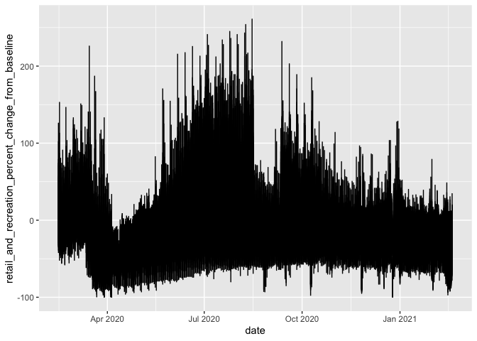
I happened to bump into this data set, so I think I can help you. Often, when you see a line plot like this, it means that there are groups in the data that are not declared in the plot. What's happening here is that the Google mobility data contains both country-wide data and region-specific (here, state and county level) data. That means you have a few options, depending on what you want.
If you just want the US data, filter out the subregional data with:
USAMobility %>%
  filter(is.na(sub_region_1)) %>%
 # ...your plot code
Alternatively, to show state data:
USAMobility %>%
  filter(!is.na(sub_region_1), is.na(sub_region_2)) %>%
  # ...your plot code +
  facet_wrap(vars(sub_region_1))
You could take a similar approach to the county level (sub_region_2).
making a simpler reprex
Hopefully, the above answer gets at your question, but as the previous responders suggest, your original question is a bit hard to answer because 1) we didn't know where the data came from and 2) we weren't sure what you were asking for.
The art of asking for code help is about presenting code questions simply and in a way that those who want to help you can run on their machines. Copying and pasting the code in your post won't work because we don't know where the data came from, and we don't know which packages you're using. There is also a lot of detail in your plot that is not related to your question.
It so happens that your data is open. So, one option could be to tell us where to find it (COVID-19 Community Mobility Reports) and which data you're using (2020_US_Region_Mobility_Report.csv), then including that information in your post. Or you could use one of the suggestions above for including data right in your question--something we can copy and paste.
Trying to create an example where I don't need to download something to help you is better, but since these data are open, let's just use the data as-is. If I were asking this question, I'd present an example like this:
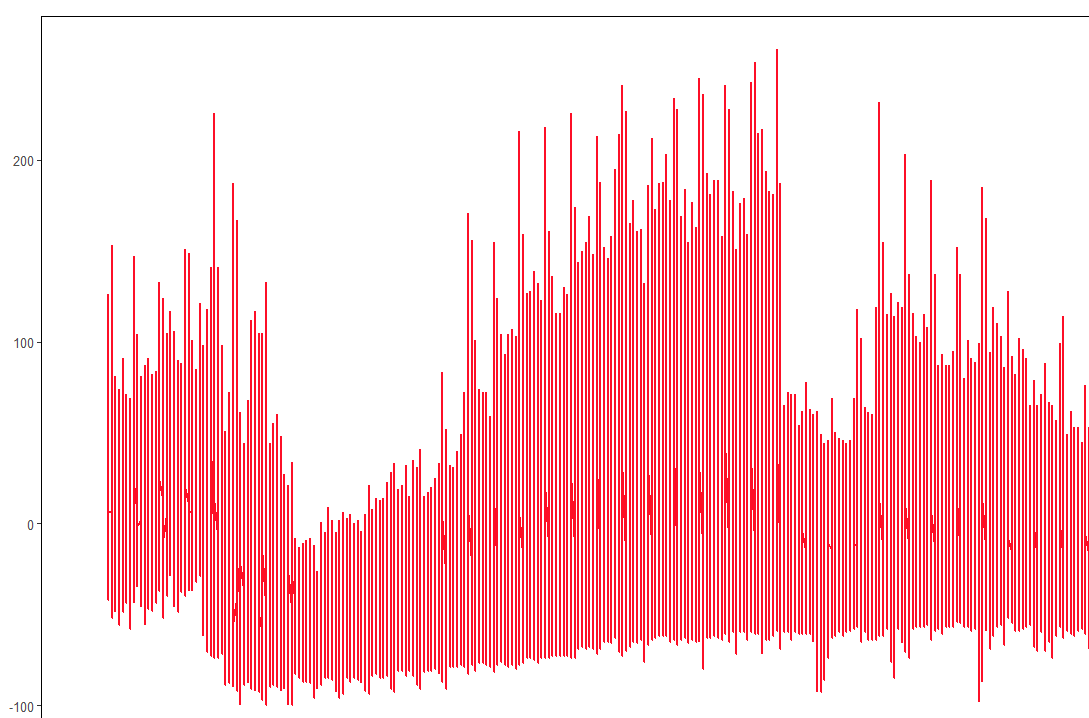
library(tidyverse)
USAMobility <- read_csv("path/on/my/computer/2020_US_Region_Mobility_Report.csv", col_types = cols())

USAMobility %>%
  ggplot(aes(x = date, y = retail_and_recreation_percent_change_from_baseline)) +
  geom_line()
#> Warning: Removed 2 row(s) containing missing values (geom_path).
Created on 2021-02-23 by the reprex package (v0.3.0)
What's different about this example?
- I explicitly call
library(tidyverse) since I'm using functions from the tidyverse
- I explicitly read in the data to
USAMobility
- I removed everything that wasn't necessary to show my problem. All the customization in the plot, for instance, is gone.
- I rendered the example with the reprex package, which makes it easier to share and make sure that my example is reproducible.