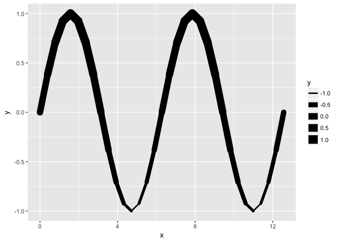
Hello, is there a plot that will show a line graph with different line thickness based on a measure value? Something like this.
Thanks for your help!
MJ
Hi,
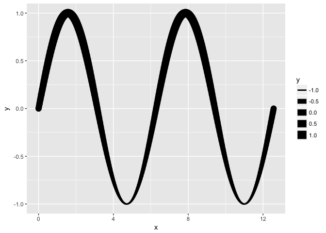
Line width and y-coordinate seem to be redundant information, but anyways: interpolation could do the trick. Line width of geom_path is constant for a whole segment. Therefore, you need to interpolate your x-values with an appropriate method in order to get a nice smooth graph. There might be other solutions (geom_ribbon, etc.)
Best, Matt
library(ggplot2)

# Some data with x-interval: pi/8
x.interval <- pi/8
x <- seq(0, 4*pi,x.interval)
df <- data.frame(x, y = sin(x))

# Interpolate values with splines to an x-interval pi/64
x.interval.new <- pi/64
x.interpolate <- seq(0, 4*pi, x.interval.new)
fct <- splinefun(df)
df.sp <- data.frame(x = x.interpolate, y = fct(x.interpolate))

# Method 1: raw version
ggplot(df, aes(x, y, size = y)) + geom_path(lineend = "round")

# Method 2: Interpolated with splines
ggplot(df.sp, aes(x, y, size = y)) + geom_path(lineend = "round")

Created on 2018-06-09 by the reprex package (v0.2.0).
2 Likes