Limiting the range of colours in a featureplot

I have returned a FeaturePlot from Seurat to ggplot by this code.

head(mat[1:4,1:4])
s1.1 s1.2 s1.3 s1.4
DDB_G0267178 0 0.009263254 0 0.01286397
DDB_G0267180 0 0.000000000 0 0.00000000
DDB_G0267182 0 0.000000000 0 0.03810585
DDB_G0267184 0 0.000000000 0 0.00000000

I have converted expression matrix to a binary matrix by 2 as a threshold

mat[mat < 2] <- 0
mat[mat > 2] <- 1

head(exp[1:4,1:4])
s1.1 s1.2 s1.3 s1.4
DDB_G0267382 0 0 0 1
DDB_G0267438 0 0 0 1
DDB_G0267466 0 0 0 0
DDB_G0267476 0 0 1 0

exp=as.matrix(exp)
colnames(exp)="value"
exp=as.data.frame(exp)
cc <- AddMetaData(object = seurat, metadata = exp)
cc <- SetAllIdent(object = cc, id = "value")
TSNEPlot(object = cc, do.return= TRUE)

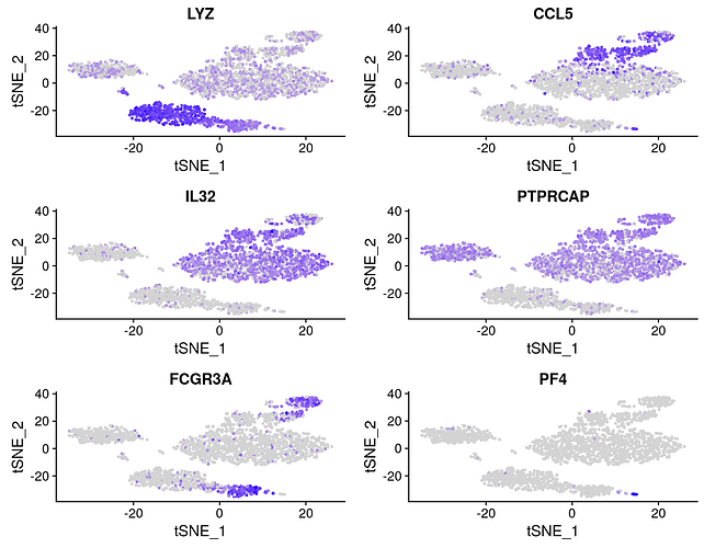
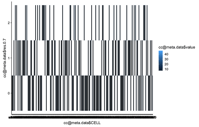
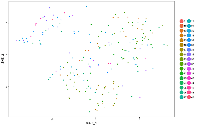
My plot has a weird range of colours as below

I returned a FeaturePlot from Seurat to ggplot. My plot has a weird range of colours as below

enter image description here

I produced this plot by this code

head(mat[1:4,1:4])
s1.1 s1.2 s1.3 s1.4
DDB_G0267178 0 0.009263254 0 0.01286397
DDB_G0267180 0 0.000000000 0 0.00000000
DDB_G0267182 0 0.000000000 0 0.03810585
DDB_G0267184 0 0.000000000 0 0.00000000

I have converted expression matrix to a binary matrix by 2 as a threshold

mat[mat < 2] <- 0
mat[mat > 2] <- 1

head(exp[1:4,1:4])
s1.1 s1.2 s1.3 s1.4
DDB_G0267382 0 0 0 1
DDB_G0267438 0 0 0 1
DDB_G0267466 0 0 0 0
DDB_G0267476 0 0 1 0

exp=as.matrix(exp)
colnames(exp)="value"
exp=as.data.frame(exp)
cc <- AddMetaData(object = seurat, metadata = exp)
cc <- SetAllIdent(object = cc, id = "value")
TSNEPlot(object = cc, do.return= TRUE)

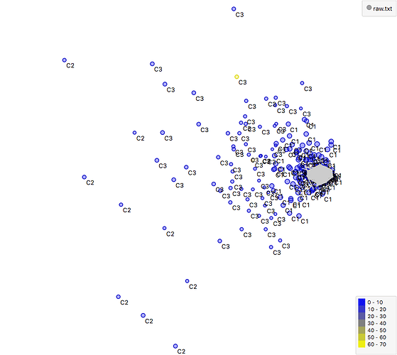
How I can convert this range to a gradient of colours for example in 8-18, 18-28, 28-38, 38-48 range in blue to yellow please? Something like below
Could you please turn this into a self-contained reprex (short for reproducible example)? It will help us help you if we can be sure we're all working with/looking at the same stuff.

install.packages("reprex")

If you've never heard of a reprex before, you might want to start by reading the tidyverse.org help page. The reprex dos and don'ts are also useful.

What to do if you run into clipboard problems

If you run into problems with access to your clipboard, you can specify an outfile for the reprex, and then copy and paste the contents into the forum.

reprex::reprex(input = "fruits_stringdist.R", outfile = "fruits_stringdist.md")

For pointers specific to the community site, check out the reprex FAQ.

It would be easier to fit to your specific case with a reprex, but the basics should be similar to ggplot2, generally speaking, where you can specify the colours you want to use in your plot.

An excerpt from the Surat documentation, New data visualization methods in v2.0 by Paul Hoffman (which I found from the documentation section "Frequently requested vignettes" by clicking How can I adjust contrast and color scales on a FeaturePlot? — note, this is not a reprex, as I did not download their data files, see the vignette for full code).

# Feature plot - visualize gene expression in low-dimensional space
FeaturePlot(object = pbmc, features.plot = features.plot, cols.use = c("lightgrey", 
    "blue"))

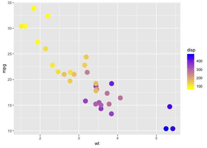
So, to get yellow and blue, you would specify those colours, or use a palette/colour scale that's to your liking. It looks like in FeaturePlot() you specify the args as cols.use = c("COLOUR_ONE_HERE", "COLOUR_TWO_HERE"), as opposed to in a regular ggplot chart where you'd use a scale_colour_*() function.

library(tidyverse)

ggplot(mtcars, aes(x = wt, y = mpg, colour = disp)) + 
  geom_point(size = 5) +
  scale_colour_gradient(low = "yellow", high = "blue")

Created on 2018-10-30 by the reprex package (v0.2.1.9000)

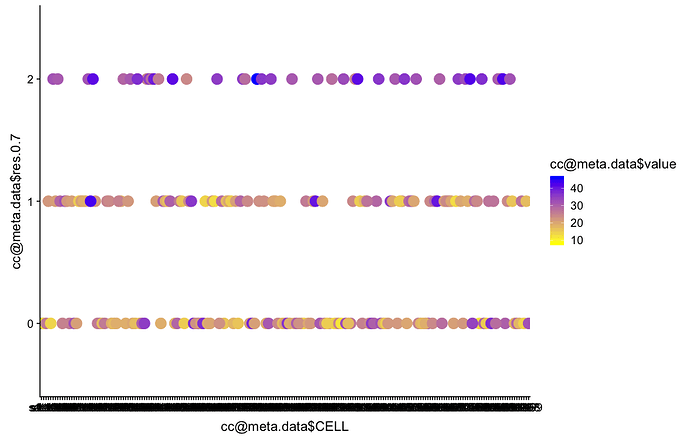
Thanks a lot, I done but my clusters are not recognisable

head(cc@meta.data)
     nGene    nUMI    orig.ident res.0.7 CELL STAGE GENO dataset stage.nice celltype value
s1.1  4331  373762 SeuratProject       0 s1.1   H16   WT       1        H16        0    34
s1.2  5603 1074639 SeuratProject       0 s1.2   H16   WT       1        H16        0    26
s1.3  2064   49544 SeuratProject       0 s1.3   H16   WT       1        H16        0    27
s1.4  4680  772399 SeuratProject       1 s1.4   H16   WT       1        H16        1    29
s1.5  3876  272356 SeuratProject       1 s1.5   H16   WT       1        H16        1    21
s1.6  2557  122314 SeuratProject       0 s1.6   H16   WT       1        H16        0    31


ggplot(as.data.frame(cc@meta.data), aes(x = cc@meta.data$CELL, y = cc@meta.data$res.0.7, colour =cc@meta.data$value)) + 
+     geom_point(size = 5) +
+     scale_colour_gradient(low = "yellow", high = "blue")

That's not surprising using that setting.

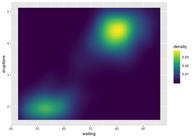
This is why people often use well-established scientific colour palettes, such as viridis:
https://cran.r-project.org/web/packages/viridis/vignettes/intro-to-viridis.html

library(ggplot2)
v <- ggplot(faithfuld) +
  geom_tile(aes(waiting, eruptions, fill = density))
v + scale_fill_viridis_c()

Created on 2018-10-30 by the reprex package (v0.2.1.9000)

Your code isn't formatted in such a way that I can reproduce what you have, but I suggest you look at the Seurat tutorials.

Sorry, but that gave the worst :disappointed_relieved:

I can't diagnose what's happening without a reprex. Please see the links above.