Hi,
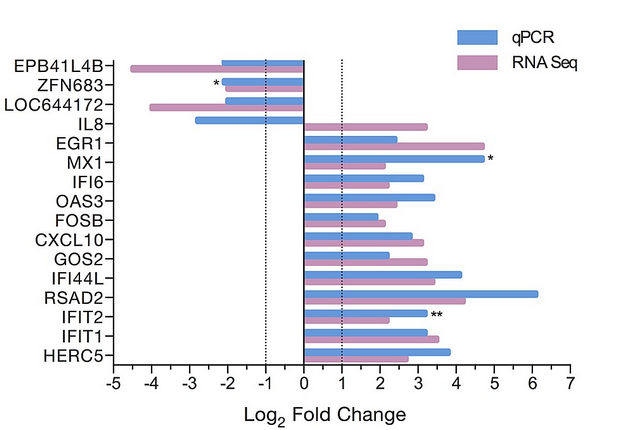
i try to reproduce the attached graph using likert library and library(HH) but i have no idea on how to supperpose 2 bars per item (gene)
If you have an idea ?
thank you --
Hi,
i try to reproduce the attached graph using likert library and library(HH) but i have no idea on how to supperpose 2 bars per item (gene)
If you have an idea ?
thank you --
Unless I were going to be doing this all the time, I would do it externally.
HH:likert() creates a trillis object under {lattice} and while it's possible to add a vertical line, there's no obvious way (without retracing my steps from {ggplot2} back to {lattice} to
I tried to convert to a {ggplot2} object, which I was able to do. However, I can't figure out how to fix an error with the geom_vline() function that prevents any result.
Here's an example of a manual markup using a vector editing program.
First the plot
library(HH)
#> Loading required package: lattice
#> Loading required package: grid
#> Loading required package: latticeExtra
#> Loading required package: multcomp
#> Loading required package: mvtnorm
#> Loading required package: survival
#> Loading required package: TH.data
#> Loading required package: MASS
#>
#> Attaching package: 'TH.data'
#> The following object is masked from 'package:MASS':
#>
#>     geyser
#> Loading required package: gridExtra

data(ProfChal)  ## ProfChal is a data.frame.
## See below for discussion of the dataset.

## Count plot in lattice
p <- likert(Question ~ . , ProfChal[ProfChal$Subtable=="Employment sector",],
       main='Is your job professionally challenging?',
       ylab=NULL,
       sub="This plot looks better in a 9in x 4in window.")
p

Created on 2023-11-20 with reprex v2.0.2
Now the markup
but it's not quite what's in the picture I sent.
On the graph you have 2 bars (red and blue) grouped by gene and by condition (qPCR and RNAseq).
I'm able to draw a single bar with the Likert library, but I can't find a way to add another bar on the same ordinates.
Can't do much in the absence of a reprex (see the FAQ).
I'm afraid with using the term "likert graph" you sent us in the wrong direction, you don't need the likert library for that, this is just a simple bar plot with dodged bars.
edit: you can also call it grouped barplot.
PlotData = tibble(
  Label = rep(c("EPB41", "IL8", "IFIT2"), each = 2),
  Method = rep(c("qPCR", "RNA Seq"), 3),
  Value = c(-2,-4, -1, -0.2, 2, 3) )

ggplot(PlotData, aes(x = Value, y = Label, fill = Method)) +
  geom_col(position = position_dodge(width = 0.6),
           width = 0.5) +
  theme_classic() +
  scale_fill_manual(values = c("RNA Seq" = "plum3",
                               "qPCR" = "steelblue3")) +
  geom_vline(xintercept = 0) +     # add line at 0
  geom_vline(xintercept = c(-1,1), # add lines at -1 and 1
             linetype = "dotted" )
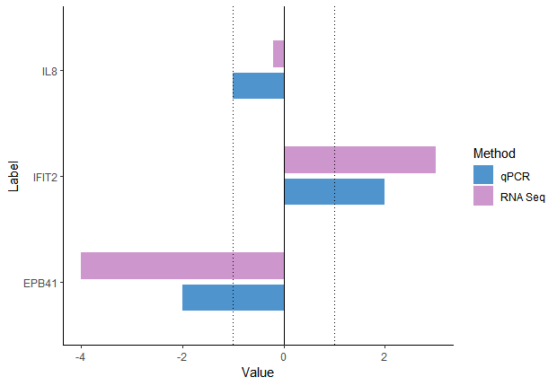
exactly what I wanted, thank you for your help.
I was thinking of the likert library because I'd seen examples using it.
This topic was automatically closed 42 days after the last reply. New replies are no longer allowed.
If you have a query related to it or one of the replies, start a new topic and refer back with a link.