How to build the Lexis diagram below in R.
Could you share the data that was used to create the plot?
2 Likes
Can you generate the data? This is sensitive data.
1 Like
2 Likes
You have several options: The tidyverse tribble() function allows you to create a table in a way that's similar to entering data in a spreadsheet, and the tidyversse tibble()function allows you to create tables, too, but you enter column data as opposed to row data. Otherwise, you could create a table directly in an spreadsheet and copy and paste the values here, between a pair of triple backticks, like this:
``` r
<-- paste here
```
I ended up not clarifying the question.
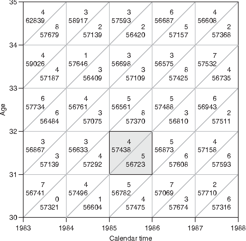
The problem is just adding the number of deaths in each period of the diagram. That is, each number in each triangle.
initial code:
lexis_grid(year_start = 1983, year_end = 1988, age_start = 30, age_end = 35) +
  # add numbers
consider only large numbers like 56 thousand.
Could you say more? It's not clear what any of the numbers mean.
1 Like
data <- data.frame(
  year = rep(1983:1988,each = 6),
  age = rep(35:30, times = 6),
  Deaths = sample(50000:100000, length(anos), replace = TRUE)
  )
1 Like
Thanks, @czargab18 — could you say a little more? It's still not clear where the single-digit numbers in your plot come from, or why there are two sets of numbers for each cell of the grid. In other words, how would you translate the content of a grid cell into words?
Disregard single-digit numbers.
The Lexis diagram is a demographic tool that helps analyze the interaction between age, period, and cohort in a population over time. Each triangle in the diagram represents a unique combination of age, period, and cohort.
Suppose we're analyzing mortality data for the age range between 30 and 35 years old and the year 1983. If in a triangle of the Lexis diagram representing people aged between 30 and 35 years old, born around 1948 to 1953, during the year 1983, we find more than 50,000 deaths recorded, this indicates that more than 50,000 people in that age range and born in those specific cohorts died in 1983.
This information would be significant for understanding mortality in that age group and that specific period, allowing for a more detailed analysis of demographic and health trends for that age group and that particular year.
perhaps this is helpful: The Lexis Diagram | SpringerLink
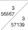
I guess what's I don't see in the data frame you shared, then, is cohort data: For example, in the bottom left grid cell from the plot you shared in your original post, what is the difference between the number 56741 above the diagonal and the number 57321 below the diagonal?
The numbers 56741 and 57321 refer to events that occurred in different periods but at similar ages. The number above the diagonal (56741) represents events that occurred in an earlier period, while the number below the diagonal (57321) represents events in a later period.
But the question is how to add the corresponding numbers for each period, triangle.
I'm not sure where the text labels are going to come from, there are only half as many value as there are triangles, so I added a text_data dataframe, where I copied (part of) what's in the example image.
library(tidyverse)

df <- data.frame(
  year = rep(1983:1988,each = 6),
  age = rep(35:30, times = 6)
  # deaths = sample(50000:100000, length(year), replace = TRUE)
)

text_data <- tribble(
  ~year, ~age, ~label, ~hjust,
  1983.5, 30.25, 57321, 0,
  1984.5, 30.25, 56604, 0,
  1985.5, 30.25, 56604, 0,
  1986.5, 30.25, 57674, 0,
  1987.5, 30.25, 57316, 0,

  1983.5, 30.75, 57321, 1,
  1984.5, 30.75, 56604, 1,
  1985.5, 30.75, 56604, 1,
  1986.5, 30.75, 57674, 1,
  1987.5, 30.75, 57316, 1,

  1983.5, 31.25, 57321, 0,
  1984.5, 31.25, 56604, 0,
  1985.5, 31.25, 56604, 0,
  1986.5, 31.25, 57674, 0,
  1987.5, 31.25, 57316, 0,

  1983.5, 31.75, 57321, 1,
  1984.5, 31.75, 56604, 1,
  1985.5, 31.75, 56604, 1,
  1986.5, 31.75, 57674, 1,
  1987.5, 31.75, 57316, 1
  # etc...
  )

ggplot(df) +
  coord_fixed(clip = "on") +
  geom_rect(aes(xmin = 1985, xmax = 1986, ymin = 31, ymax = 32, fill = "#e7e7e7"))+
  geom_tile(aes(x = year+.5, y = age+.5, fill = "transparent"), color = "black", linewidth = .2)+
  geom_text(data = text_data, aes(x = year, y = age, label = label, hjust = hjust), color = "black", size = 8/.pt)+
  geom_abline(intercept = (35-1983):(30-1988), slope = 1, color = "black", linewidth = .2, linetype = "dotted")+
  scale_fill_identity()+
  scale_x_continuous(breaks = 1983:1988, limits = c(1983,1988), expand = c(0,0))+
  scale_y_continuous(breaks = 30:35, limits = c(30,35), expand = c(0,0))+
  labs(title = "",
       x = "Calendar time",
       y = "Age")+
  theme(
    plot.margin = margin(12, 12, 12, 12, "pt"),
    axis.ticks.length = unit(6, "pt"),
    axis.ticks = element_line(linewidth = .2),
    axis.text = element_text(size = unit(8,"pt")),
    axis.title = element_text(size = unit(8,"pt")),
    axis.title.x.bottom = element_text(margin = margin(12,0,0,0,"pt")),
    panel.background = element_blank(),
    panel.grid = element_blank()
    )
1 Like
This topic was automatically closed 7 days after the last reply. New replies are no longer allowed.
If you have a query related to it or one of the replies, start a new topic and refer back with a link.