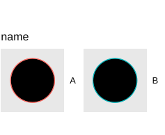
legend aes override in ggplot2

Hi,

I'd like to manage the size of shapes in the legend but size in override.aes = list(shape = 21, size = 20) doesn't seem to be working. Do you have any clue how to solve it?

data <- structure(list(percentil = c(20, 20, 40, 40, 60, 60, 80, 80, 
                             90, 90, 100, 100), 
               name = c("A", "B", "A",  "B", 
                        "A", "B", "A",  "B",  
                        "A", "B", "A",  "B"), 
               value = c(7.7, 63.3, 79.7, 71.5, 95.4, 72.2, 
                        97.8, 81.6, 98.9, 91.2, 97.5, 89.2)), 
          class = c("tbl_df", "tbl", "data.frame"), row.names = c(NA, -12L))
                                                                                                                              

library(ggplot2)


ggplot(data, aes(x = percentil, y = value, color = name)) +
  geom_line(linewidth = 2,
            key_glyph = draw_key_point)+
  geom_point(size = 3)+
  theme(legend.margin=margin(0,0,-5,0),
        axis.text.y = element_text(hjust = 0.7),
        axis.title.y = element_text(margin = margin(0,5,0,0)),
        axis.title.x = element_text(margin = margin(5,0,0,0)),
        panel.grid.major.x = element_blank()) +
  guides(fill = guide_legend(override.aes = list(shape = 21, size = 20),
                             nrow = 1))

Many thanks!
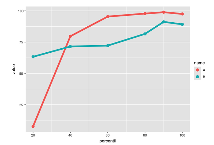
In the guides function, set color instead of fill.

ggplot(data, aes(x = percentil, y = value, color = name)) +
  geom_line(linewidth = 2,
            key_glyph = draw_key_point)+
  geom_point(size = 3)+
  theme(legend.margin=margin(0,0,-5,0),
        axis.text.y = element_text(hjust = 0.7),
        axis.title.y = element_text(margin = margin(0,5,0,0)),
        axis.title.x = element_text(margin = margin(5,0,0,0)),
        panel.grid.major.x = element_blank()) + 
  guides(color = guide_legend(override.aes = list(size = 10)))

Thanks, but then I get sth like this. I want the fill of it to have the same color.

Screenshot 2024-06-13 at 16.24.08

Here is what I get with the code you posted and my modification.

data <- structure(list(percentil = c(20, 20, 40, 40, 60, 60, 80, 80, 
                                     90, 90, 100, 100), 
                       name = c("A", "B", "A",  "B", 
                                "A", "B", "A",  "B",  
                                "A", "B", "A",  "B"), 
                       value = c(7.7, 63.3, 79.7, 71.5, 95.4, 72.2, 
                                 97.8, 81.6, 98.9, 91.2, 97.5, 89.2)), 
                  class = c("tbl_df", "tbl", "data.frame"), row.names = c(NA, -12L))


library(ggplot2)
#> Warning: package 'ggplot2' was built under R version 4.3.3


ggplot(data, aes(x = percentil, y = value, color = name)) +
  geom_line(linewidth = 2,
            key_glyph = draw_key_point)+
  geom_point(size = 3)+
  theme(legend.margin=margin(0,0,-5,0),
        axis.text.y = element_text(hjust = 0.7),
        axis.title.y = element_text(margin = margin(0,5,0,0)),
        axis.title.x = element_text(margin = margin(5,0,0,0)),
        panel.grid.major.x = element_blank()) + 
  guides(color = guide_legend(override.aes = list(size = 10), nrow = 1))

Created on 2024-06-13 with reprex v2.0.2

Oh I see, one doesn't have to define shape?

Thanks!

This topic was automatically closed 7 days after the last reply. New replies are no longer allowed.

If you have a query related to it or one of the replies, start a new topic and refer back with a link.