saurabh
February 27, 2022, 4:03pm
1
tata3 <- data.frame(Subtype = c("Prostate", "Oesophagus", "Breasr"), alive = c(88, 22, 100), dead = c(12, 55, 17), uncertain = c(10, 2, 2), total = c(186,46,202))
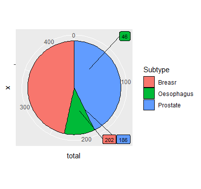
Above is dataframe. I then tried code below to get a pie chart
ggplot(tata3, aes(x = "", y = total, fill=Subtype)) + geom_col(width=1, color=1) + coord_polar(theta = "y") + geom_label_repel(data=tata3, aes(y= total, label = paste0(total)), size = 3, nudge_x = 3, show.legend = FALSE)
Hello, I want the following if possible
Thanks very much
saurabh
February 27, 2022, 4:09pm
2
just to say I've tried various permutations of y_nudge and x_nudge...still hasnt worked.
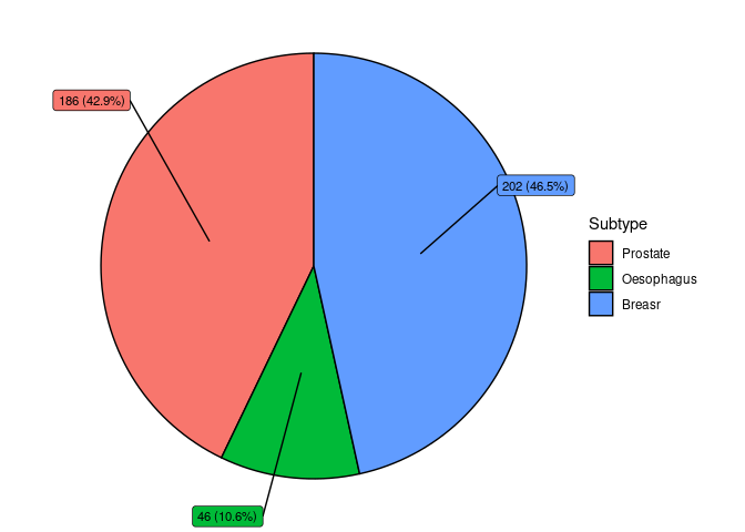
Polar coordinates for geom_label_repel() need to be manually calculated.
library(tidyverse)
library(ggrepel)

tata3 <- data.frame(
    Subtype = c("Prostate", "Oesophagus", "Breasr"),
    alive = c(88, 22, 100), dead = c(12, 55, 17),
    uncertain = c(10, 2, 2), total = c(186,46,202))

tata3 %>%
    mutate(csum = rev(cumsum(rev(total))),
           pos = total/2 + lead(csum, 1),
           pos = if_else(is.na(pos), total/2, pos),
           percentage = total/sum(total)) %>%
    ggplot(aes(x = "", y = total, fill = fct_inorder(Subtype))) +
    geom_col(width = 1, color = 1) +
    geom_label_repel(aes(y = pos,
                         label = glue::glue("{total} ({scales::percent(percentage)})"),
                         fill = Subtype),
                     size = 3,
                     nudge_x = 3,
                     show.legend = FALSE) +
    labs(  fill = "Subtype" ) +
    coord_polar(theta = "y") +
    theme_void()
Created on 2022-02-27 by the reprex package (v2.0.1)
saurabh
February 27, 2022, 5:02pm
4
many thanks.
I'd also quite like to understand with the code below means..
csum = rev(cumsum(rev(total))),
pos = total/2 + lead(csum, 1),
pos = if_else(is.na(pos), total/2, pos),
percentage = total/sum(total))
I can see its trying to convert the values into percentages...but I'm not sure exactly what each line does. Thanks
This gets the cumulative sum of your total values
This gets the mid position for each Subtype label
This replaces the NA introduced by the use of lead()
This calculates the percentage for each Subtype
saurabh
February 27, 2022, 10:21pm
6
Many thanks.
Also, I 've tried using geom_text to get the Subtype categorical variable name to appear within its respective slice of the piechart. This does not seem to work and the variable 'Prostate' etc all seem to appear haphazardly in the chart.
Is there any way of achieving the above?
The lines within the piechart appear a bit frazzled in output from my PC. These dark lines appear quite smooth here...is there anything I can do about this?
Thanks Again
system
March 6, 2022, 10:21pm
7
This topic was automatically closed 7 days after the last reply. New replies are no longer allowed.

