A figure that I created in knitr to pdf is displayed correctly when it is rendered within knitr, but is not correct when the code is printed to pdf. This is the correct fugure
The attached file is a copy of the figure as retrieved from the "keep pdf" file. jointHbA1c-1.pdf (4.9 KB)
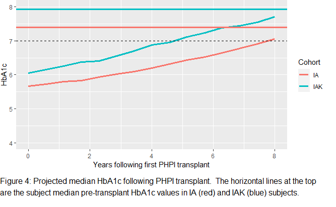
Note that the right ends of the two lines are too low (incorrect) in the second file.
Any idea what is causing this? More importantly, is there a way to correct this misrendering of a graphic file being rendered to a pdf file?
Running Windows 10 up to date, R 4.0.3 in RStudio Version 1.3.1073, knitr, markdown, ggplot2 all up to date. I am using cairo_pdf, but I get the same issue when I use the default knitr pdf. Is there any other information that I can give you that will help?
Thanks for any help you can give me.
Larry Hunsicker
No. I cleared the workspace and restarted R before doing the knit, and similarly I cleared the workspace and "Restart R and Run all chunks" to generate the plot within knitr. See also my response to cderv below.
cderv: I added geom_point() + to the ggplot function. The points in both versions of the plot overlay the lines exactly. So whatever is happening is affecting the plot of the points and the lines the same way. I can upload the two plots with geom_point() added if you want, but it is clear that what is affecting the lines also is affecting the points the same way. Interestingly, the two horizontal lines are correctly rendered in the pdf version. So it seems that that the data are not being pulled from the dataframe and processed correctly to create the pdf graphic stored and then pulled in by the Latex step. .
I also checked the data to be sure which of the two plots was correct. The plot generated within knitr is correct. The pdf version is incorrect. So there is something awry in the generation of the plots in the knit to pdf step where the graphics are generated and stored for addition to the final pdf in the Latex step.
I have found an awkward but effective work around by exporting the graphic from the knitr step and then importing the graphic to the knitr document. What worries me, though, is that I now think that I have to visually check the rendering of all of the graphics in the pdf document. So far, so far as I can see, this is the only graphic that was misrendered.
If it would be helpful, I can upload the data.frame with the data and the ggplot2 code.
Same data = Same plot I would say, so different plot = different data.
A cache mechanism depending on the format or any other mechanism taht would replace your data in one of the rendering could be the cause. I don't see why a plot would be different with the same data.
IMO not a PDF or HTML issue. (cache mechanism appart if you are using this.)
Woodward: OK. I have an explanation finally, and you were absolutely correct. I am running a Bayesian program (stan_jm, and then posterior_proj) and of course the results are stochastic. So when I ran the program within knitr and when I ran it to knit to pdf, the results were different. So the software is not a problem. Rather it is my forgetting that stochastic analyses give varying results. The result in the two plots are both correct, but different. Since they are marginally meaningfully different, I'll run posterior_proj with a lot more draws to see whether I get more consistent results.
Are you a Bayesian? That would explain your thinking that I might have been running a stochastic process.
And are you the Simon Woodward from Nottingham? If so, you are just about 20 miles north of my daughter, Maths faculty at U. Loughborough.
Thanks for your help, which finally led me to realize my error.
Larry Hunsicker
cderv: See my reply to woodward. He was correct. I am running a stochastic analysis, and I should have realized that the different results were the results of the stochastic process. Problem fixed. Thanks for your help! Larry Hunsicker