Iterating regression model predictions and plotting all lines

Hi all. I am training data on various regression models (x to x^6), and then using it to predict on a test set. I am having trouble with visualization. By randomly splitting my data 50 times and then training/predicting, ultimately I want to output:

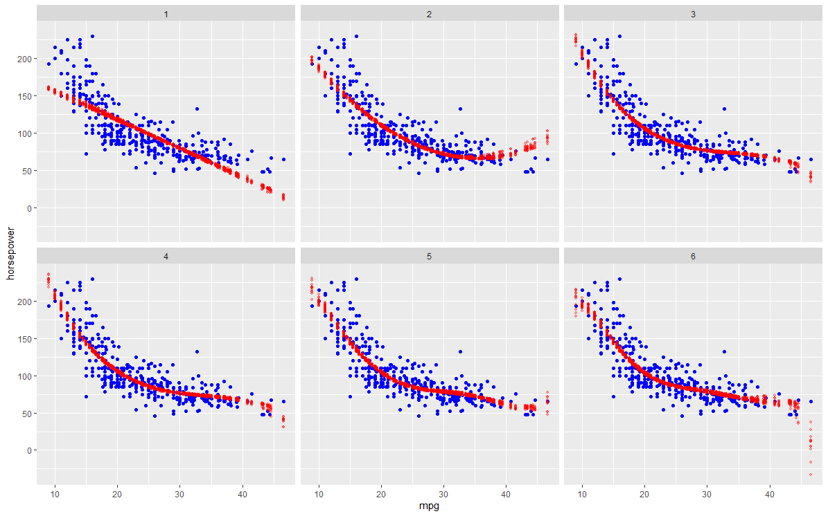
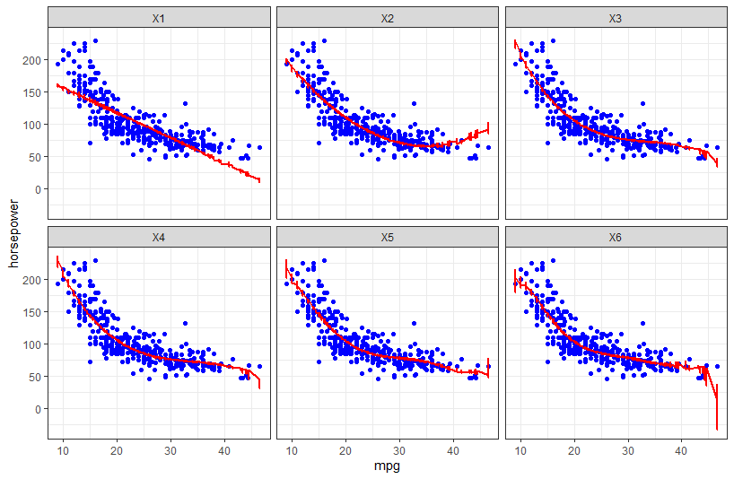
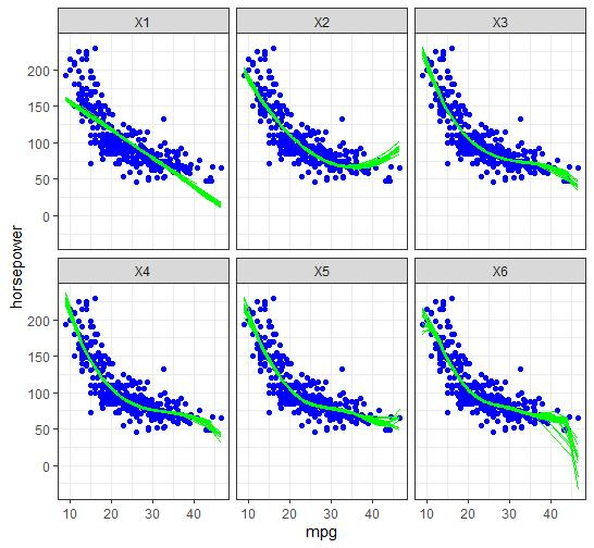
  1. For each polynomial, the 50 separate prediction lines drawn on the same plot so as to visualize the variance. As for the scatterplot in the background, I assume it should be a scatter of the full dataset?
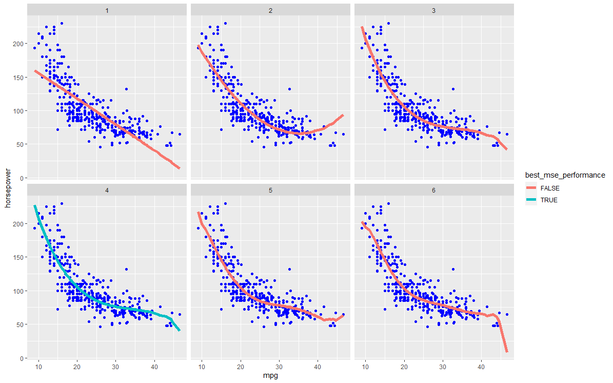
  2. Highlight the test error of the best model across the 50 iterations. The error lines of other models can be coloured in a lighter colour.

In the code below, I have so far been able to achieve:
(i) Storing the test set mean sq errors (MSEs) for each model across 50 iterations in all.mse.dat
(ii) Plots with a single prediction line for each polynomial (not inside the loop). The lines are against the scatterplot of a single test set (instead of the full dataset).

# use Auto dataset from ISLR
library(ISLR)
str(Auto) 

# Create df/vector to store MSEs 
# for each of six models across 50 iterations 
all.mse.dat <- data.frame(matrix(data = NA, 
                                 ncol = 6, 
                                 nrow = 50))
mse.test <- vector(mode = "numeric", length = 6)

# Begin the iteration
set.seed(1337)
for (j in 1:50){
  # sample random train and test sets (75%/25% split)    
  rows.test <- sample(1:nrow(Auto), 
                      size = nrow(Auto)*0.25, 
                      replace = FALSE)
  train.dat <- Auto[-rows.test, c("mpg", "horsepower") ]
  test.dat <- Auto[rows.test, c("mpg", "horsepower") ]
  
  # loop to train and predict
  for (i in 1:6){ 
    # train models
    model_name <- paste0("train", i,".lm")
    assign(model_name, lm(horsepower ~ poly(mpg, i), data = train.dat))
    
    # get predictions
    fit_name <- paste0("test", i,".pred")
    assign(fit_name, predict(get(paste0("train", i,".lm")), newdata = test.dat))  
    
    # get prediction MSE of each model and store them
    mse.test[i] <- mean((get(fit_name) - test.dat$horsepower)^2) 
    all.mse.dat[j, ] <- mse.test
    
  }
  
}  # not sure how to do the below in a loop, or if it is necessary, so I have left the rest outside for now

 # Create data.frame for the predictions
  test.pred.dat <- data.frame(matrix(data = NA, 
                                     ncol = 2+6, 
                                     nrow = nrow(test.dat)))   
  colnames(test.pred.dat) <- c("mpg", "horsepower", paste0("x", 1:6))  
  # fill the data frame 
  test.pred.dat$mpg <- test.dat$mpg
  test.pred.dat$horsepower <- test.dat$horsepower
  for (i in 1:6){
    test.pred.dat[i + 2] <- get(paste0("test", i,".pred"))   
   }

  # reshape wide to long for ggplot
  require(reshape2)
  long.testpred.dat <- reshape2::melt(test.pred.dat,
                                      id.vars = c("mpg", "horsepower"),
                                      measure.vars = c(paste0("x", 1:6)),  
                                      variable.name = "Polynomial", 
                                      value.name = "y.fit")
  
 # ggplot
 require(ggplot2)
  ggplot(long.testpred.dat, aes(x = mpg, y = horsepower,  
                                color = Polynomial)) +  
    geom_point(color = "red") + # need scatter of full Auto dataset instead of just test set
    geom_line(aes(y = y.fit), size = 1) + 
    facet_wrap(~ Polynomial) 

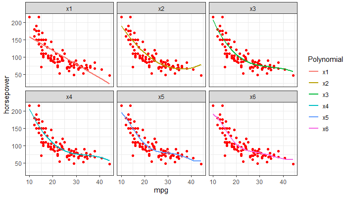
I'm also not quite sure if I understand how/what to visualise for 2), in case my wording seems confusing.

Thanks for any help!

Finding it hard to understand your requirements.
I can tell you your current implementation has the following flaw.
for each of 50 random splits, 6 models are trained. But you only keep those from the 50th split.

If you were to train 6 model variants(powers of x), on 50 training datasets, that implies there are 300 'fitting' objects. I'm not sure your description grasps with that.

Apologies for the confusion. I am aware that it only plots results and saves models from the 50th split--i'm not sure how to store all of them (or if there is a need to store anything else other than the all the predictions and MSEs).

As for the plot I intend to do in (1), it is to draw a best fit line for each iteration against a scatterplot of the full sample. In the graph I have produced, it only shows the best fit lines for the 50th test set, and against a scatterplot of that final test set. So across the 6 models, there would indeed be a total of 300 lines.

I am a bit lost myself too with the requirements for (2) -- it is from an exercise. I thought it meant to highlight the best performing model (i.e. for each polynomial, the best fit line of the model that produced the lowest MSE out of the 50 iterations), but that would not be "test error".

I propose this as a starting point.
6 models of increasing order of x are fitted on each of 50 random training samples.
predictions are made on 50 corresponding test samples.
We plot the original full population, and overlay the predictions for all test samples for all order of x, with facet wrap on order of x enabling us to distinguish.

library(ISLR)
library(tidyverse)

# Begin the iteration
set.seed(1337)

#make 50 random samples
  # sample random train and test sets (75%/25% split)    
single_split <-  function(){ 
  rows.test <- sample(1:nrow(Auto), 
                                      size = nrow(Auto)*0.25, 
                                      replace = FALSE)
train.dat <- Auto[-rows.test, c("mpg", "horsepower") ] %>% mutate(segment='TRAIN')
test.dat <- Auto[rows.test, c("mpg", "horsepower") ] %>% mutate(segment='TEST')

tibble(bind_rows(train.dat,test.dat))
}

datasplits <- purrr::map(.x = 1:50,~single_split())
head(datasplits)


  # loop to train and predict
fit6 <- function(indata){
  train.dat<- filter(indata,
                     segment=="TRAIN")
  test.dat<- filter(indata,
                     segment=="TEST")
  mylm <- vector(mode="list",length = 6)
  mypreds <- vector(mode="list",length = 6)
  
  for (i in 1:6){ 
    # train models
    mylm[[i]] <- lm(horsepower ~ poly(mpg, i), data = train.dat)
    mypreds[[i]] <- tibble(
      mpg=test.dat$mpg,
      predictedhorsepower= predict(mylm[[i]],newdata=test.dat),
      order_x = i)
  }
  
  list(mylm=mylm
      , mypreds=mypreds
  )
}

all_fits <- purrr::map(datasplits,
           ~fit6(.))
#a length 50 list, contains 2lists of firstly 6 fits i.e. 300 fit objects and secondly 6 predictions dataframes


collated_testfits <- bind_rows(map(all_fits,~.[[2]]))

# ggplot
require(ggplot2)
ggplot(Auto, aes(x = mpg, y = horsepower)) + 
         geom_point(color="blue") +
  geom_point(data=
              collated_testfits,
            aes(y = predictedhorsepower),
                color="red",alpha=.3, size = 1) + 
  facet_wrap(~ order_x) 

Great stuff! This is very close to I want to visualize for (1). I am not familiar with purrr so I replicated your solution in base R and reshape2 to get the collated_testfits.

  1. Ideally, I would like to get the best fits as smooth lines instead of geom_point. I tried using geom_line but it seems to create very jittery lines. I think it is joining all the points together into one line.

  2. How can I highlight/shade the best model in red and the rest in gray? I found the best performing model for each polynomial.

apply(all.mse.dat, 2, which.min) # all.mse.dat from my earlier code
X1 X2 X3 X4 X5 X6 
34 34 44 44 44 44 # MSE was lowest on the j^th iteration

You'd have to average the predictions at a given mpg, so that there is a single line to draw

library(ISLR)
library(tidyverse)

# Begin the iteration
set.seed(1337)

#make 50 random samples
# sample random train and test sets (75%/25% split)    
single_split <-  function(){ 
  rows.test <- sample(1:nrow(Auto), 
                      size = nrow(Auto)*0.25, 
                      replace = FALSE)
  train.dat <- Auto[-rows.test, c("mpg", "horsepower") ] %>% mutate(segment='TRAIN')
  test.dat <- Auto[rows.test, c("mpg", "horsepower") ] %>% mutate(segment='TEST')
  
  tibble(bind_rows(train.dat,test.dat))
}

datasplits <- purrr::map(.x = 1:50,~single_split())
head(datasplits)


# loop to train and predict
fit6 <- function(indata){
  train.dat<- filter(indata,
                     segment=="TRAIN")
  test.dat<- filter(indata,
                    segment=="TEST")
  mylm <- vector(mode="list",length = 6)
  mypreds <- vector(mode="list",length = 6)
  mse.test <- rep(NA_real_,6)
  
  for (i in 1:6){ 
    # train models
    mylm[[i]] <- lm(horsepower ~ poly(mpg, i), data = train.dat)
    mypreds[[i]] <- tibble(
      mpg=test.dat$mpg,
      predictedhorsepower= predict(mylm[[i]],newdata=test.dat),
      order_x = i)

    mse.test[i] <- mean(mypreds[[i]]$predictedhorsepower 
                        - test.dat$horsepower)^2
  }
  
  list(mylm=mylm
       , mypreds=mypreds,
       mse.test=mse.test
  )
}

all_fits <- purrr::map(datasplits,
                       ~fit6(.))
#a length 50 list, contains 2lists of firstly 6 fits i.e. 300 fit objects and secondly 6 predictions dataframes


collated_testfits <- bind_rows(map(all_fits,~.[[2]]))

summarised_testfits <- group_by(
  collated_testfits,
  order_x,mpg
) %>% summarise(avg_pred_hp = mean(predictedhorsepower,na.rm = TRUE))


#investigate MSE 
all_mse <- map(all_fits,~.[[3]])
whichmin_of_all_mse <- map_int(all_mse,which.min)
(summary_mse <- table(whichmin_of_all_mse) %>% as_tibble() %>%
    mutate(whichmin_of_all_mse=as.integer(whichmin_of_all_mse),
           best_mse_performance=n==min(n)))

summarised_testfits_b <- left_join(summarised_testfits,
                                   summary_mse,
                                   by=c("order_x"="whichmin_of_all_mse"))

# ggplot
require(ggplot2)
ggplot(Auto, aes(x = mpg, y = horsepower)) + 
  geom_point(color="blue") +
  geom_line(data=
               summarised_testfits_b,
             aes(y = avg_pred_hp,
                 color=best_mse_performance),
              size = 2) + 
  facet_wrap(~ order_x) 

oops I meant that it should be 50 lines. After some toying around, I managed to draw the 50 lines separately by adding group = iterations. It also seems geom_line does create smooth lines:

I think this is the entirety of what part (i) is asking for. As for (ii), i'm still unsure how to visualise 'error lines' but it seems to suggest again 50 'error lines' per model...

This topic was automatically closed 21 days after the last reply. New replies are no longer allowed.

If you have a query related to it or one of the replies, start a new topic and refer back with a link.