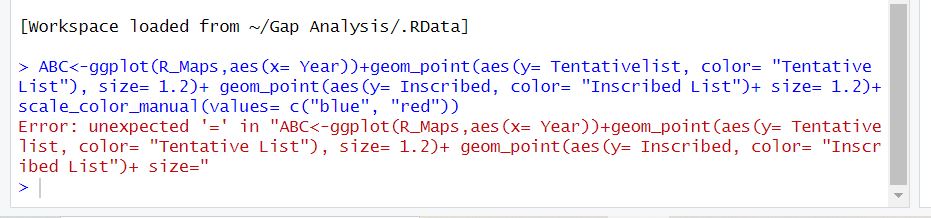
I just have a small data with years and heritage list of sites. I am trying to create a point plus line graph which can show the trend year wise but it is giving me error everytime.
The problem is that you cannot use " " in the statement. So "Tentative List" and "Inscribed List" are illegal. If they are valid variables, try
Tentative List and Inscribed List.
Generally, it is not a good idea to have variables with spaces. If you have them it is a good idea to run your data.frame/tibble through the clean_names() in the {janitor} package which will deal with them.
there are several problems, in your case you want to define a colour that doesn't exist. I see what you want to do, you want to change the entries shown in the legend but this isn't working that way.
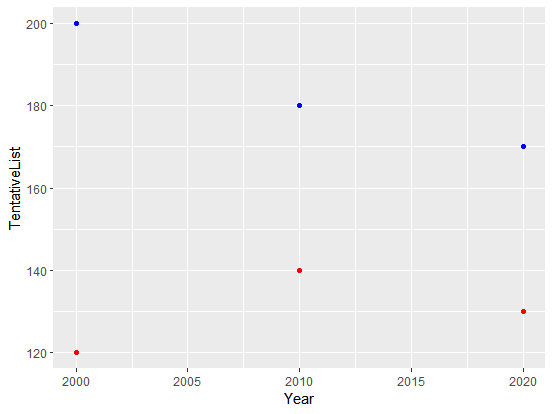
Let us start simple: You have your data in 2 different columns and want to show both. In this case you have to call each one individually and define the colour for each:
library(tidyverse)
# some example data
R_maps = tibble(
  Year = c(2000, 2010, 2020),
  TentativeList = c(200, 180, 170),
  Inscribed = c(120, 140, 130))

ggplot(R_maps, aes(x = Year)) +
  geom_point(aes(y = TentativeList),
             colour = "blue") +
  geom_point(aes(y = Inscribed),
             colour = "red")
As pointed out in the answer above column names with spaces are bit more complicated, but it can be worked with, you just need to remember to use the correct quotation marks for this, these one will do the job: `
R_maps2 = tibble(
  Year = c(2000, 2010, 2020),
  "Tentative List" = c(200, 180, 170),
  "Inscribed List" = c(120, 140, 130))

ggplot(R_maps2, aes(x = Year)) +
  geom_point(aes(y = `Tentative List`),
             colour = "blue") +
  geom_point(aes(y = `Inscribed List`),
             colour = "red")
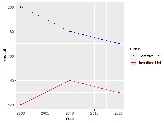
Probably you want to add a legend to identify the colours, for this it's best practise to convert evertything into the so called "long" format, you have one column for all the values, and another one that describes the type of measurement:
R_maps_long = pivot_longer(R_maps,
                           -Year,  # we don't want to include the column "Year"
                           names_to = "class",  # column for the classes / types
                           values_to = "readout")  # column for the values
R_maps_long
# A tibble: 6 × 3
   Year class         readout
  <dbl> <chr>           <dbl>
1  2000 TentativeList     200
2  2000 Inscribed         120
3  2010 TentativeList     180
4  2010 Inscribed         140
5  2020 TentativeList     170
6  2020 Inscribed         130
Now we can plot it, with adding a legend and make the labels of the classes nicer using the labels argument, when defining the colour brakes.
ggplot(R_maps_long, aes(x = Year, y = readout, colour = class)) +
  geom_point() +
  geom_line() +
  scale_colour_manual(values = c("TentativeList" = "blue", "Inscribed" = "red"),
                      breaks = c("TentativeList", "Inscribed"),
                      labels = c("Tentative List", "Inscribed List"))
1 Like
It would be easier if you pasted text rather than a screenshot, but is this like what you were trying to do?
library(tidyverse)

tibble(year = 1:10, tent = sample(1:10, 10), inscr = sample(11:20, 10)) |>
  ggplot(aes(year))+
  geom_point(aes(y = tent, color = "tent"), size = 1.2) +
  geom_line(aes(y = tent, color = "tent")) +
  geom_point(aes(y = inscr, color = "inscr"), size = 1.2) +
  geom_line(aes(y = inscr, color = "inscr"))

Created on 2024-02-05 with reprex v2.0.2
If so, the plus (+) near the end of the red warning text should be changed to a comma.
This topic was automatically closed 7 days after the last reply. New replies are no longer allowed.
If you have a query related to it or one of the replies, start a new topic and refer back with a link.