Issue with gghighlight and geom_col

Hello team!
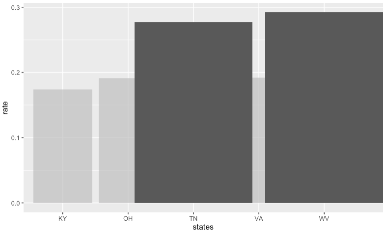
I've been trying to create plots in combination with gghighlight to indicate results that are above average for the dataset (multiple of these will be combined with so it's useful for audiences to focus only on the highlighted results)

It happens that the highlighted result generated by gghighlight has a different amount of columns (showing 2 bars only i/o 5) do you guys (maybe @yutannihilation) know what might be causing that?

#Example Data Frame
library(tidyverse)
states = c("KY","OH","TN","VA","WV")
rate = c(0.174,0.191,0.277,0.192,0.292)
df <- data.frame(states,rate)

#Create avg for gghighlight
avg_rate = mean(rate)

ggplot(
  data = df,
  aes(x = states, y = rate)) + 
  geom_col() + 
  gghighlight::gghighlight(rate > avg_rate)

Created on 2023-10-13 with reprex v2.0.2

I got this. Is this different from your result?

library(tidyverse)
states = c("KY","OH","TN","VA","WV")
rate = c(0.174,0.191,0.277,0.192,0.292)
df <- data.frame(states,rate)

#Create avg for gghighlight
avg_rate = mean(rate)

ggplot(
  data = df,
  aes(x = states, y = rate)) + 
  geom_col() + 
  gghighlight::gghighlight(rate > avg_rate)

https://i.imgur.com/LZ8g6Xp.png

Thanks for the reply @yutannihilation! So, this is how it is showing up for me (the x-axis split is different for the highlighted plot)

Initially i thought is could be something about how it was calculating the average, but even if I select max_highlight = 2L i still get the same plot:

#Example Data Frame
library(tidyverse)
states = c("KY","OH","TN","VA","WV")
rate = c(0.174,0.191,0.277,0.192,0.292)
df <- data.frame(states,rate)

#Create avg for gghighlight
avg_rate = mean(rate)

ggplot(
  data = df,
  aes(x = states, y = rate)) + 
  geom_col() + 
  gghighlight::gghighlight(rate, max_highlight = 2L)


Created on 2023-10-13 with reprex v2.0.2

https://i.imgur.com/PAUyKRu.png

dont know, why but experimentation shows that controlling geom_col width parameter, gets it to be more as expected.
i.e.

geom_col(width=.9)
1 Like

Oh, I can reproduce it with the CRAN version of ggplot2. It seems it's something unintentionally introduced in v3.4.0 (no problem with v3.3.6), which is already fixed in the GitHub version. So, it seems there's nothing I can do, sorry. Thanks @nirgrahamuk for the workaround!

1 Like

Probably this one.

1 Like

Thanks guys, it worked!

This topic was automatically closed 7 days after the last reply. New replies are no longer allowed.

If you have a query related to it or one of the replies, start a new topic and refer back with a link.