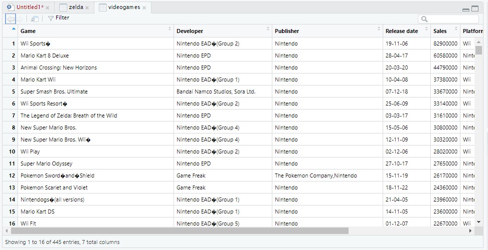
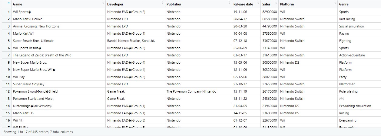
Hello, I'm having difficulty creating dataviz with a spreadsheet on Nintento's best selling games. I'm trying to create various visualizations comparing the best selling games (the "Games" and "Sales" columns are what I'm interested it.
For some reason, when I enter the code, it only shows a single plot.
Is there anything you can see as to why the vis only shows a single plot? I've also tried doing a geom_bar with Game/Sales but I end up having the same issue.
I've played around with different variables on the X and Y axis and nothing seems to be changing. I just want to be able to show certain games or game franchises in relation to how many copies they've sold.
I'm quite new to R and am just working on finishing the Google Data Analytics certificate. So the solution is probably pretty simple, but I'm just inexperienced.
you have made a mistake of quoting variable names that you use as aes(), this tells R that you want to plot a literal string, rather than a variable, simply remove the quotes.
I can share with you the resource which taught me how to plot (and do other things besides) R for Data Science (2e) (hadley.nz)
Data Vis is the first chapter.
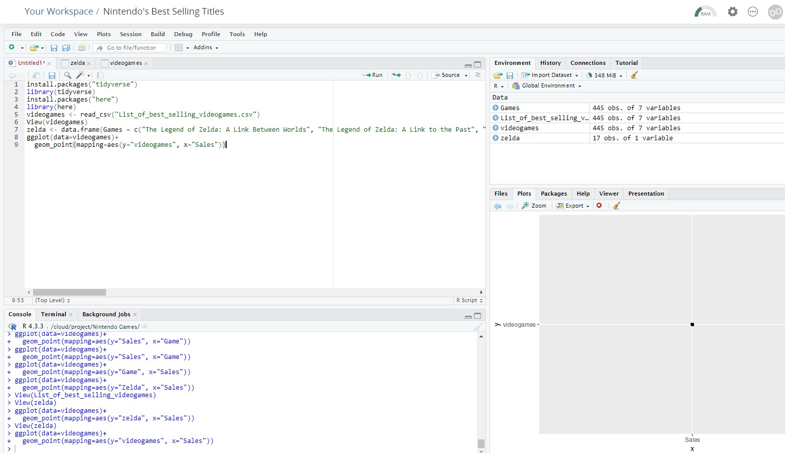
install.packages("tidyverse")
library(tidyverse)
install.packages("here")
library(here)
videogames <- read_csv("List_of_best_selling_videogames.csv")
View(videogames)
zelda <- data.frame(Games = c("The Legend of Zelda: A Link Between Worlds", "The Legend of Zelda: A Link to the Past", "The Legend of Zelda: Breath of the Wild", "The Legend of Zelda: Link's Awakening", "The Legend of Zelda: Majora's Mask", "The Legend of Zelda: Majora's Mask 3D", "The Legend of Zelda: Ocarina of Time", "The Legend of Zelda: Ocarina of Time 3D", "The Legend of Zelda: Phantom Hourglass", "The Legend of Zelda: Skyward Sword", "The Legend of Zelda: Skyward Sword HD", "The Legend of Zelda: Spirit Tracks", "The Legend of Zelda: Tears of the Kingdom", "The Legend of Zelda: The Minish Cap", "The Legend of Zelda: The Wind Waker", "The Legend of Zelda: Tri Force Heroes", "The Legend of Zelda: Twilight Princess"))
ggplot(data=videogames)+
geom_col(mapping=aes(y="Sales", x="zelda"))
ggplot(data=videogames)+
geom_plot(mapping=aes(y="Sales", x="Game"))
A handy way to supply some sample data is the dput() function. In the case of a large dataset something like dput(head(mydata, 100)) should supply the data we need. Just do dput(mydata) where mydata is your data. Copy the output and paste it here between
```
Here's a simple example with nonsense data that should give you enough information to fix your own data and chart: The data frame has two variables, Game an Sales. To plot that, I provide the name of the dataframe to ggplot() and tell the aes() function which variable should be mapped to which aesthetic. The x aesthetic is the position on the x-axis, the y aesthetic the position on the y, axis. Because Game is not a number, ggplot will sort Game alphabetically , and use the order as the value. That put the lowest value ("Duck Hunt") at the bottom and the highest ("Wii ") at the bottom. People typically expect the sort to to be from top to bottom though, so I reverse the limits of the y axis to show the names of the games in alphabetical order.
videogames <- data.frame(
  Game = c("Wii Sports", "Super Mario Bros.", "Mario Kart Wii", "Wii Sports Resort", "Pokemon Red/Pokemon Blue", "Tetris", "New Super Mario Bros.", "Wii Play", "New Super Mario Bros. Wii", "Duck Hunt"),
  Sales = c(82.74, 40.24, 35.82, 33.00, 31.37, 30.26, 30.01, 29.02, 28.62, 28.31)
)

ggplot(data = videogames, mapping = aes(x = Sales, y = Game))+
  geom_point()+
  scale_y_discrete(limits = rev)