I'm working on a model based on a power law. From some research and videos, it looks like when I have a straight line after taking the log of an x and y variable, I can say I have a power law model.
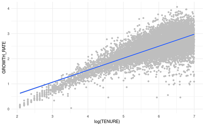
I have an almost straight line but it needs a little curvature of it's own to visually fit better. Here's a plot of log growth rate (Y axis is log even though the axis doesn't say that) and log(tenure) - I'm plotting log cumulative revenue growth for a cohort of customers:
plotd |>
  ggplot(aes(x = log(TENURE), y = GROWTH_RATE)) +
  geom_point(color = 'grey') +
  geom_smooth(method = 'lm', formula = 'y ~ x') +
  theme_minimal()
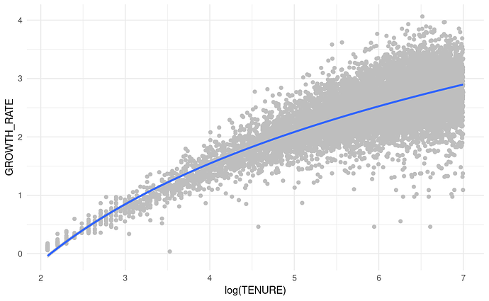
I noticed that if I double log the x axis tenure I get this visual. Since my aes() already takes log(x) , by adding formula = y ~ log(x) in geom_smooth I'm basically double logging (you can perhaps tell I discovered this by accident with a mistake in my r code):
plotd |>
  ggplot(aes(x = log(TENURE), y = GROWTH_RATE)) +
  geom_point(color = 'grey') +
  geom_smooth(method = 'lm', formula = 'y ~ log(x)') +
  theme_minimal()
Just visually, this line appears to fit better.
The geom_smooth fitted line is therefore the log(log(TENURE)) fitted against growth rate.
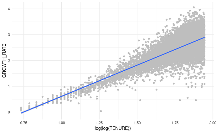
The same plot but taking the log(log(Tenure)) in the aes() from the start:
plotd |>
  ggplot(aes(x = log(log(TENURE)), y = GROWTH_RATE)) +
  geom_point(color = 'grey') +
  geom_smooth(method = 'lm', formula = 'y ~ x') +
  theme_minimal()
THis indeed looks like a better relationshipt to model. What does this mean?! A log(log(x)) relationship? Do I have a power law relationship or something else? Can I use this newly found relationship to fit a model that would be expected to fit better than the power law model?


