is there a way to order colors in the ggplot area map?

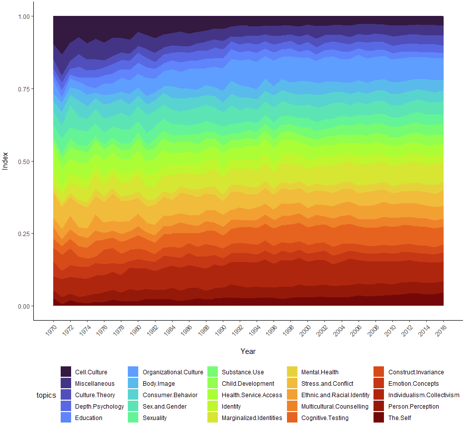
Is there is a way to distinguish between the overarching groupings in the variables plotted? See category in df

Plot:

df_long$topics <- factor(df_long$topics, 
                         levels = c("Cell.Culture", "Miscellaneous", # Other/Miscellaneous
                                    "Culture.Theory", "Depth.Psychology", # Culture Theory
                                    "Education", "Organizational.Culture", # Domain Culture
                                    "Body.Image", "Consumer.Behavior", "Sex.and.Gender", "Sexuality", "Substance.Use", # Cultural Norm
                                    "Child.Development", "Health.Service.Access", "Identity", "Marginalized.Identities", "Mental.Health", "Stress.and.Conflict", # Cultural Context
                                    "Ethnic.and.Racial.Identity", "Multicultural.Counselling", # Cross-Ethnic/Multicultural
                                    "Cognitive.Testing", "Construct.Invariance", "Emotion.Concepts", "Individualism.Collectivism", "Person.Perception", "The.Self" # Cross-Cultural
                                    ))

# stacked area chart
area_fig <- ggplot(df_long, aes(x = year, y = index, fill = topics)) + 
  geom_area() + #alpha = 1, size = 0.5, color = "white") +
  #scale_fill_viridis(discrete = T) + # produces the viridis color space
  #scale_fill_viridis(discrete = T, option = "inferno") + # produces the inferno color space
  scale_fill_viridis(discrete = T, option = "turbo") + # produces the turbo color space
  theme_classic() +
  xlab("\nYear") +
  ylab("Index\n") +
  scale_x_continuous(breaks = seq(1970,2017,2)) +
  theme(axis.text.x=element_text(angle = 45, hjust = 1)) +
  theme(legend.position = 'bottom') 
Try this: fill=interaction(category, topics)

1 Like

Thanks! This is great and works, although it doesn't make a difference to the graph as I manually ordered the topics by category.

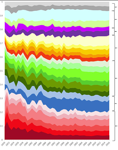
I was more wondering whether it is possible to layer colour palettes manually, or by category - as in the graph here (done in excel, where the colour grades clearly distinguish between the categories) :

I was wondering whether it is somehow possible to layer different palettes on the graph? I noticed that when using a palette with insufficient colours, it doesn't fill all the topics, but when I tried to add another palette, ggplot didn't register this!

I'm used to do it manually: remove scale_fill_viridis line and add for example

scale_fill_manual(breaks = c("Cell.Culture", "Miscellaneous", "Culture.Theory"),
                  values = c("#ff7865", "#ff004f", "#d41243")) 

If you like viridis color you can use this tool Viridis Palette Generator

1 Like

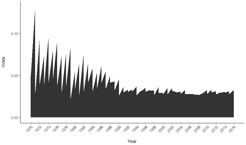
Thank you very much, @Flm! I wasn't aware of the Viridis Palette Generator so did it somewhat manually, but am not sure why my output would be so weird. Would you know how to troubleshoot this code to reach the desired objective?

# stacked area chart
area_fig <- ggplot(df_long, aes(x = year, y = index)) + 
  geom_area()+ #alpha = 1, size = 0.5, color = "white") +
  scale_fill_manual(breaks = c("Cell.Culture", "Miscellaneous", # Other/Miscellaneous
                                          "Culture.Theory", "Depth.Psychology", # Culture Theory
                                          "Education", "Organizational.Culture", # Domain Culture
                                          "Body.Image", "Consumer.Behavior", "Sex.and.Gender", "Sexuality", "Substance.Use", # Cultural Norm
                                          "Child.Development", "Health.Service.Access", "Identity", "Marginalized.Identities", "Mental.Health", "Stress.and.Conflict", # Cultural Context
                                          "Ethnic.and.Racial.Identity", "Multicultural.Counselling", # Cross-Ethnic/Multicultural
                                          "Emotion.Concepts", "The.Self", "Construct.Invariance", "Individualism.Collectivism", "Person.Perception", "Cognitive.Testing" # Cross-Cultural
                    ),
                    values = c("#7c7c7c", "lightgrey",                                                  # G
                               "#7a0c02", "#db3a07",                                                # F
                               "#541fa3", "#8b23a5",                                                # E
                               "#fcfda4", "#f0f920", "#fe9b2d", "#f57d15", "#db3a07",               # D 
                               "#1fa187", "#4ac16d", "#31f299", "#56fa75", "#80ff53", "#a2fc3c",    # C                                    
                               "#28bbec", "#4777ef"                   ,                             # B
                               "#fbe1e5", "#f4b2bb", "#ff7c80", "#ff4747", "#ff0000", "#a8041b")) + # A    "#ccffff"
  theme_classic() +
  xlab("\nYear") +
  ylab("Index\n") +
  scale_x_continuous(breaks = seq(1970,2017,2)) +
  theme(axis.text.x=element_text(angle = 45, hjust = 1)) +
  theme(legend.position = 'bottom') 
print(area_fig)

Note: i have checked, and there are enough colour codes and variables in breaks and values arguments (25).

can you share part of your df so that i can run the code? Try dput(head(yourdf,20))

1 Like

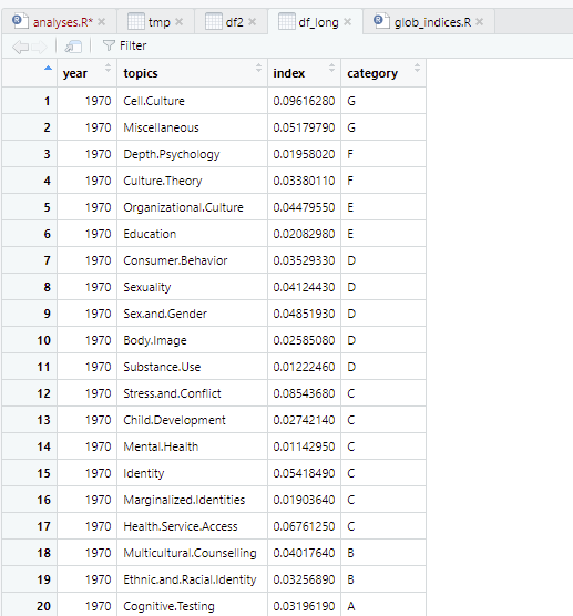
Sure! this is is below:

dput(head(df_long,20))

structure(list(year = c(1970, 1970, 1970, 1970, 1970, 1970, 1970,
1970, 1970, 1970, 1970, 1970, 1970, 1970, 1970, 1970, 1970, 1970,
1970, 1970), topics = structure(c(1L, 2L, 4L, 3L, 6L, 5L, 8L,
10L, 9L, 7L, 11L, 17L, 12L, 16L, 14L, 15L, 13L, 19L, 18L, 25L
), levels = c("Cell.Culture", "Miscellaneous", "Culture.Theory",
"Depth.Psychology", "Education", "Organizational.Culture", "Body.Image",
"Consumer.Behavior", "Sex.and.Gender", "Sexuality", "Substance.Use",
"Child.Development", "Health.Service.Access", "Identity", "Marginalized.Identities",
"Mental.Health", "Stress.and.Conflict", "Ethnic.and.Racial.Identity",
"Multicultural.Counselling", "Emotion.Concepts", "The.Self",
"Construct.Invariance", "Individualism.Collectivism", "Person.Perception",
"Cognitive.Testing"), class = "factor"), index = c(0.0961628,
0.0517979, 0.0195802, 0.0338011, 0.0447955, 0.0208298, 0.0352933,
0.0412443, 0.0485193, 0.0258508, 0.0122246, 0.0854368, 0.0274214,
0.0114295, 0.0541849, 0.0190364, 0.0676125, 0.0401764, 0.0325689,
0.0319619), category = c("G", "G", "F", "F", "E", "E", "D", "D",
"D", "D", "D", "C", "C", "C", "C", "C", "C", "B", "B", "A")), row.names = c(NA,
-20L), class = c("tbl_df", "tbl", "data.frame"))

I think you missed fill= in this line ggplot(df_long, aes(x = year, y = index))

1 Like

Cool! that worked. I removed it as I thought that might be part of the problem.

I really appreciate all your help. thank you @Flm. The palette generator is very handy too.

I'm glad it worked, if you still need I'm here. At the end you can mark the best answer to close the post

This topic was automatically closed 7 days after the last reply. New replies are no longer allowed.

If you have a query related to it or one of the replies, start a new topic and refer back with a link.