Hi,
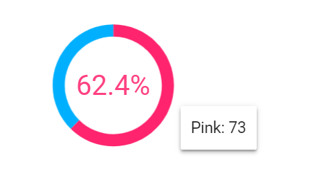
I am looking to include a donut chart like this in my shiny app, but haven't found a library for this.

Hi,
I am looking to include a donut chart like this in my shiny app, but haven't found a library for this.

try the REcharts3 package in github,but this package not in cran.
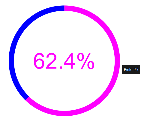
Using ggiraph:
library(dplyr)
library(ggplot2)
library(ggiraph)

donut_data <- data.frame(type = c("Blue", "Pink"), value = c(44, 73)) %>%
  mutate(
    percentage = value / sum(value),
    hover_text = paste0(type, ": ", value)
  ) %>%
  mutate(percentage_label = paste0(round(100 * percentage, 1), "%"))

donut_plot <- ggplot(donut_data, aes(y = value, fill = type)) +
  geom_bar_interactive(
    aes(x = 1, tooltip = hover_text),
    width = 0.1,
    stat = "identity",
    show.legend = FALSE
    ) +
  annotate(
    geom = "text",
    x = 0,
    y = 0,
    label = donut_data[["percentage_label"]][donut_data[["type"]] == "Pink"],
    size = 20,
    color = "magenta"
    ) +
  scale_fill_manual(values = c(Blue = "blue", Pink = "magenta")) +
  coord_polar(theta = "y") +
  theme_void()

ggiraph(ggobj = donut_plot)

Thank you, this is exactly what I needed!
How do you incorporate this in Shiny app as an interactive plot?
The ggiraph author, David Gohel, explains Shiny interaction in his online guide:
https://davidgohel.github.io/ggiraph/articles/offcran/using_ggiraph.html#shiny-usage
Thanks a million! It worked.