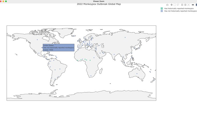
Hello! I'm trying to recreate the US Centers for Disease Control (CDC) 2022 Monkeypox Outbreak Global Map but I'm not familiar with creating interactive maps and tutorials I have come across are very far from the simplicity of this map.
So far, I have a static map that needs to be interactive so it has a popup on mouse hover that shows the country name and number of cases. My code so far and a tribble of the subset of the CDC dataset are below:
tibble::tribble(
     ~country, ~cases,                                 ~category,                                ~asof,
    "Andorra",      4, "Has not historically reported monkeypox", "Data as of 05 Aug 2022 5:00 PM EDT",
  "Argentina",     31, "Has not historically reported monkeypox", "Data as of 05 Aug 2022 5:00 PM EDT",
  "Australia",     58, "Has not historically reported monkeypox", "Data as of 05 Aug 2022 5:00 PM EDT",
    "Austria",    160, "Has not historically reported monkeypox", "Data as of 05 Aug 2022 5:00 PM EDT",
    "Bahamas",      1, "Has not historically reported monkeypox", "Data as of 05 Aug 2022 5:00 PM EDT",
   "Barbados",      1, "Has not historically reported monkeypox", "Data as of 05 Aug 2022 5:00 PM EDT"
  )

# join tables --------------------------------------------------------------

countries_clean <- sqldf(
  "SELECT * FROM country_loc
  FULL OUTER JOIN mpx_cases
  ON country_loc.country = mpx_cases.country"
) |>
  select(1:4, 6:8) |>
  drop_na()

# plot map --------------------------------------------------------------
world <- map_data("world")

ggplot() +
  geom_map(
    data = world, map = world,
    aes(long, lat, map_id = region),
    color = "black", fill = "lightgray", size = 0.1
  ) +
  geom_point(
    data = countries_clean,
    aes(longitude, latitude, size = cases, color = category)
  ) +
  theme_void() +
  theme(
    plot.title = element_text(face = "bold"),
    legend.position = "right"
  ) +
  labs(
    title = "2022 Monkeypox Outbreak Global Map",
    subtitle = "Data as of 05 Aug 2022 3:38:PM MST",
    caption = "Source: US Centers for Disease Control and Prevention"
  )
