Interaction plot of repeated measured, how to include a graph of the mean values

Dear RStudio Community

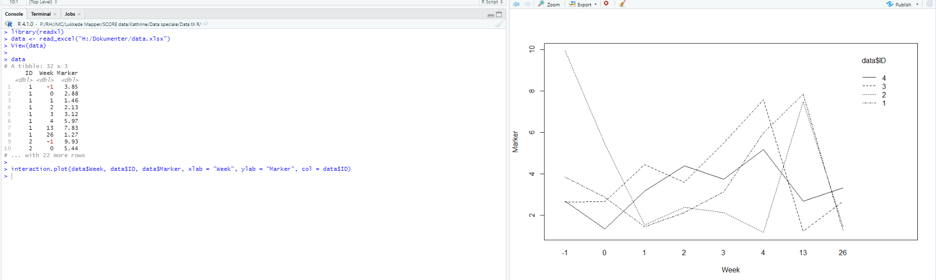
I have my data where I have measured a marker on the same patients at different times.
To illustrate this i have made an interaction plot:

interaction.plot(data$Week, data$ID, data$Marker, xlab = "Week", ylab = "Marker", col = data$ID)

I was wondering if it is possible in this plot to include a graph of the mean value at the different times?

Best, Kathrine

Please post the output of

dput(data)

Put a line with three back ticks just before and just after the pasted output, like this
```
Your pasted output
```

Like this?

´´´
structure(list(ID = c(1, 1, 1, 1, 1, 1, 1, 1, 2, 2, 2, 2, 2,
2, 2, 2, 3, 3, 3, 3, 3, 3, 3, 3, 4, 4, 4, 4, 4, 4, 4, 4), Week = c(-1,
0, 1, 2, 3, 4, 13, 26, -1, 0, 1, 2, 3, 4, 13, 26, -1, 0, 1, 2,
3, 4, 13, 26, -1, 0, 1, 2, 3, 4, 13, 26), Marker = c(3.84747,
2.87773, 1.45894, 2.1333, 3.1222, 5.97328734, 7.834774, 1.274774,
9.933393, 5.4444, 1.5384, 2.377364, 2.13383, 1.17236, 7.47474,
1.47744, 2.64875, 2.65171323529412, 4.45584, 3.588235, 5.4847474,
7.575754, 1.23837, 2.66949264705882, 2.67245588235294, 1.33733,
3.17363, 4.37633, 3.73663, 5.17363, 2.69023529411765, 3.313636
)), class = c("tbl_df", "tbl", "data.frame"), row.names = c(NA,
-32L))

´´´

This topic was automatically closed 21 days after the last reply. New replies are no longer allowed.

If you have a query related to it or one of the replies, start a new topic and refer back with a link.