Inserting plot objects into the axis

Dear,

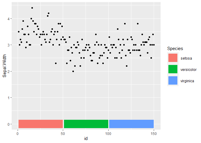
I'm using ggplot2 to make a plot like this:

According to the graph, I would like to know to how can I realize the object which is like a bar, which is close to the X-axis?

If anyone has the knowledge or I should use an additional package, please let me know. I would be very grateful

Easiest way is just to make a geom_line which has a large value of size.

library(tidyverse)
iris %>% 
    arrange(Species) %>% 
    mutate(id = 1:n()) %>% 
    ggplot() + 
    geom_point(aes(id, Sepal.Width)) + 
    geom_line(aes(id, 0, color = Species), size = 10)

Created on 2021-06-22 by the reprex package (v1.0.0)

Thanks! Is possible this bar could be out of the main graph? A bit more below

library(tidyverse)
iris %>% 
  arrange(Species) %>% 
  mutate(id = 1:n()) %>% 
  ggplot() + 
  geom_point(aes(id, Sepal.Width)) + 
  geom_line(aes(id, -0.25, color = Species), size = 10)

Created on 2021-06-22 by the reprex package (v1.0.0)

Sorry, your script didn't work to me. I'm looking for another solution

What issue are you having?

It's easier to help with a reproducible example.

I'm analyzing SARS variants, which I manipulated the data with tidyverse and acquired the following dataset

> glimpse(data)
Rows: 2,861
Columns: 5
$ Position <int> 67, 67, 70, 70, 72, 72, 1782, 2557, 2601, 3165, 3852, 3852, 3852, 4952, 5681, 7919, 7919, 7919, 7919, 7930…
$ ORF      <chr> "5UTR", "5UTR", "5UTR", "5UTR", "5UTR", "5UTR", "ORF1a", "ORF1a", "ORF1a", "ORF1a", "ORF1a", "ORF1a", "ORF…
$ Mutation <chr> "intergenic", "intergenic", "intergenic", "intergenic", "intergenic", "intergenic", "synonymous", "missens…
$ Seq_ID   <chr> "H3-USA", "H4-USA", "H3-USA", "H4-USA", "H3-USA", "H4-USA", "H6-TWN", "H11-CHA", "H12-CHA", "H10-TWN", "H6…
$ Host     <chr> "Human", "Human", "Human", "Human", "Human", "Human", "Human", "Human", "Human", "Human", "Human", "Human"...

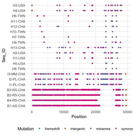
From this data I made the follow figure using the ggplot2 and the script employed is the one shown below:

data$Seq_ID <- factor(data$Seq_ID, levels = rev(unique(data$Seq_ID)))
ggplot(data) + geom_point(aes(Position, Seq_ID, color = Mutation), size = 1) + theme_minimal() + theme(legend.position = "bottom") + scale_color_brewer(palette = "Dark2")

Rplot01.pdf (122.3 KB)

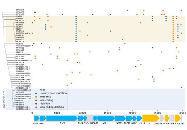
Visually it looks like what I want. However, several aspects are still to be annotated according to the figure I show below
A-graphical-representation-of-variants-found-in-COVID-19-genomes-Variants-are-colored_W640

These are the tasks I need help:

  1. To each type of host assign a different color as background (bat, intermediate, human) that is seen in the Y-axis.
  2. Build the bar chart near the X-axis, where it shows the different ORFs.

I appreciate very much any help you can contribute.
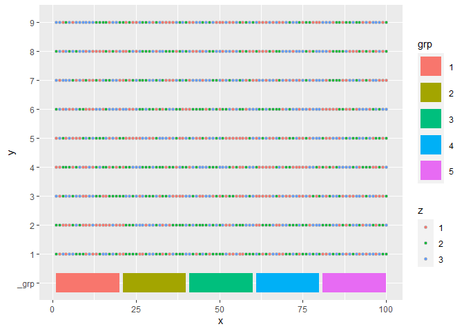
Perhaps something like this?

library(tidyverse)
lev <- c("_grp", as.character(1:9))
expand_grid(x = 1:100, y = as.character(1:9) %>% factor(lev)) %>%
  mutate(z = ntile(runif(nrow(.)), 3) %>% as.factor(),
         id = 1:n(),
         grp = ntile(id, 5) %>% as.factor()) %>%
  ggplot() +
  geom_point(aes(x, y, fill = z), pch = 21, color = "grey") + 
  geom_line(aes(x, factor("_grp", lev), color = grp), size = 10)

Created on 2021-06-24 by the reprex package (v1.0.0)

You are probably better off using patchwork or a similar package to stitch different plots together rather than forcing different objects together.

Hi Arthur.
It's very interesting your contribution, although I noticed that the figure generated with the script you shared differs drastically the visualization of the data that I have.

Rplot

Check that in the Y axis must be the Seq_ID and in the X axis the position that will be represented according to the size of each gene (ORF).

Hi Martin. It's great idea, could you please share an example to understand how to do it?

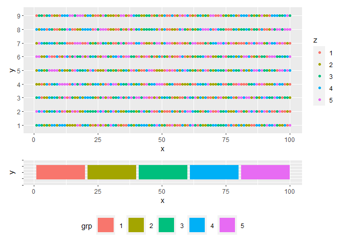
Here's an example with patchwork. It's a nice package - I need to start using it more!

The examples I share will not look exactly like your plot because I don't have access to your data, and so I just made up some data in an similar format with simple column names x, y, z. It will be your responsibility to adapt this to your own problem :slight_smile:

library(tidyverse)
library(patchwork)
#> Warning: package 'patchwork' was built under R version 4.0.5
df <- expand_grid(x = 1:100, y = as.character(1:9)) %>%
  mutate(z = ntile(runif(nrow(.)), 5) %>% as.factor(),
         id = 1:n(),
         grp = ntile(id, 5) %>% as.factor()) 

p1 <- df %>%
  na.omit() %>%
  ggplot() +
  geom_point(aes(x, y, color = z))

p2 <- df %>%
  ggplot() + 
  geom_line(aes(x, 0, color = grp), size = 10) + 
  theme(axis.text.y = element_blank(),
        legend.position = "bottom")

p1 + p2 + plot_layout(heights = c(5, 1))

Created on 2021-06-24 by the reprex package (v1.0.0)

This topic was automatically closed 21 days after the last reply. New replies are no longer allowed.

If you have a query related to it or one of the replies, start a new topic and refer back with a link.