
What is it? All I see is a photo that really makes no sense.
I think OP is referring to figure 2.13 on Page 33 of the Comprehensive Assessment of Soil Health – The Cornell Framework that can be download from Manual | Cornell Soil Health
Thanks, that looks like it. Now They just have to explain what they actually want to do.
I'm sorry but a screenshot is not quite enough.
That's a rather interesting manual though.
1 Like
This will recreate the background, now all they need to do is add the curve.
library(tidyverse)

background <- tribble(
  ~label, ~lower, ~upper, ~rgb,
  "very low", 0, 20,"#ff5150",
  "low", 20, 40, "#ff9936",
  "medium", 40, 60,"#ffff00",
  "high", 60, 80, "#33cd37",
  "very high", 80, 100, "#329364"
)

lines <- tribble(
  ~x, ~y, ~color, ~arrow,
  380, 20, "black", FALSE,
  480, 40, "black", FALSE,
  560, 60, "red", TRUE,
  800, 80, "black", FALSE,
  )

ggplot() +
  geom_rect(
    data = background,
    aes(
      xmin = 0,
      xmax = 1200,
      ymin = lower,
      ymax = upper,
      fill = rgb
    ),
    alpha = 1
  ) +
  geom_text(
    data = background,
    aes(
      label = toupper(label),
      x = 100,
      y = (lower + upper) / 2
    ),
    size = 5,
    hjust = 0,
    fontface = "bold"
  ) +
  geom_segment(
    data = lines %>% filter(arrow == FALSE),
    aes(
      x = x,
      xend = x,
      y = 0,
      yend = y,
      color = color
    ),
    linewidth = 1,

  ) +
  geom_segment(
    data = lines %>% filter(arrow == TRUE),
    aes(
      x = x,
      xend = x,
      y = 0,
      yend = y,
      color = color
    ),
    linewidth = 1.5,
    arrow = arrow(
      angle = 30,
      length = unit(10, "pt"),
      type = "closed"
    )
  ) +
  geom_segment(
    data = lines %>% filter(arrow == FALSE),
    aes(
      x = 0,
      xend = x,
      y = y,
      yend = y,
      color = color
    ),
    linewidth = 1
  ) +
  geom_segment(
    data = lines %>% filter(arrow == TRUE),
    aes(
      x = 0,
      xend = x,
      y = y,
      yend = y,
      color = color
    ),
    linewidth = 1.5,
    arrow = arrow(
      angle = 30,
      length = unit(10, "pt"),
      ends = "first",
      type = "closed"
    )
  ) +
  scale_x_continuous(
    limits = c(0, 1200),
    breaks = seq(0, 1200, 200),
    expand = c(0, 0)
  ) +
  scale_y_continuous(
    limits = c(0, 100),
    breaks = seq(0, 100, 20),
    expand = c(0, 0)
  ) +
  scale_fill_identity() +
  scale_color_identity() +
  labs(x = "[Active C] (ppm)", y = "Score") +
  theme(plot.margin =  margin(24, 24, 24, 24, "pt"),
        axis.title = element_text(face = "bold"),)
1 Like
Pls how do I add the curve PAW in the codes above?
Thanks in anticipation
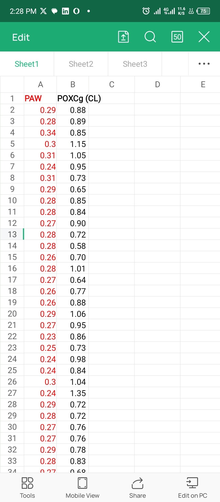
Here is the raw data N=72
PAW
0.29
0.28
0.34
0.3
0.31
0.24
0.31
0.29
0.28
0.28
0.27
0.28
0.28
0.26
0.28
0.27
0.26
0.26
0.29
0.27
0.23
0.25
0.24
0.24
0.3
0.24
0.29
0.28
0.27
0.27
0.29
0.28
0.27
0.25
0.3
0.27
0.26
0.25
0.26
0.26
0.28
0.29
0.3
0.29
0.25
0.29
0.26
0.27
0.26
0.26
0.34
0.29
0.25
0.32
0.29
0.29
0.24
0.25
0.3
0.26
0.2
0.27
0.3
0.26
0.23
0.31
0.32
0.29
0.27
0.3
0.2
0.29
Same as you would any data you want to plot as a line: Make a dataframe with PAW and POXCgCL and then add a geom_line() to the ggplot()+ after the base layers (they're drawn in order)
geom_line(data = eastlife_data, aes(x = POXCgCL, y = PAW)) +
Note that the values for the base layer are about 1000 times larger than the data, so will need adjusting.
1 Like
data.frame(Em$PAW, Em$POXCg..CL.)
Em.PAW Em.POXCg..CL.
1 29 88
2 28 89
3 34 85
4 30 115
5 31 105
6 24 95
7 31 73
8 29 65
9 28 85
10 28 84
11 27 90
12 28 72
13 28 58
14 26 70
15 28 101
16 27 64
17 26 77
18 26 88
19 29 106
20 27 95
21 23 86
22 25 73
23 24 98
24 24 84
25 30 104
26 24 135
27 29 72
28 28 72
29 27 76
30 27 76
31 29 78
32 28 83
33 27 68
34 25 76
35 30 75
36 27 73
37 26 89
38 25 78
39 26 65
40 26 62
41 28 113
42 29 95
43 30 75
44 29 95
45 25 98
46 29 92
47 26 72
48 27 72
49 26 69
50 26 73
51 34 81
52 29 56
53 25 63
54 32 48
55 29 77
56 29 54
57 24 95
58 25 63
59 30 72
60 26 58
61 20 63
62 27 62
63 30 56
64 26 73
65 23 28
66 31 14
67 32 57
68 29 32
69 27 48
70 30 60
71 20 57
72 29 45
geom_line(data = Em, aes(x=Em$POXCg..CL., y=Em$PAW))
mapping: x = ~Em$POXCg..CL., y = ~Em$PAW
geom_line: na.rm = FALSE, orientation = NA
stat_identity: na.rm = FALSE
position_identity
a<-geom_line(data = Em, aes(x=Em$POXCg..CL., y=Em$PAW))
background <- tribble(
- ~label, ~lower, ~upper, ~rgb,
- "very low", 0, 20,"#ff5150",
- "low", 20, 40, "#ff9936",
- "medium", 40, 60,"#ffff00",
- "high", 60, 80, "#33cd37",
- "very high", 80, 100, "#329364"
- )
lines <- tribble(
- ~x, ~y, ~color, ~arrow,
- 380, 20, "black", FALSE,
- 480, 40, "black", FALSE,
- 560, 60, "red", TRUE,
- 800, 80, "black", FALSE,
- )
ggplot(a) +
- geom_rect(
-
data = background, -
aes( -
xmin = 0, -
xmax = 1200, -
ymin = lower, -
ymax = upper, -
fill = rgb -
), -
alpha = 1 - ) +
- geom_text(
-
data = background, -
aes( -
label = toupper(label), -
x = 100, -
y = (lower + upper) / 2 -
), -
size = 5, -
hjust = 0, -
fontface = "bold" - ) +
- geom_segment(
-
data = lines %>% filter(arrow == FALSE), -
aes( -
x = x, -
xend = x, -
y = 0, -
yend = y, -
color = color -
), -
linewidth = 1, - ) +
- geom_segment(
-
data = lines %>% filter(arrow == TRUE), -
aes( -
x = x, -
xend = x, -
y = 0, -
yend = y, -
color = color -
), -
linewidth = 1.5, -
arrow = arrow( -
angle = 30, -
length = unit(10, "pt"), -
type = "closed" -
) - ) +
- geom_segment(
-
data = lines %>% filter(arrow == FALSE), -
aes( -
x = 0, -
xend = x, -
y = y, -
yend = y, -
color = color -
), -
linewidth = 1 - ) +
- geom_segment(
-
data = lines %>% filter(arrow == TRUE), -
aes( -
x = 0, -
xend = x, -
y = y, -
yend = y, -
color = color -
), -
linewidth = 1.5, -
arrow = arrow( -
angle = 30, -
length = unit(10, "pt"), -
ends = "first", -
type = "closed" -
) - ) +
- scale_x_continuous(
-
limits = c(0, 1200), -
breaks = seq(0, 1200, 200), -
expand = c(0, 0) - ) +
- scale_y_continuous(
-
limits = c(0, 100), -
breaks = seq(0, 100, 20), -
expand = c(0, 0) - ) +
- scale_fill_identity() +
- scale_color_identity() +
- labs(x = "[PAW] (ppm)", y = "Score") +
- theme(plot.margin = margin(24, 24, 24, 24, "pt"),
-
axis.title = element_text(face = "bold"), - )
Error infortify():
!datamust be a <data.frame>, or an object coercible byfortify(), not a
<LayerInstance/Layer/ggproto/gg> object.
Runrlang::last_trace()to see where the error occurred.
perhaps you can fix the formatting of the code? I can't read that.
Just copy your code and paste it here between
```
```
This topic was automatically closed 7 days after the last reply. New replies are no longer allowed.
If you have a query related to it or one of the replies, start a new topic and refer back with a link.