increase the length of y axis and want to put data in ggplot

X1 <- seq(-3,3, length = 300)
Y1 <- dnorm(X1)
plot(X1, Y1, type = "n", xlab=" ", ylab = " ")

x0 <- min(which(X1 >= -2.58))
x1 <- min(which(X1 >= -1.96))
x2 <- min(which(X1 >= -1))
x3 <- max(which(X1 <= 1))
x4 <- max(which(X1 <= 1.96))
x5 <- max(which(X1 <= 2.58))
polygon(x = c(X1[c(1, 1:x0, x0)]), y = c(0, Y1[1:x0], 0), col = "yellow", border = NA)
polygon(x = c(X1[c(x0, x0:x1, x1)]), y = c(0, Y1[x0:x1], 0), col = "yellow", border = NA)
polygon(x = c(X1[c(x1, x1:x2, x2)]), y = c(0, Y1[x1:x2], 0), col = "orange", border = NA)
polygon(x = c(X1[c(x2, x2:x3, x3)]), y = c(0, Y1[x2:x3], 0), col = "orange", border = NA)
polygon(x = c(X1[c(x3, x3:x4, x4)]), y = c(0, Y1[x3:x4], 0), col = "orange", border = NA)
polygon(x = c(X1[c(x4, x4:x5, x5)]), y = c(0, Y1[x4:x5], 0), col = "yellow", border = NA)
polygon(x = c(X1[c(x5, x5:300, 300)]), y = c(0, Y1[x5:300], 0), col = "yellow", border = NA)
abline(v = 0, lwd = 0.5, lty = 1)
points(X1, Y1, type = "l")
abline(v = 1.96, lwd = 1, lty = 2)
abline(v = -1.96, lwd = 1, lty = 2)
text(0.5, 0.3, "1-alpha = 0.95 so alpha = 0.05", cex = 1, col = "black")
Welcome to the community!

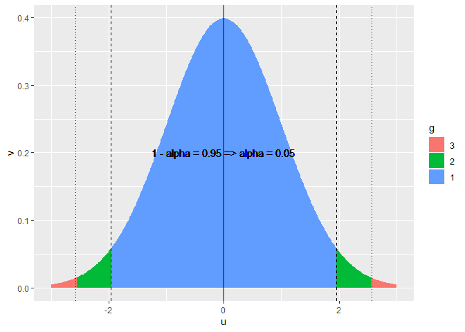
I can't say I understand what exactly your question is. Is it to plot the same using ggplot?

if so, you can do something like this:

library(ggplot2)

u <- seq(from = -3, to = 3, length.out = 300)
v <- dnorm(x = u)
g <- cut(x = u,
         breaks = c(-Inf, qnorm(p = 0.005), qnorm(p = 0.025), qnorm(p = 0.975), qnorm(p = 0.995), Inf),
         labels = c(3, 2, 1, 2, 3))

ggplot(data = data.frame(u, v, g)) +
  geom_area(mapping = aes(x = u, y = v, fill = g)) +
  geom_vline(xintercept = c(qnorm(p = 0.005), qnorm(p = 0.025), 0, qnorm(p = 0.975), qnorm(p = 0.995)),
             linetype = c(3, 2, 1, 2, 3)) +
  geom_text(mapping = aes(x = 0, y = 0.2, label = "1 - alpha = 0.95 => alpha = 0.05"))

Created on 2019-06-17 by the reprex package (v0.3.0)

The problem with this is the leftmost and the rightmost line doesn't exactly match with the shaded regions. That's because of the absence of points in that region. If you use more points, that gap will decrease and eventually disappear.

There may be a better way to do this plot, but I'm not quite familiar with ggplot2 and hence can't suggest anything. I'd also prefer to display alpha as \alpha, but I failed :frowning_face: I hope someone will help you (and me) to get rid of these issues.

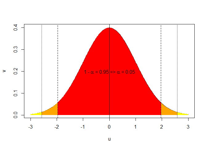
P.S. The way you plotted using basic plot functions is OK, but here's another way using clip, and I'm quite biased in its favour personally.

u <- seq(from = -3, to = 3, length.out = 300)
v <- dnorm(x = u)
plot(x = u, y = v, type = "l")
usr <- par("usr")
polygon(x = c(-3, u, 3), y = c(0, v, 0), col = "yellow", border = NA)
clip(x1 = qnorm(p = 0.005), x2 = qnorm(p = 0.995), y1 = 0, y2 = max(v))
polygon(x = c(-3, u, 3),y = c(0, v, 0), col = "orange", border = NA)
clip(x1 = qnorm(p = 0.025), x2 = qnorm(p = 0.975), y1 = 0, y2 = max(v))
polygon(x = c(-3, u, 3), y = c(0, v, 0), col = "red", border = NA)
do.call(what = clip, args = as.list(x = usr))
abline(v = c(qnorm(p = 0.005), qnorm(p = 0.025), 0, qnorm(p = 0.975), qnorm(p = 0.995)), lty = c(3, 2, 1, 2, 3))
text(x = 0, y = 0.2, labels = expression(paste("1 - ", alpha, " = 0.95", " => ", alpha, " = 0.05")))

Created on 2019-06-17 by the reprex package (v0.3.0)

1 Like

THANKYOU YARNABRINA. This helped me alot.

Glad it helped.

If your question is answered, will you please consider marking this thread as solved?

If you don't know how to do it, please take a look at this thread:

1 Like

This topic was automatically closed 7 days after the last reply. New replies are no longer allowed.